Detail Module
The Grid Detail Module allows you to organize the information displayed according to its significance. It’s a complementary application that displays the data in a detailed Form. In order to see the Grid Detail within the Grid the final user needs to click on  that is displayed for each record.
To enable the Grid Detail Module, access the “Grid Modules” and enable the check box, it uses to come enabled by default:
Detail Settings
In this section, the user can define how the detail of a particular record should be displayed when it’s selected and which registry information should be displayed in this detail.
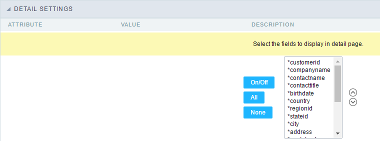
- Attributes
- Fields selection for the detail page. : Allows you to select the desired fields. Just click the field and then click the “On/Off” button to enable/disable the fields.
Detail Keys
Through this interface you can chose the fields that will be part of the “WHERE” clause, it will return the corrected information according to the selected record. ScriptCase uses to identifies the table primary keys, that is being used within the application SQL, automatically. However, sometimes it is necessary to set the primary key manually, especially in cases where the application has a SQL JOIN, involving more than one table.
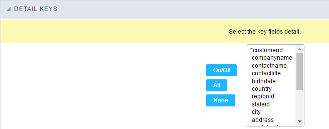
Select here the fields that are keys to the Detail. The application will execute another select command, and you can configure which fields will be passed for this “WHERE” clause:
- On/Off : Select the field to be displayed in detail. The selected field (On) gets an asterisk.
- All : Check “On” to all fields.
- None : Check “Off” to all fields.
Desktop Toolbar
The application toolbar is divided in two parts: superior and inferior. It is possible to select the buttons for each part independently. A button can even be part of both parts simultaneously.
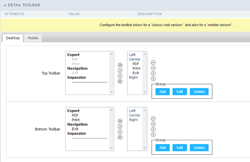
- Attributes
- Navigation : Navigation Buttons
- Exit : Ends or return to the previous application depending on how the “Display Detail” is configured. You can change the label within the “Button Settings”.
- Exports : Sets the formats for printing generation:
- Print : Creates a complete report with all Grid Detail data within a HTML printable page.
- PDF : Creates a complete report with all Grid Detail data within a PDF file type.
- Othes
- Separator : Creates a separation line between the buttons for better display, specially for grouped buttons.
- Navigation : Navigation Buttons
Mobile Toolbar
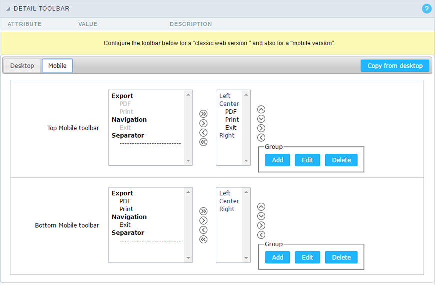
It has the same options of Desktop version, by adding only the item “copy of the desktop”, in which, when clicked, performs a copy of toolbar items from Desktop to Mobile.
Button Settings
| Button | Displays the buttons available in the application. |
| Label | Allows you to customize the buttons name from current application. You can also use the option “Application Language” (placed within the main menu “Locales”) to change the button labels for the whole project. |
| Hint | Allows you to set a hint for the buttons. The hint will help the user to understand the button’s action. |
| Shortcut key | Allows you to set a shortcut key to run the button action. Important note: Each browser has its own shortcut combinations and reserved words, you need to check it before implementing this option. |
Application Hotkeys
Scriptcase allows creating shortcut keys to your applications. You can select a predefined template or create specific actions for an application.
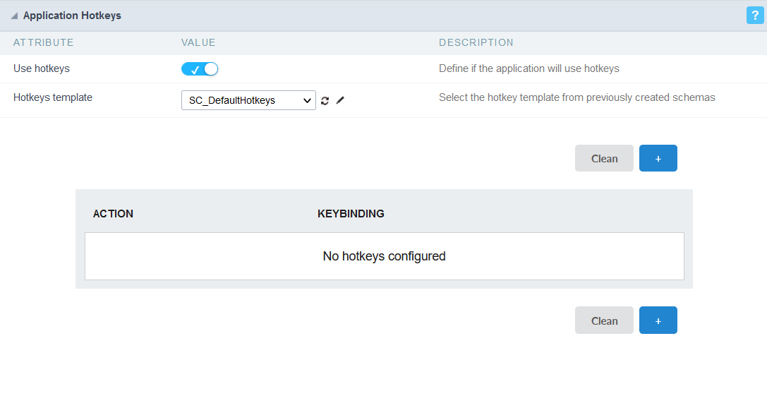
Use hotkeys
Defines if the application uses hotkeys. When you enable this option, the default shortcut keys settings are disabled.
Hotkeys templat
Select the hotkey template previously created.
Action
Selects the triggered action when pressing the selected key.
Keybinding
Selects the keys responsible for executing the chosen action.
Add “+”
Adds a new action on the keys list.
Clear
It clears the selected hotkeys preference.
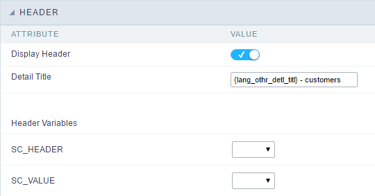
Header
In this section is where the content variables that will be part of the header is set.
This screen will change depending on the format chosen header within.
- Display Header : This flag determines whether the header is displayed.
- Detail Title : Using this option you can set a title for the application, it uses bring a value from the Grid application as default. However it can be customized.
- Header Variables : Variable fields can be filled with any of the types displayed in the Combo box. Depending on the type, you must associate a content. Below we describe the existing types:
- Field : When the “__Category” type option is chosen, it will open a combo box next to the fields that are part of the “Select”. By choosing one of these fields, you are associating the value of the field to display in the header.
- Title : When this option is selected, it will display the value filled in “Detail Title” to the header.
- Date : When you select the “Date” type, the system date in the format mm/dd/yyyy will be displayed in the header. There are several display formats using server date and time. The format can be reported in the text field that appears next. Click in the question mark to check out the available formats.
- Image : When the image type field is selected, a field for filling in the image name on the server will appear. To locate the existing images and select one, click on the “Choose Image” icon and to make new images available on the server click on “Download an image”
 .
. - Value : When “Value” type is selected, the content filled in the text field next to that will be displayed in the header, texts and “__ Global variables__” can be entered. Ex: “Name of the Employee: [v_name]”.