Default Values
With this configuration, it is possible to standardize the creation of the applications of the current project, increasing productivity in the development of the applications.
Common Settings
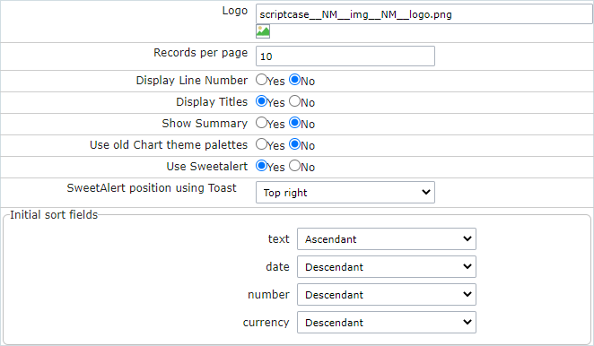
- Logo - The Favicon that is going to use with the project. Customize the project using the same Favicon in all the applications.
- Records per page - Amount of records per page.
- Display Line Number - Defines the display of the line number existing in each application.
- Display Titles - Displays the title of the application in execution.
- Show Summary - Displays the number of records on the page and the total of the records in the application. This option executes only if the line option in the Grid toolbar is disabled.
- Use old Chart theme palettes - Defines the use of the old scheme of colors on the charts
- Initial sort fields - Defines the initial sorting of the fields.
Grid
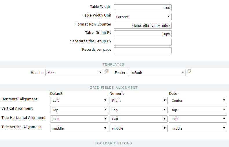
- Table Width - Defines the length for the application table. this option is available to select Pixel or Percent in the table width unit.
- Table Width Unit - The unit used to define the width of the application. Automatic (Width automatically defined according to the size of the fields); Pixel (Width defined by pixels, that should be informed in the Form: 800px); Percent (Width defined in percentage, and should be informed in the Form: 80%)
- Format Row Counter - Configuration of visualization of the display summary option of the Grid. The display summary option is displayed and executed only if the line option in the toolbar isn’t enabled
- Tab a Group By - Defines the left margin of the Group By.
- Separates the Group - Defines the margin between two Group By.
- Records per page - Available values in the Record button, on the toolbar
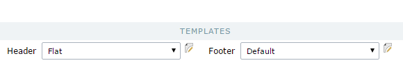
- Templates - Defines the templates used by default on the Header and Footer. It’s possible to inform the values to the variables of the selected templates, clicking on the editing icon right beside the field of the template selection.
- Grid fields alignment - It’s possible to define the default alignment specifically for the fields that contain numbers and dates and the other types of fields.
- Toolbar Buttons - Define the buttons that’ll be set up by default in the toolbar for the new applications. We can set up the toolbar for the Grid, Detail, and Summary.
Form
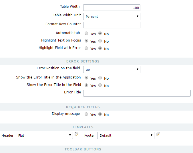
- Table Width - Defines the length for the application table. this option is available to select Pixel or Percent in the table width unit.
- Table Width Unit - The unit used to define the width of the application. Automatic (Width automatically defined according to the size of the fields); Pixel (Width defined by pixels, that should be informed in the Form: 800 pixels); Percent (Width defined in percentage, and should be informed in the Form: 80%)
- Format Row Counter - Configuration of visualization of the display summary option of the Form on a horizontal orientation. The Display summary option is displayed and executed only if the line option in the toolbar isn’t enabled
- Automatic tab - Enables the automatic tab when finishing to inform a field.
- Highlight Text on Focus - Allows the content of the fields to be Highlighted when the field is focused.
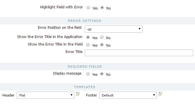
- Highlight Field with Error - When occurring an error on a field, it is also required, for example, the focus will be applied to this field.
- Error Position on the field - Position of the field error.
- Show the Error Title in the Application - Defines the display of the title of the application error.
- Show the Error Title in the Field - Defines the display of the error Title for the field.
- Error Title - Defines the error Title.
- Display message - Defines the display for the message if the field is required.
- Templates - Defines the templates used by default on the Header and Footer. It’s possible to inform the values to the variables of the selected templates, clicking on the editing icon right beside the field of the template selection.
- Toolbar Buttons - Define the buttons that’ll be set up by default in the toolbar for the new applications.
Control
- Highlight Text on Focus - Allows the content of the fields to be highlighted when the field is focused.
- Highlight Field with Error - When occurring, an error on a field is also required. For example, the focus will be applied to this field.
- Error Position on the field - Position of the field error.
- Show the Error Title in the Application - Defines the display of the title of the application error.
- Show the Error Title in the Field - Defines the display of the error Title for the field.
- Error Title - Defines the error Title.
- Display message - Defines the display for the message if the field is required.
- Templates - Defines the templates used by default on the Header and Footer. It’s possible to inform the values to the variables of the selected templates, clicking on the editing icon right beside the field of the template selection.
Search
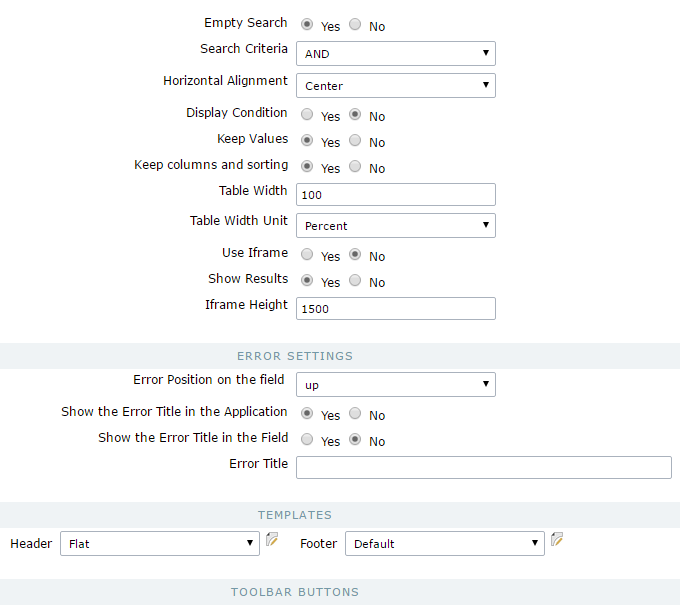
- Empty Search - Defines how the search treats the conditions. “AND” (Should satisfy all the conditions so that the search can return some results) “OR” (Should satisfy any condition informed so that the search can return some results)
- Horizontal Alignment - Horizontal Alignment of the search.
- Display Condition - Displays the condition of the search so that the user can make their choice. (“AND” or “OR”)
- Keep Values - Keep the values of the previous searches done when reaccessing the search.
- Keep Columns and Order Selection - Preserve the position of the fields and the sorting of the previous search.
- Table Width - Defines the length for the application table. this option is available to select Pixel or Percent in the table width unit.
- Table Width Unit - The unit used to define the width of the application. Automatic (Width automatically defined according to the size of the fields); Pixel (Width defined by pixels, that should be informed in the Form: 800 pixes); Percent (Width defined in percentage, and should be informed in the Form: 80%)
- Use Iframe - Allows the use and the display of the application searched in the same page within an iframe.
- Initial State - Defines how the application is displayed at first when using the search with an iframe, if the application is displayed at first or only the search is displayed.
- Iframe Height - Defines the height of the iframe in pixels.
- Error Position on the field - Position of the field error.
- Show the Error Title in the Application - Defines the display of the title of the application error.
- Show the Error Title in the Field - Defines the display of the error Title for the field.
- Error Title - Defines the error Title.
- Display message - Defines the display for the message if the field is required.
- Templates - Defines the templates used be default on the Header and Footer. It’s possible to inform the values to the variables of the selected templates, clicking on the editing icon right beside the field of the template selection.
- Toolbar Buttons - Define the buttons that’ll be setup by default in the toolbar for the new applications.
Calendar
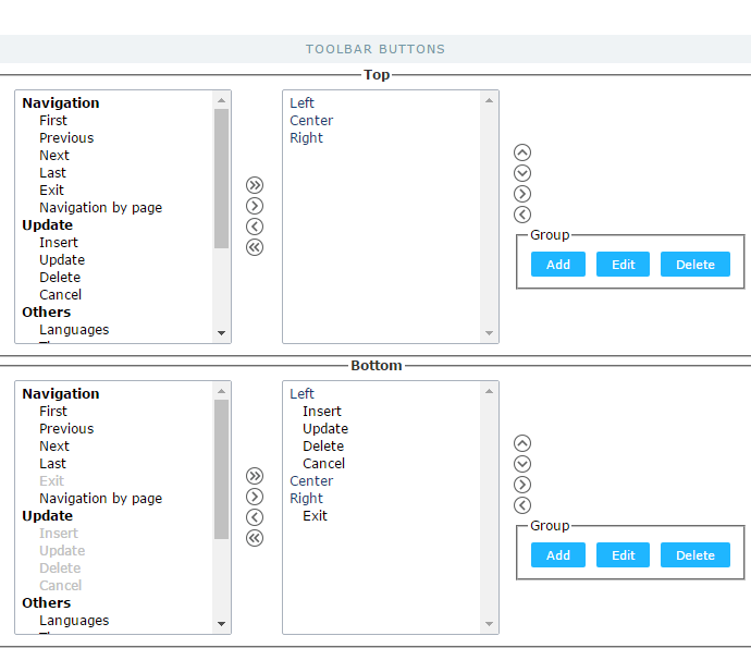
- Toolbar Buttons - Define the default buttons in the toolbar for the new applications.
New Chart
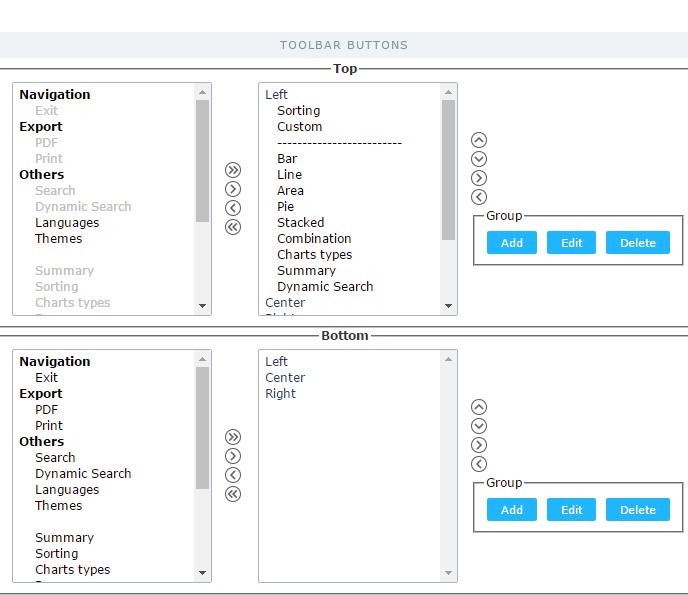
- Toolbar Buttons - Define the buttons that will be set up by default in the toolbar for the new applications.
Old Chart
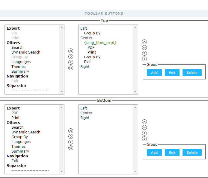
- Toolbar Buttons - Define the default buttons in the toolbar for the new applications.
Tab
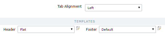
- Tab Alignment - Display alignment of the tabs in the application.
- Templates - Defines the templates used by default on the Header and Footer. It’s possible to inform the values to the variables of the selected templates, clicking on the editing icon right beside the field of the template selection.
Menu
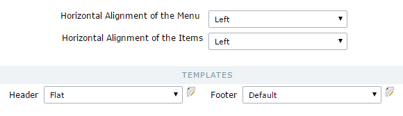
- Horizontal Alignment of the Menu - Menu alignment.
- Horizontal Alignment of the Items - Menu item alignment
- Templates - Defines the templates used by default on the Header and Footer. It’s possible to inform the values to the variables of the selected templates, clicking on the editing icon right beside the field of the template selection.
Dashboard
- Templates - Defines the templates used by default on the Header and Footer. It’s possible to inform the values to the variables of the selected templates, clicking on the editing icon right beside the field of the template selection.
HTML Editor
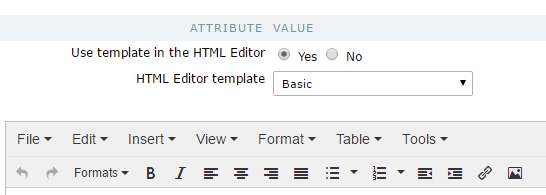
The HTML Editor has to options of configurations, depending on the option selected on Use template in the HTML Editor.
- Use template in the HTML Editor - Selecting Yes (Image Below), you use the new templated of the HTML Editor field, these themes should be set up in Layout > HTML Editor Templates.
- HTML Editor template - Defines the template for editing of the field HTML Editor.
- Field Preview - Default Text of the HTML Editor Fields.
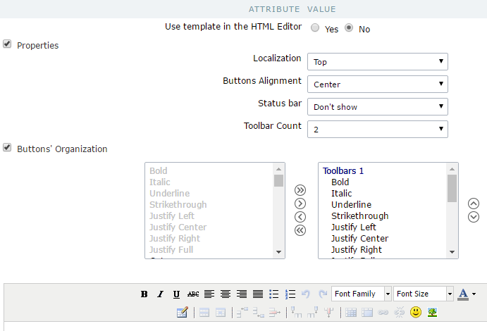
- Use template in the HTML Editor - Selecting No (Image Below), you won’t be using the new templated of the HTML Editor field. In this case, the options should be set up in the field.
- Properties - Defines the display properties.
- Location - Defines the position of the items in the field. Top or Bottom
- Buttons Alignment - Defines the alignment of the items in the field. Left, Center, Right.
- Status bar - Position of the Status Bar.
- Toolbar Count - Amount of the bars to organize the items.
- Buttons’ Organization - Set the available items in the bars.
Internal Libraries
Define the libraries available in the project.
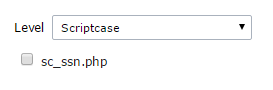
- Level - Access level of the library.
- List of Libraries - List of all the libraries available for use in the project.