Grid Toolbar
The application toolbar has two segments: Top and Bottom, in a way that is possible to define to display buttons into both areas. Those areas work independently, allowing them to display the same button, for example.
It’s also possible to select the buttons and their position if the application is running on a mobile device.
Toolbar
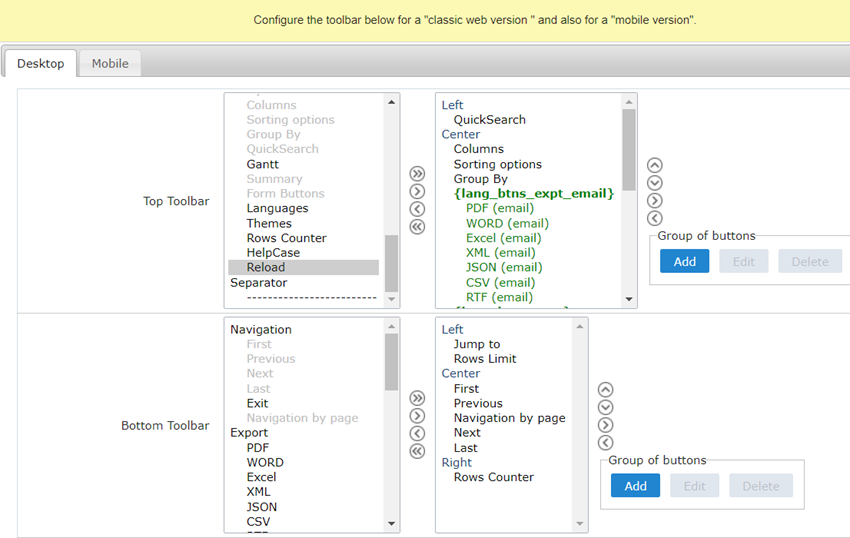
Desktop
Here we must inform the toolbar settings for the “Classic Web Version” mode and which buttons are available in the application when accessed from a Desktop environment.
Mobile
Here we must inform the toolbar settings for the “Mobile Version” mode. That is which buttons are available in the application when accessed from a Mobile dispositive.
Navigation:
Buttons relative to the navigation of the application.
| Next | Move to the next page that can be a single record or a list of records. |
| Previous | Returns to displays the previous page records or a single record. |
| First | Move to the First page or record |
| Last | Move to the Last page or record |
| Exit | Close the application |
| Navigation by page | Displays a “page-number” navigation bar. Example: 1 2 3 4 5 |
| Reload | Displays a button to reload the query data |
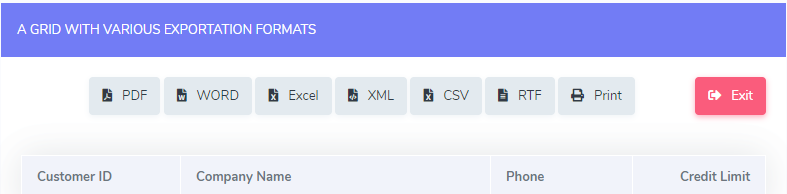
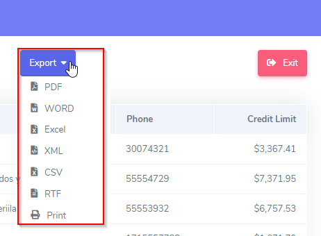
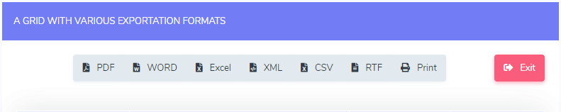
Export:
Groups the options relative to the generated exports. Scriptcase generates the following export formats:
| Generates a complete Report with all the data of the application in a PDF format. | |
| WORD | Generates a complete Report with all the data of the application in a WORD format. |
| XLS | Generates a complete Report with all the data of the application in an EXCEL format. |
| XML | Generates a complete Report with all the data of the application in an XML format. |
| CSV | Generates a complete Report with all the data of the application in a CSV format. |
| RTF | Generates a complete Report with all the data of the application in an RTF format. |
| Creates an HTML with the records ready for printing. |
Export by Email:
Groups the options relative to the emails exports. Scriptcase generates the following export formats:
| PDF (Email) | Sends by Email a complete report with all the data of the application in a PDF format. |
| WORD (Email) | Sends by Email a complete report with all the data of the application in a WORD format. |
| XLS (Email) | Sends by Email a complete report with all the data of the application in an EXCEL format. |
| XML (Email) | Sends by Email a complete report with all the data of the application in an XML format. |
| CSV (Email) | Sends by Email a complete report with all the data of the application in a CSV format. |
| RTF (Email) | Sends by Email a complete report with all the data of the application in an RTF format. |
Others:
Other options available in the Grid application.
| Jump to | Move to the informed page. |
| Rows Limit | It is a Combobox that defines the number of rows per page. |
| Search | Goes to the Search Form to filter the records. |
| Dynamic Search | It displays the fields of the search to filter the records. |
| Columns | Allows to include or remove columns of the Grid on the fly. |
| Sorting Options | Allows selecting the order of the records based on the field. |
| Group By | Allows to select or change a Group By rule on the Grid. |
| Save Grid | Allows saving the current state of the application. For example, in the advanced search, you can save the search data for further use. |
| Quick Search | Allows to perform a quick search in the records of the application. |
| Gantt | It displays a Gantt chart, if it was previously set. |
| Summary | It displays a summary with the synthetical data of the records. |
| Form Buttons | It displays the Form Buttons when there’s an Application Link from the Grid to a Form. |
| Languages | It displays a Combobox with the names available, defined in the project properties. |
| Themes | It displays a Combobox with the themes available, defined in the project properties. |
| Rows Counter | It displays the number of records retrieved by the application. |
| HelpCase | Displays a button to open the help page. |
Separator:
| ———————— | Displays a line separating the buttons, when used the Group Buttons. |
Toolbar Mobile
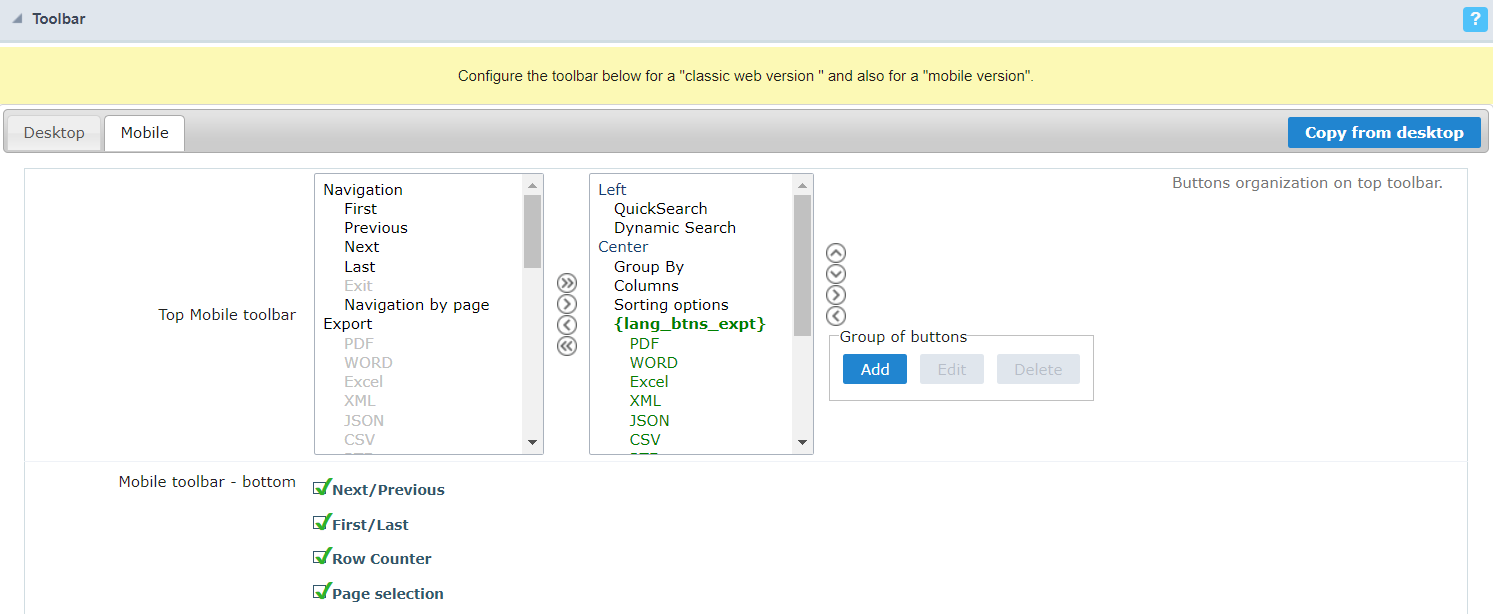
Top Mobile toolbar
It has the same options as the Desktop version, adding only the item “Copy from desktop”, which, when clicked, makes a copy of the items from the upper toolbar of Desktop to Mobile.
Mobile toolbar - bottom
Next/Previous
Enables navigation to the next and previous page on mobile devices.

First/Last
Enables first and last page navigation on mobile devices.

Row Counter
Enables the record counter showing the application’s total records

Page selection
Enables page navigation on mobile.

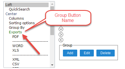
Buttons Group
The Group option allows you to group a set of buttons of the application toolbar to display them as a dropdown, for example.
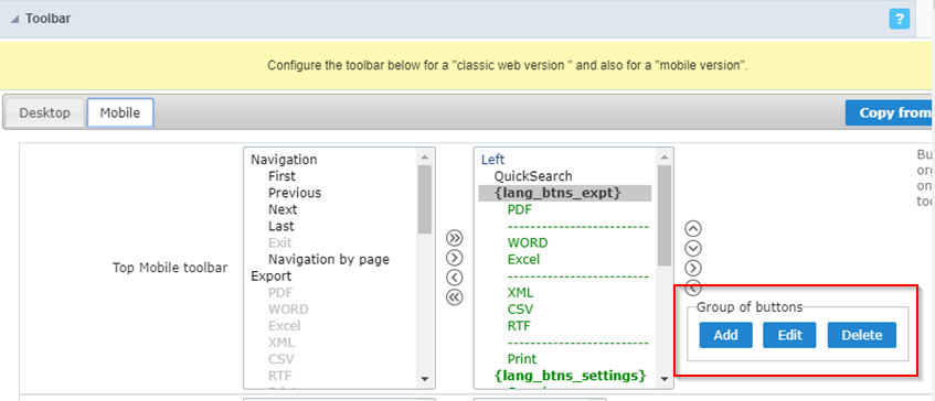
Add
Add a new group of buttons.
Edit
Edit an existent group of buttons.
Delete
Delete the selected group of buttons.
When you press the Add or Edit option, you can see the settings to configure the grouper:
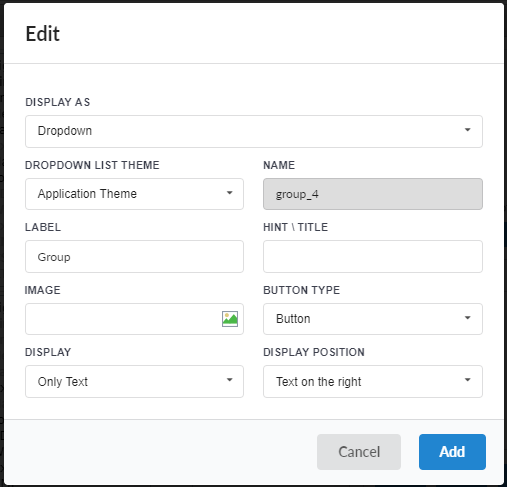
Display As
Allows displaying the group button as Dropdown or Side by Side.
Dropdown List Theme
Allows defining the Dropdown theme selecting between Application theme and Button theme.
Name
Allows defining a name for the button group.
Label
It is the displayed name for the button group in the application.
Hint\Title
Displays a hint to the end-user when the mouse is on the group of buttons.
Button Type
Allows displaying the button group as a Button, Image, or Link.
Image
Allows selecting an image for the button.
Display
Defines if the button displays only Text, only image, or both.
Display Position
Defines the position of the Text or Image (Text to the right, Image to the right).
After creating a button group, you need to move the grouped buttons below of the Button Group and then move them to the right. Like the image below:
Button Settings
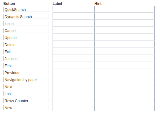
Button:
It displays the buttons available in the application.
Label:
Allows defining the label of the buttons to display for the users.
Hint:
Allows defining the buttons hint to display for the users.
Application Hotkeys
Scriptcase allows creating shortcut keys to your applications. You can select a predefined template or create specific actions for an application.
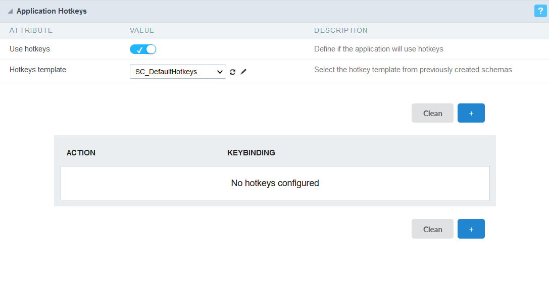
Use hotkeys
Defines if the application uses hotkeys. When you enable this option, the default shortcut keys settings are disabled.
Hotkeys templat
Select the hotkey template previously created.
Action
Selects the triggered action when pressing the selected key.
Keybinding
Selects the keys responsible for executing the chosen action.
Add “+”
Adds a new action on the keys list.
Clear
It clears the selected hotkeys preference.
Options
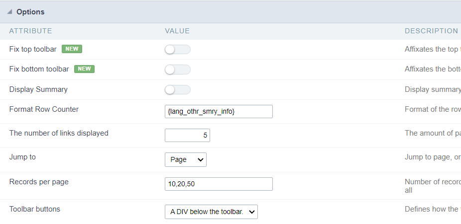
Fix top toolbar:
Affixates the top toolbar to the top of the window
Fix bottom toolbar:
Affixates the bottom toolbar to the bottom of the window
Display Summary:
Allows to display the summary button or not.
Row Counter:
Allows to display the Row Counter or not.
Example: (1 to 10 of 200)
The Number of Links Displayed:
Defines the number of links per page, when the navigation option is disabled.
Jump To:
Move to the informed record page.
Records by page:
Allows defining the number of records to be exhibited for each page. To show all records use the option “all”.
Example: 10,20,30, all
Toolbar Buttons:
The type of view for the Toolbar buttons (A DIV below the toolbar, Modal).