Grid - Rating Smile Field
General settings
This field type allows the developer to show data as an evaluation with emoji that goes from Very Bad to Excellent, where the final user could see the last evaluation.
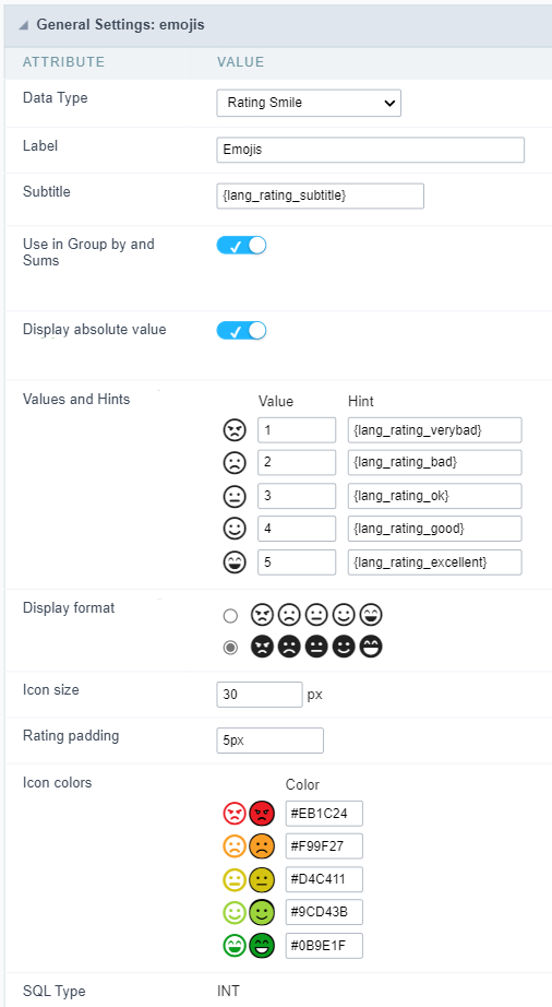
Data type
Defines the data type of the field in the application. In this case we should select Rating Smile.
Label
Defines the title that will be shown in the field when the application is running. The used terms in the interface are essential to the system has good usability, we should use comum name and terms for the final user, instead of the default values of the system.
For example, for the rating smile field, the client would have a better understanding of the field function when the label is Product evaluation.
Besides a fixed text, the Label allow to use of lang to define the field title, this way is possible to use the application internationalization.
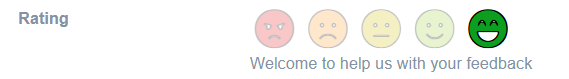
Subtitle
Define a subtitle that will be shown beside the field. Ex.: Thank you for the feedback!
Below is one example of an application subtitle:
Use in Group by and Sums
Allows the field to be used instead of the value when the field is selected in the (static or dynamic) group by or in the totalization of the summary. To do this, just add the fields in the dynamic or static group by column to be able to visualize the grouping performed in the query.
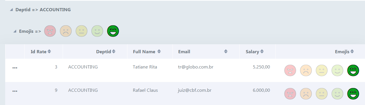
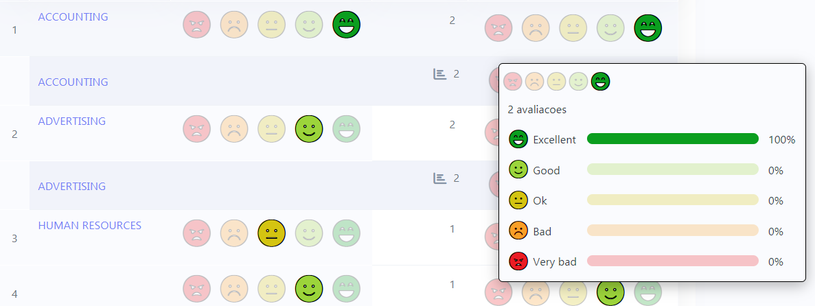
Example of the Rating Smile field in the summary.
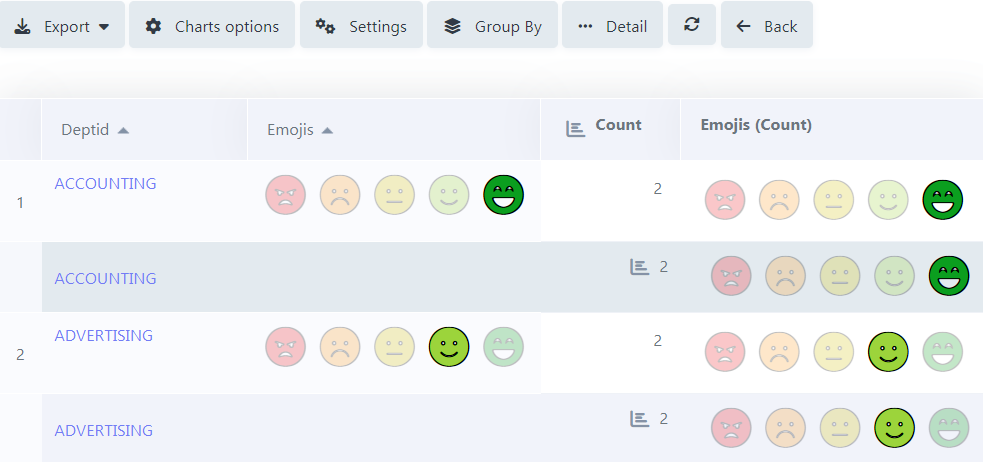
In the summary, when hovering the mouse over the field, a small window detailing the evaluations that were carried out both in each record and in total will be displayed, as shown in the image below.
Display absolute value
Allows the exact number of evaluations that each icon received to be displayed in the detailing window, next to the percentage, when summing up the summary.
With this flag turned off, the grouping will only display the voting percentage, leaving out the exact number of ratings.
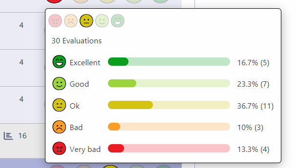
In the case of the result of the evaluations, this result is calculated through the weighted average (Sum/Total of Evaluations) as in the example below:
Excellent: 5 ratings - 16.7%
Good: 7 ratings - 23.3%
Regular: 11 ratings - 36.7%
Bad: 3 ratings - 10%
Very bad: 4 reviews - 13.3%
Considering that the weight of each smile always varies from 1 to 5 (Very bad to Excellent), we have:
5 ratings x 5 (weight) + 7 ratings x 4 (weight) + 11 ratings x 3 (weight) + 3 rating x 2 (weight) + 4 ratings x 1 (weight)
Sum = 96 —> Result = 96 / 30 (total evaluations) = 3.2
As the result taken into account in the Rating Smile field is always an integer, and the value after the decimal point is below the central value (in this example, the central value would be 3.2), so we rounded DOWN, and we got the same result a 3, which corresponds precisely to the “Regular” smile, and that is why this is the one that is most lit at the top of the detailing window, as shown in the image above.
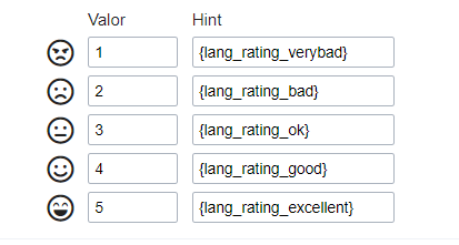
Values and hints
Allows to the developer to define the values to each emoji taht will be saved at the data base and allow to define a hint (It is show passing the mouse above the emoji)
Display format
Allows the developer to define the format that the emojis will be shown.
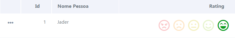
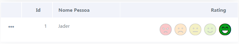
In case the first option is defined, the emojis will be shown like this:
In case the second option is defined, the emojis will be shown like this:
Icon size
Allows defining the icon size in pixels.
Rating padding
Allows for defining the padding value between the emojis.
Icon colors
Allows the icon colors to be defined in each emoji.
SQL type
Infomrs the field type at the data base.
Display Settings
The Display Settings allows to define the CSS values individually for each field. For each Display schema of scriptcase, there are the same attributes available in Interface.
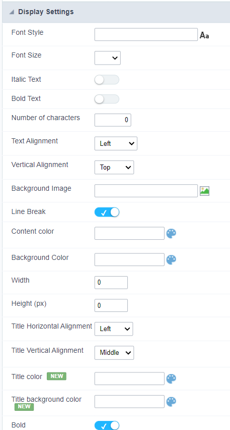
Display Settings configuration Interface.
- Display Settings
- Text Font : Allows choosing the font type, which will be applied in the application field.
- Font Size : Allows choosing the font size, which will be applied to the application object.
- Italic Text : Allows to apply the italic type in the font.
- Bold Text : Allows you to apply bold type to the font.
- Number of characters : Number of characters to display.
- Text Alignment : Allows you to position the field in the desired location (left, right, center and justified).
- Vertical Alignment : Allows you to position the field in the desired location (top, middle or bottom).
- Background Image : Allows you to add a background image to the field.
- Line Break : Enables the possibility of a line break for the field.
- Content color : Changes the content color of the query field and the grouped field, when available.
- Background color : Allows choosing the color, using a color palette to be applied as the background of the application field.
- Width : To define the width of the field.
- Height : To set the height of the field.
- Title Horizontal Alignment : Allows you to define the horizontal alignment for the field title (left, right or centered).
- Title Vertical Alignment : Allows you to define the vertical alignment for the field title (top, middle or bottom).
- Title color : Allows you to choose a color for the field title using a color palette.
- Title background color : Allows choosing a color for the background of the field title using a color palette.
- Bold : Displays the field title in bold