Summary
Summary Settings
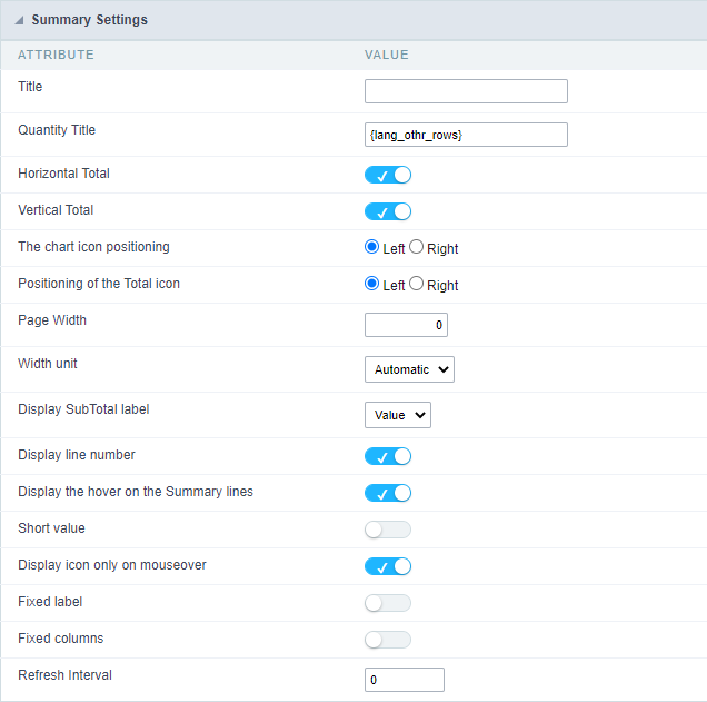
- Title: Defines a title for the Summary, if not informed the default title will be “Summary”. For no title to be displayed, enter the HTML tag
. - Quantity Title: Title Amount of Record.
- Horizontal Total: Show horizontal total for Summaries of matrix type.
- Vertical Total: Display vertical total for Summaries of matrix type.
- The chart icon positioning: Chart icon positioning (left or right).
- Positioning of the Total icon: Total icon positioning (left or right).
- Page Width: Width value for the Summary page.
- Width unit: Unit of measure used for width. Auto (width value is ignored), pixels and percentage.
- Display SubTotal label: Displays the Total label or the Value itself.
- Display line number: Display the sequence number of the record in the Summary.
- Display the hover on the Summary lines: Apply the hover attribute by hovering the mouse cursor over the Summary lines.
- Short value: Displays the value abbreviated in the summary.
- Display icon only on mouse over: Displays the sorting icon only when the mouse is on the field label.
- Fixed Label: Establishes the column label in the screen top during the page scrolling.
- Fixed columns: This option allows that the Group By columns displayed on the Y-axis of the summary to be fixed during horizontal scrolling.
- Refresh Interval: Page refresh interval in seconds. If zero is provided there will be no refreshing.
Layout Settings
You can define the layout of the Summary for each type of Group By.
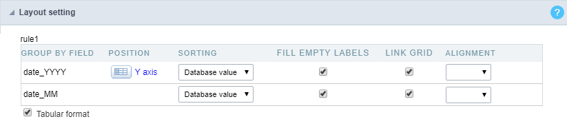
- Group By Field: Group By fields selected in the Grid.
- Position: Defines whether to use the x-axis or y-axis position.
- Sorting: Sets the sorting by the database value or by the display value.
- Fill Empty Labels: Defines whether the empty labels will be filled.
- Link Grid: Creates a link in the selected field.
- Alignment: Sets the layout alignment type to center, left, or right.
- Tabular format: Sets the Summary to the tabular format.
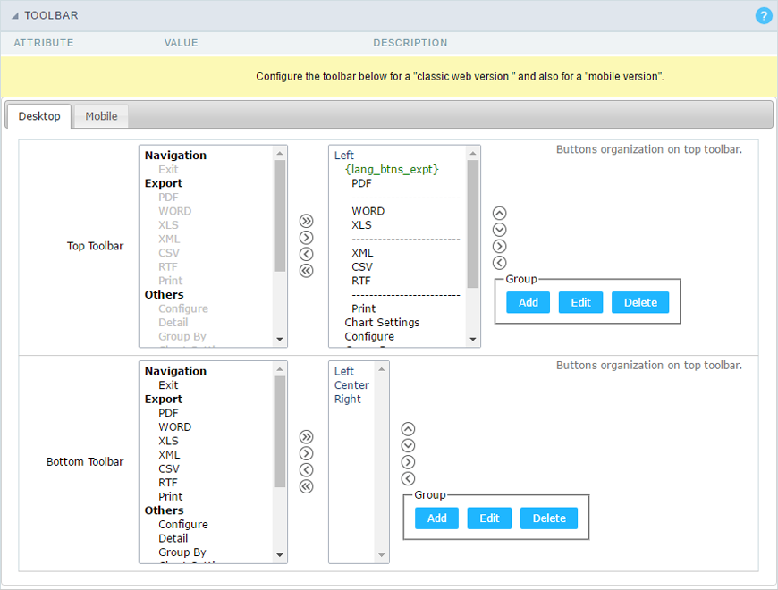
Toolbar
The toolbar is divided into two parts, top and bottom, so you can define which buttons will be displayed in both places. Button selection works independently.
You can also define which buttons will be displayed when the application is accessed by a mobile device, just access the Mobile tab.
For more information about the toolbar, access Application > Grid > Toolbar.
Application Hotkeys
Scriptcase allows creating shortcut keys to your applications. You can select a predefined template or create specific actions for an application.
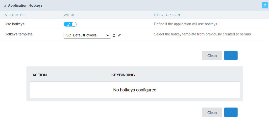
Use hotkeys
Defines if the application uses hotkeys. When you enable this option, the default shortcut keys settings are disabled.
Hotkeys templat
Select the hotkey template previously created.
Action
Selects the triggered action when pressing the selected key.
Keybinding
Selects the keys responsible for executing the chosen action.
Add “+”
Adds a new action on the keys list.
Clear
It clears the selected hotkeys preference.
Options
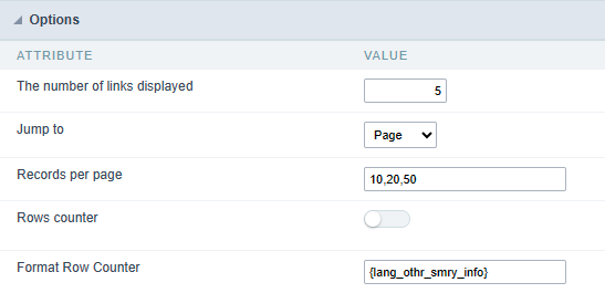
The number of links displayed
Allows you to define the number of page links when the Page Navigation option is enabled.
Jump to
Allows you to define whether the redirection will be to a page or record.
Records per page
Allows you to define the options for the number of lines displayed in the combobox.
Rows counter
Shows the sequential number of rows in a partition of a result set. To use it, you must remove the row counter button from the toolbar.
Format Row Counter
Allows you to define the format in which the counter lines will be displayed.
Example: [1 to 10 of 200].
Group Label
Click on Add Row, so that the group label can be added.
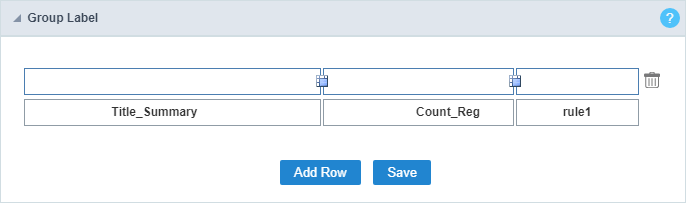
With this option, you can enter one or more titles for the columns of your applications.
If you have dynamic display fields, Group Label will not work.
To merge two or more cells, click the icon positioned between them.
To add a title, click the pencil icon to add a title.
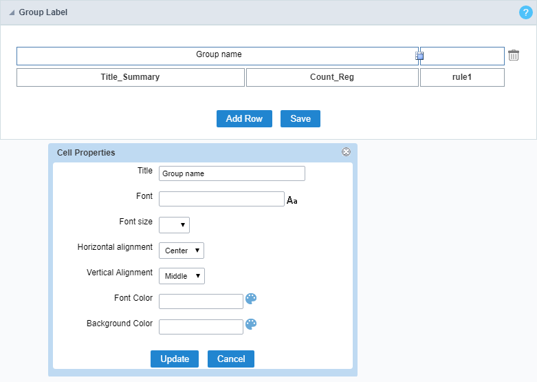
| Title | Sets the title that will be displayed in your Group Label. |
| Font | Sets the font type of the title of your group label. |
| Font Size | Sets the font size of the title of your group label. |
| Horizontal alignment | Sets the horizontal alignment of the title of your group label. Being left, center or right. |
| Vertical alignment | Sets the horizontal alignment of the title of your group label. Being middle, low or top. |
| Font Color | Sets the color of the title text of your group label. |
| Background Color | Sets the background color of the space where the title of your group label will be displayed. |
Sorting
You can define the fields in which you wish to allow the sorting, when running the application.
This configuration must be performed in each of the application group by.
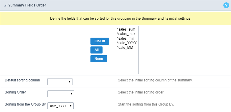
- Fields: Select the fields that you want to allow sorting.
- Default sorting column: Select a field for initial sorting in the Summary.
- Sorting Order: Choose whether the sort will be ascending or descending.
- Sorting from the Group By: Select one of the Group By for initial sorting.
Limit
Lets you limit the amount of records to be retrieved from SQL and displayed in the Summary.
This option is only available for static group by.
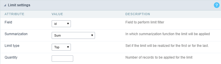
- Field: Defines the field that will be used to perform the limit.
- Summarization: Defines the summarization function in which the limit will be performed.
- Limit type: Sets the sorting that the limit will be applied, DESC or ASC.
- Quantity: Sets the amount of records that will be returned.
Charts
One of the modules of the Grid application is the charts, which in turn are generated based on Grid summary information.
Scriptcase charts are generated in HTML5.
Chart Settings
In the settings screen, you can edit the settings of all available charts.
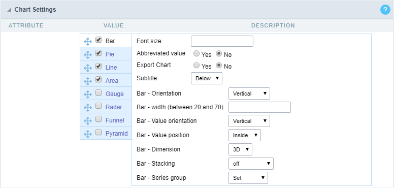
To edit the specific settings for each Chart, select the Chart you want to edit.
To define the available charts when running the application, check the box next to the name of the Charts.
Below you will detail the specific settings of each of the Charts.
Bars
- Font Size: Sets the font size in the Chart. Enter only the font size, for example: 15.
- Abbreviated value: Defines whether or not the values displayed in the Chart should be abbreviated.
- Subtitled: Sets the subtitled position of the Chart.
- Bar - Orientation: Orientation of the vertical or horizontal bars on the Chart.
- Bar - width (between 20 and 70): You can set the width from 20 to 70.
- Bar - Value orientation: The orientation of the Chart is defined and can be placed vertically.
- Bar - Value position: You can choose where the value will position itself.
- Bar - Dimension: Bar Dimension (2D or 3D) on the chart.
- Bar - Stacking: Stack the Bars in a single Bar (In series).
- Bar - Series group: Group the Bar chart in series.
Pie
- Font Size: Sets the font size in the Chart. Enter only the font size, for example: 15.
- Abbreviated value: Defines whether or not the values displayed in the Chart should be abbreviated.
- Subtitled: Sets the subtitled position of the Chart.
- Pie - Format: Pie or Donut format.
- Pie - Dimension: Dimension of the Pie Chart.
- Pie - Sorting: Ordering the Pie Chart.
- Pie - Values format: Formatting the displayed data.
Line
- Font Size: Sets the font size in the Chart. Enter only the font size, for example: 15.
- Abbreviated value: Defines whether or not the values displayed in the Chart should be abbreviated.
- Subtitled: Sets the subtitled position of the Chart.
- Line - Shape: Line Format
- Line - Series group: Line grouping type.
Area
- Font Size: Sets the font size in the Chart. Enter only the font size, for example: 15.
- Abbreviated value: Defines whether or not the values displayed in the Chart should be abbreviated.
- Subtitled: Sets the subtitled position of the Chart.
- Area - Shape: Format of the area displayed on the Chart.
- Area - Stacking: Stack the areas on the Chart.
- Area - Series group: Group the Chart in series.
Gauge
- Font Size: Sets the font size in the Chart. Enter only the font size, for example: 15.
- Abbreviated value: Defines whether or not the values displayed in the Chart should be abbreviated.
- Subtitled: Sets the subtitled position of the Chart.
- Gauge - Shape: Display format of the Chart.
Radar
- Font Size: Sets the font size in the Chart. Enter only the font size, for example: 15.
- Abbreviated value: Defines whether or not the values displayed in the Chart should be abbreviated.
- Subtitled: Sets the subtitled position of the Chart.
Funnel
- Font Size: Sets the font size in the Chart. Enter only the font size, for example: 15.
- Abbreviated value: Defines whether or not the values displayed in the Chart should be abbreviated.
- Subtitled: Sets the subtitled position of the Chart.
- Funnel - Dimension: Funnel dimension (2D or 3D) on the chart.
Pyramid
- Font Size: Sets the font size in the Chart. Enter only the font size, for example: 15.
- Abbreviated value: Defines whether or not the values displayed in the Chart should be abbreviated.
- Subtitled: Sets the subtitled position of the Chart. Pyramid - Dimension: Dimension (2D or 3D) on the Chart. Pyramid - Values format: Formatting the displayed data. Pyramid - Sliced: Display format of the Chart.
Below are the settings common to all Chart types.
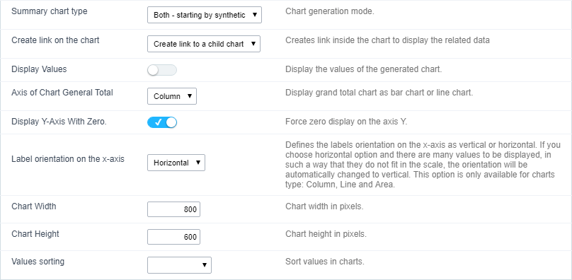
- Summary chart type: Defines how the Charts will be generated: analytical, synthetic, or both.
- Synthetic They should restrict themselves to the first Group By the condition and allow the user to use the links to see details of the next set of criteria, increasing the level of detail.
- Analytical They appear with the whole Group By criteria, creating a complete detailed Chart that does not allow the linking of other detailed Charts.
- Create link on the chart: Allows the Charts to have a link in their elements for detailed Grid applications or Charts. The data shown will be relative to the value clicked on the Chart.
- Display Values: Displays the values of the generated Chart.
- Axis of Chart General Total: Option to display the Chart of the grand total as column or row.
- Display Y-Axis With Zero.: Force display of the zero value on the Y axis.
- Label orientation on the x-axis: Sets the orientation of the labels on the X axis to vertical or horizontal. If the horizontal option is chosen and there are many values to be displayed so that they do not fit in the scale, the orientation will be automatically changed to vertical. This option is only available for Charts of type: Column, line and area.
- Chart Width: Width in pixels of the generated Charts.
- Chart Height: Height in pixels of the Charts generated.
- Values sorting: Sort the values of the Charts.
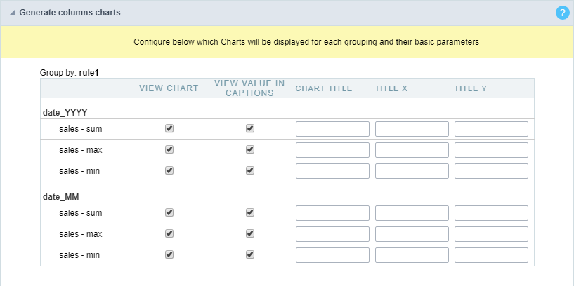
Column Charts
You can define the display of the column Charts as well as the label for the Chart and the axes. These settings are set individually for each Group By.
If the user sets up more than one field, the analytical chart will only generate with the first two.
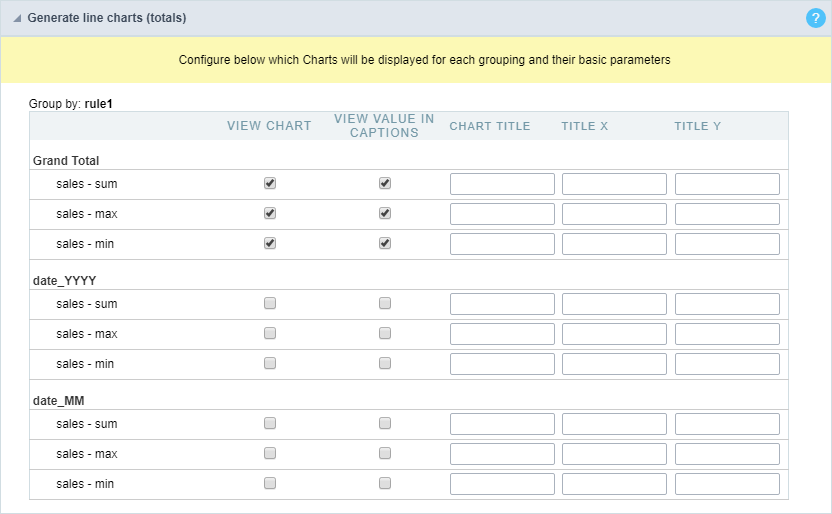
Line charts (totals)
The use of line Chart (totals) configuration is only available when you have a Group By with at least two fields.
To configure this option, go to the “Group By” menu and create a static Group By some fields or add fields to dynamic Group By.
Layout
The Chart theme tool enables you to fully edit Chart themes.
These themes can be set only for the current application, when changed in the application itself or for all Charts when these settings are performed in the Charts editor.
For more information, access Layout > Chart Themes.
Fields
All fields added in the Summary totals, in the dynamic Group By or in the static Group By, will be listed here separated by the Group By name.
General Settings
General settings of total fields in the Summary.
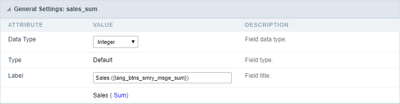
- Data Type: Defines the data type for the field.
- Label: Defines the label for the displayed field in the Summary.
Values Formatting
Integer Type
-
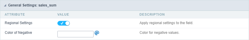
Regional Settings: When you activate it you apply the regional settings for this field. To configure them, click on the menu Locales > Regional Settings.
-
Color of Negative: In this field you can enter a color in hexadecimal. (Example: # 000000)
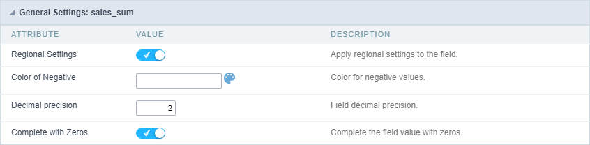
Decimal Type
-
Regional Settings: When you activate it you apply the regional settings for this field. To configure them, click on the menu Locales > Regional Settings.
- Color of Negative: In this field you can enter a color in hexadecimal. (Example: # 000000)
- Decimal Precision: Number of decimal places your field will have on display.
- Complete with Zeros: Enables the field value to be filled with zeros.
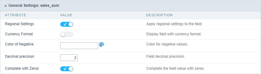
Currency Type
-
Regional Settings: When you activate it you apply the regional settings for this field. To configure them, click on the menu Locales > Regional Settings.
- Currency Format: When you enable this option the application will display the currency symbol according to the regional setting.
- Color of Negative: In this field you can enter a color in hexadecimal. (Example: # 000000)
- Decimal Precision: Number of decimal places your field will have on display.
- Complete with Zeros: Enables the field value to be filled with zeros.
Visual Settings of Totals in Group By
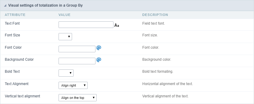
- Font : Allows you to define the font used in the Group By label.
- Font Size : Allows you to set the font size used in the Group By label.
- Font Color : Label color in Group By.
- Background Color : Group By background color.
- Bold Text : Enables or disables the Group By label text in bold.
- Text Alignment: Sets the horizontal positioning of text.
- Vertical text alignment: Sets the vertical positioning of text.
Visual Settings of The General Total
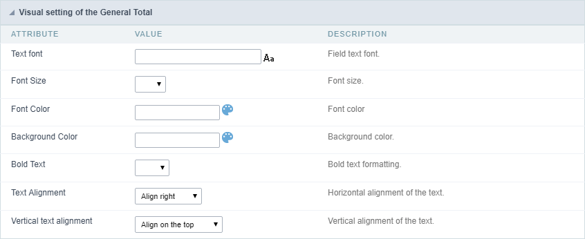
- Font : Allows you to define the font used in the Group By label.
- Font Size : Allows you to set the font size used in the Group By label.
- Font Color : Label color in Group By.
- Background Color : Group By background color.
- Bold Text : Enables or disables the Group By label text in bold.
- Text Alignment: Sets the horizontal positioning of text.
- Vertical text alignment: Sets the vertical positioning of text.
Layout
Header
In this configuration, you can define the information that will be displayed in the header and footer of the Summary.
This screen may vary depending on the header format you choose within the Display folder.
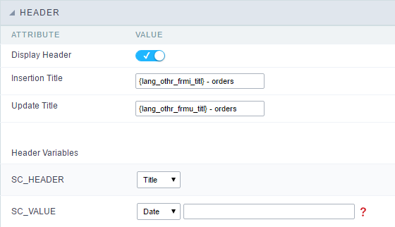
- Display Header: This flag determines whether the header will be displayed.
-
Summary Title: Lets you enter a title to be displayed in the application.
- Variables: Variable fields can be filled with any of the types displayed in the Combobox, depending on the type you need to associate a content with the required one. Below you describe the existing types:
- Field: When the “Field” option is chosen, it will open a Combobox next to the fields that are part of the “Select”. By choosing one of these fields, you are associating the value of the field to display in the Header or Footer.
- Date : When “Date” type is selected, the system date in mm/dd/yyyy format will be displayed in the Application Header or Footer. There are several display formats using the date and time of the server. The format can be entered in the text field next to it. To access existing formats click on
 and an explanatory window will appear.
 - Image : When the image type field is selected, a field for filling in the image name on the server appears. To locate the existing images and select one, click on the “Choose Image” icon and to make new images available on the server click on “Upload”
 .
. - Value: When “Value” type is selected, the content that is filled in the text field next to option, appears in the Header or Footer. You can enter texts and “Global variables”. Ex: “Employee Name: [v_name]”.
- Date : When “Date” type is selected, the system date in mm/dd/yyyy format will be displayed in the Application Header or Footer. There are several display formats using the date and time of the server. The format can be entered in the text field next to it. To access existing formats click on
- Field: When the “Field” option is chosen, it will open a Combobox next to the fields that are part of the “Select”. By choosing one of these fields, you are associating the value of the field to display in the Header or Footer.
Footer
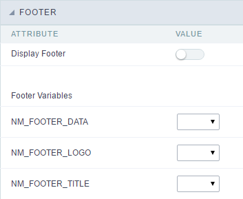
This screen may vary depending on the Footer format you choose within the Display folder.
-
Display Footer: This flag determines whether the Footer will be displayed in the application.
-
Variables: Variable fields can be filled with any of the types displayed in the Combobox, depending on the type you need to associate a content with the required one. Below you describe the existing types:
- Field: When the “Field” option is chosen, it will open a Combobox next to the fields that are part of the “Select”. By choosing one of these fields, you are associating the value of the field to display in the Header or Footer.
- Date : When “Date” type is selected, the system date in mm/dd/yyyy format will be displayed in the Application Header or Footer. There are several display formats using the date and time of the server. The format can be entered in the text field next to it. To access existing formats click on and an explanatory window will appear.
- Image : When the image type field is selected, a field for filling in the image name on the server appears. To locate the existing images and select one, click on the “Choose Image” icon and to make new images available on the server click on “Upload” .
- Value: When “Value” type is selected, the content that is filled in the text field next to option, appears in the Header or Footer. You can enter texts and “Global variables”. Ex: “Employee Name: [v_name]”.
- Date : When “Date” type is selected, the system date in mm/dd/yyyy format will be displayed in the Application Header or Footer. There are several display formats using the date and time of the server. The format can be entered in the text field next to it. To access existing formats click on
- Field: When the “Field” option is chosen, it will open a Combobox next to the fields that are part of the “Select”. By choosing one of these fields, you are associating the value of the field to display in the Header or Footer.
Search
Settings

- Display combo box quantity : Allow to display the quantity of existence records in the table net to the value in search combo.
Settings of search fields
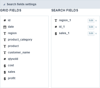
To define the fields that will be used in the Summary search, use drag-and-drop to position the fields within Search Fields.
The order of the fields, within Search Fields, will be the display order in the generated application.
This search works only in Grid summary.
Editing Fields
The same field can be added more than once to the Search, these fields will be visible in the generated application since it uses distinct settings, if they are using the same configuration only one of the fields will be displayed.
The display settings of the fields are performed individually, and can be accessed by adding the field in the search and clicking edit.
you will separate the explanation of the display settings from the fields according to the types.
Types: Text/Special
Configuration interface for text and special fields.
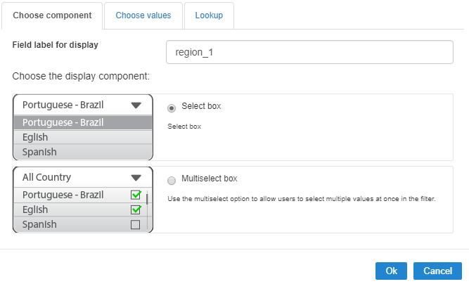
Choose Component
You must define how the field will be used in the Search. Each field type, text, number, and date have different configuration options.
- Search field label : Defines the label of the field that will be displayed in the Search.
- Choose component type: It defines the format of use of the fields in the Search, for text fields you have the Select Box and the Multi select box.
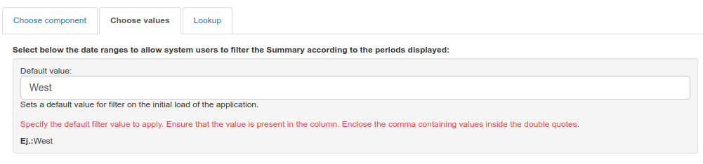
Choose values
The default value field allow us to define a default value to the summary search in the initial application charge.
Lookup
In this tab, you can configure the display lookup in the Search field. For more information on creating a view lookup, access Application > Grid > Fields > Text.
Types: Date/Time
Configuration interface for date and date time fields.
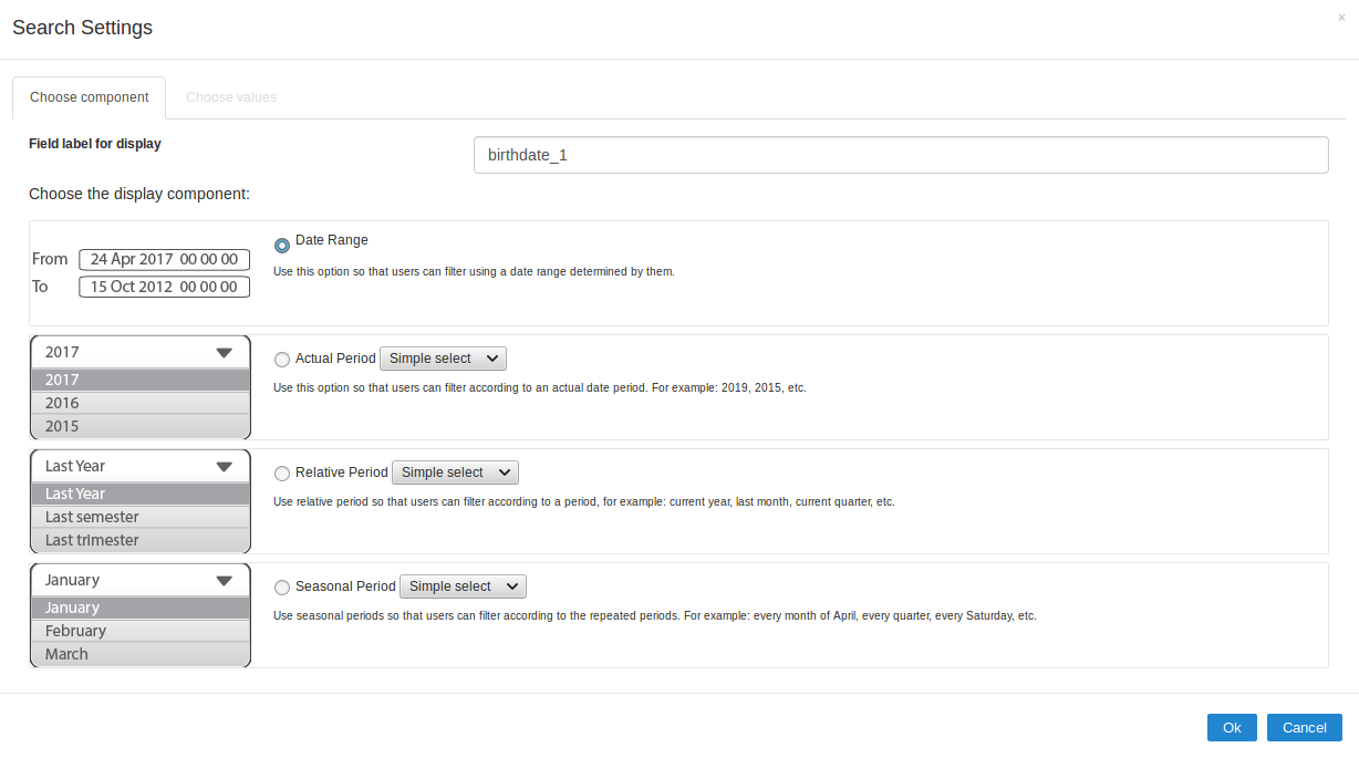
Choose Component
You must define how the field will be used in the Search. Each field type, text, number, and date have different configuration options.
- Search field label : Defines the label of the field that will be displayed in the Search.
- Choose component type: Defines the format of use of the fields in the Search, for fields date and datetime, you will have the following options: Date Range, Actual Period, Relative Period and Seasonal Period.
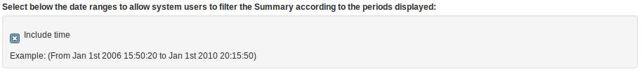
Choose Values - Date Range
For datetime fields, you must enable the option Include Time so that the hours can be included in the search
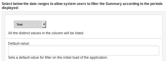
Choose Values - Actual Period
You must define the period that will be used in the search. When running the application, you will have a select with the dates displayed according to the selected period.
Choose Values - Relative Period
You must define which periods are available for use in the search.
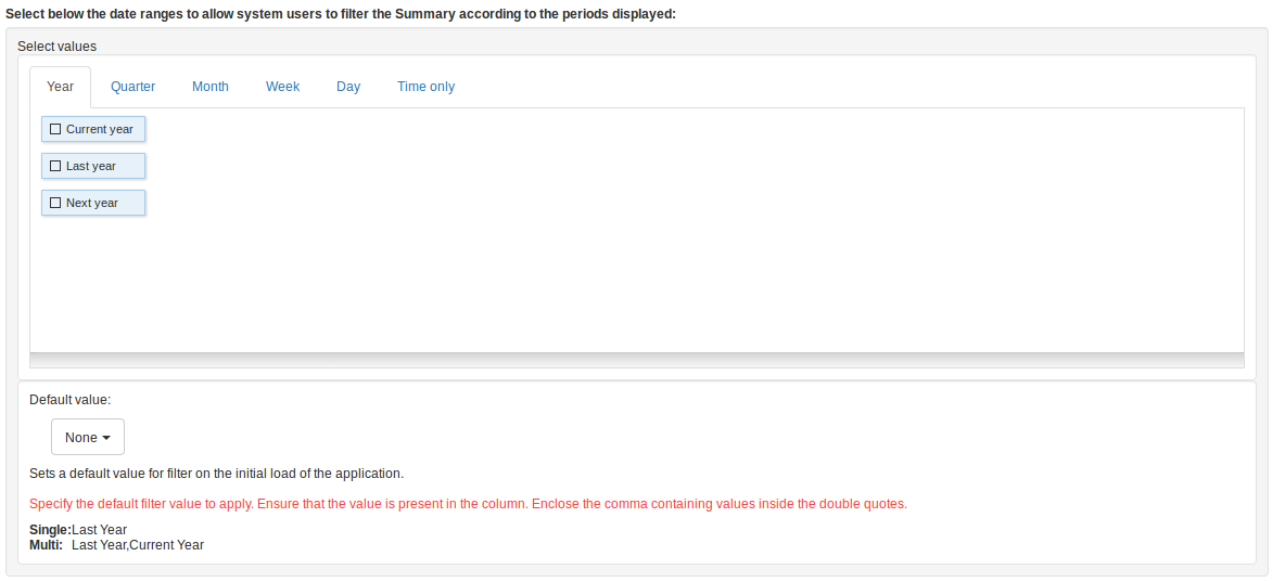
Choosing Values - Seasonal Period
The available values are separated by tabs:
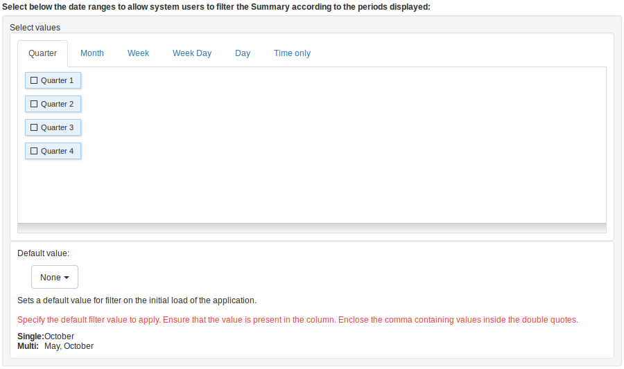
- Quarter: Defines the quarters used in the search.
- Month: Defines the usage of the months of the year.
- Week: Defines the usage of the weeks of the year.
- Week Day: Defines the use of the days of the week.
- Day: Defines the usage of the days of the month.
- Only Time: Defines the use of the day time (Available only in the datetime field)
Types: Number
Configuration interface for numeric fields.
Choose Component
You must define how the field will be used in the Search. Each field type, text, number, and date have different configuration options.
- Search field label : Defines the label of the field that will be displayed in the Search.
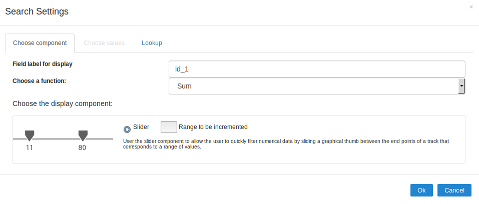
- Choose function to apply: Defines the function that will be used in the search for setting the value. For example, when choosing sum, the range is the range between the lowest and the result of the sum greater.
- Actual Values: This option sets the display of the actual value of the field, saved in the database, without the use of any of the aggregate functions. When using this option, two types of searches, select box and Multi select box usage are added, as well as enabling lookup settings for numeric fields.
- Choose component type: Defines the format used for the fields in the search, for numeric fields, you have the Range and selecting Actual Values will be displayed Select Box and Multi select box.
Lookup
For numeric fields, this option is available only when you use the Actual Values option and the way the field is used in the search is Select box or Multi select box.
In this tab, you can create a display lookup in the search field. For more information about creating view lookup, go to Application > Grid > Fields > Integer.