Blocks
Conceptually a block is a “container” where you can position the fields of the Applications: Form, Control or Grid with Slide orientation.
By default, the applications created in ScriptCase are built with a only one block, with the same name as the application. You can add the amount of blocks that you want to organize in a more convenient way. The page below, observe that theirs a column Organization, and that is where you’ll define if the next block will be set beside or below the current one.
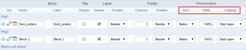 Application Block configuration
On the left side of each block there are two icons, first  has the function to edit all the information relative to the block and the second
  is to delete the block.
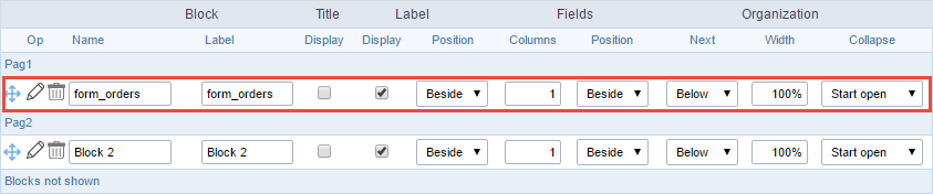
- Organizing the position of the Blocks
- See below how to modify the display order of the Blocks in one Page.
Click and drag the block that you desire to modify to its new position.
 Application Block Display configuration
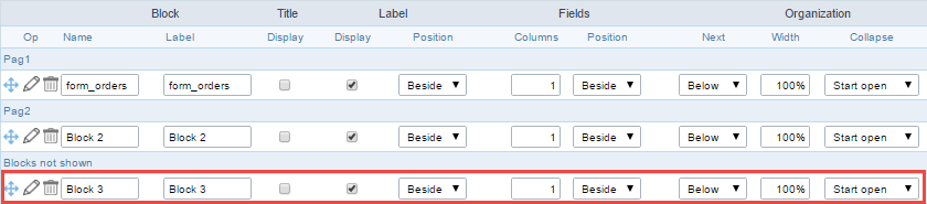
- See how to remove a block from display
Click on the block desired and drag it to the item “Blocks not Shown”. This way, you can also drag the block to another page if desired. See the images below.
 Application Block Display configuration
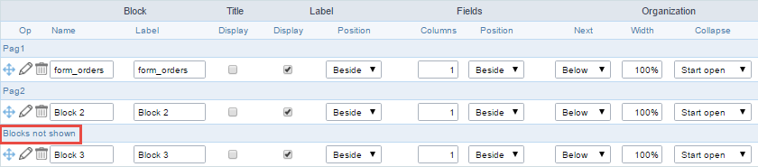 Application Block Display configuration
- Attributes
- Block
- Name : Name of the Block.
- Label : Title of the block that’ll be displayed in the application.
- Title
- Display : Flag that controls the title display of the block.
- Label
- Display : Flag that controls id the label of the fields will be displayed in the block.
- Position : Options to display label :
- Above : The label will be displayed above the field.
- Beside : The label will be displayed beside the field.
- Below : The label will be displayed below the field.
- Fields
- Columns : Amount of columns that are displayed side by side in the block.
- Position : The way that the fields are displayed in the block :
- Below : The fields are displayed one below the other respecting the amount of columns.
- Beside : The fields are displayed one beside the other respecting the amount of columns.
- Line : The fields are displayed one beside the other without the tabulation.
- Organization
- Next : The way that the blocks are displayed in the page:
- Below : Indicates that the next block will be placed below the current one.
- Beside : Indicates that the next block will be placed beside the current one.
- Tabs : Indicates that the next block will be placed in a different tab then the current one.
- Width : Specifies the width that block will occupy in pixels or percentage, in case the value is in percentage, inform the (%).
- Collapse : Enables the option to close the block.
- Next : The way that the blocks are displayed in the page:
- Block
-
Create New Block
To include new blocks in an Application, click on the button
 . Next, you’ll see the following interface to define the name and label of the block. At the end click on Create.
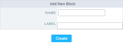 Creating application blocks configuration
- Attributes
- Name : Name of the Block.
- Label : Title of the block that’ll be displayed in the application.
- Attributes
-
Edit Blocks
To edit a block just click on the icon
, that is on the left side of the block. Next, you’ll see the following interface to define the parameters of the blocks. At the end click on save.
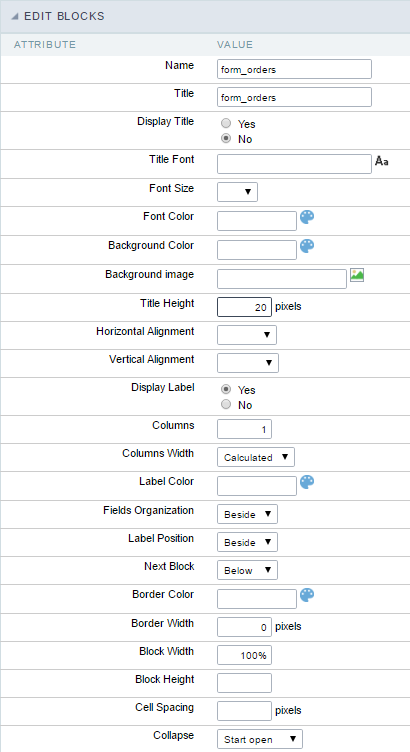
- Name : Name of the block.
- Title : Block title for display.
- Display Title : This option, when active, allows to display the block title.
- Title Font : Font applied to the block title.
- Font Size : Size of the font applied to the block title.
- Font Color : Font color for the block title.
- Background Color : Background Color of the block title.
- Background image : Background image for the block title.
- Title Height : Height in pixels of the block title line.
- Horizontal Alignment : Horizontal Alignment of the block title (Left, Center and Right).
- Vertical Alignment : Vertical Alignment the block title (Top, Middle and Bottom).
- Display Label : Display the labels of the fields in the block.
- Columns : Amount of field columns in a block.
- Columns Width : How the width of the block is defined.
- Label Color : Color of the field labels.
- Fields Organization : How the fields are organized in the block.
- Label Position : Position of the field labels relating to the data.
- Next Block : Position of the next block relating to the current block.
- Border Color : Border color for the block.
- Border Width : Border Width for the block.
- Block Width : Width for the block.
- Block Height : Height for the block.
- Cell Spacing : Cell Spacing in the block.
- Collapse : Enables the option to close the block.