Decimal
 View video
View video
General Settings
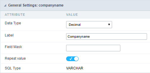 Decimal field Configuration Interface.
Data Type
Define the field type to Decimal. It allows defining the Decimal number format.
Label
The Label option lets you define the title of a field. Example: If the database field name is “cmp_name_client”, You can display a different name for the user, like “Client Name”.
Accumulated
It defines the field to accumulate values of another field. This option is only available for virtual fields.
Accumulator field
It is available when the option “Accumulated” is enabled. This configuration defines which field will accumulate the values. The field should be Integer, Currency, or Decimal.
Grid Mask
It defines a mask for the field value. There is two types of masks:
| Character | Description |
|---|---|
| X | It sets the placeholder to any character for replacing. If the entered number of characters is less than the mask size, It completes the field value with zeros (Filling full-size field entry is required). |
| Z | It sets the placeholder to any character for replacing, but it suppresses zeros at field left (Complete field filling is optional). Use it on the left when combined with the X mask. |
Mask Examples
| Mask | Field Value | Formatted Value |
|---|---|---|
| (xx) xxxx - xxxx | 1234567890 | (12) 3456 - 7890 |
| (xx) xxxx - xxxx | 12345678 | (00) 1234 - 5678 |
| (zz) xxxx - xxxx | 1234567890 | (12) 3456 - 7890 |
| (zz) xxxx - xxxx | 12345678 | ( ) 1234 - 5678 |
| (zz) xxxx - xxxx | 0012345678 | ( ) 1234 - 5678 |
Do Not Repeat Value
Do not repeat the value of the field if it is the same as the previous record.
SQL Type
It informs the data type of field in the database.
Field Behavior
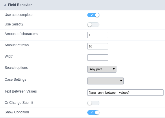
Use autocomplete:
Field automatically turns into autocomplete according to existing values in the database.
Use Select2
Uses the new component for data selection, allowing searches within the select comboBox.
Width for the Select2
Sets a width for the area in the Select2.
Amount of characters
Sets the amount of characters to start the search.
Amount of rows
Sets the maximum number of rows to list the search result.
Width:
Defines a width in pixels for a result box.
Search options:
Defines the validation that will be made to fetch the search result.
Start equals to: Will return the records with the same start value as in the database.
Any part: Will return the records when exist the character in any part of the record.
End equals to: Will return the records with the same final value as in the database.
Position between values:
Defines the position that objects will be displayed.
Text Between Values
Text that will appear when using a filter condition between two values.
OnChange Submit:
Submit search on this field changing.
Show Condition:
To show or not the search condition. It only works if the search has at least one condition.
Values format
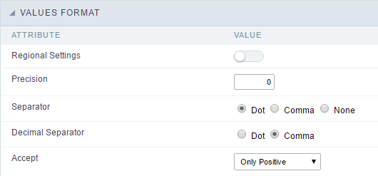 Decimal Field Format of Values with Regional Settings.
- Regional Settings : Allows to apply the Regional Settings to format the number of the field. When not enabled, the attributes Digit Grouping Separator, Decimal Separator, Negative sign and Negative number format.
- Decimal Precision : Defines the amount of decimal places for the field.
- Digit grouping : Defines if the field will display the digits separator.
- Decimal Separator : Defines the decimal separator.
- Accept : Determines if the field, will accept only negative, positive or both numbers.
Display Settings
The Display Settings allows to define the CSS for the fields individually. For each Display Settings of Scriptcase, exists the same attributes available for this interface.
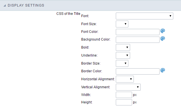
- CSS of the Title
- Font : Allows to choose the font type, that will be applied to the application field title.
- Font Size : Allows to choose the the font size, that will be applied to the application field title.
- Font Color :Allows to choose a color for the font from the color pallet.
- Background Color : Allows to define the color for the field, the color can be selected from the color pallet.
- Bold : Applies the bold style to the font.
- Underline : Applies the underline style to the font.
- Border Size : Applies the border size to the title of the field.
- Border Color : Allows to choose a color for the border, using a color pallet to apply to the title.
- Horizontal Alignment : Allows to position the label of the field in the desired position (left,right,center and justify).
- Vertical Alignment : Allows to position the label of the field in the desired position (baseline, sub, super, top, text-top, middle, bottom, text-bottom).
- Width : To define a width for the title of the field.
- Height : To define a height for the title of the field.
- CSS of the Field
- Font : Allows to choose the font type, that will be applied to the application field.
- Font Size : Allows to choose the the font size, that will be applied to the application field.
- Font Color :Allows to choose a color for the font from the color pallet.
- Background Color : Allows to define the color for the field, the color can be selected from the color pallet.
- Bold : Applies the bold style to the font.
- Underline : Applies the underline style to the font.
- Border Size : Applies the border size to the field.
- Border Color : Allows to choose a color for the border, using a color pallet to apply to the field.
- Horizontal Alignment : Allows to position the field in the desired position (left,right,center and justify).
- Vertical Alignment : Allows to position the field in the desired position (baseline, sub, super, top, text-top, middle, bottom, text-bottom).
- Width : To define a width for the field.
- Height : To define a height for the field.
- CSS of the Input Object
- Font : Allows to choose the font type, that will be applied to the Input Object. For example: Radio, Select, Text, etc
- Font Size : Allows to choose the the font size, that will be applied to the application field.
- Font Color :Allows to choose a color for the font from the color pallet.
- Background Color : Allows to define the color for the Input Object, the color can be selected from the color pallet.
- Bold : Applies the bold style to the font.
- Underline : Applies the underline style to the font.
- Border Size : Applies the border size to the Input Object.
- Border Color : Allows to choose a color for the border, using a color pallet to apply to the Input Object.
- Horizontal Alignment : Allows to position the Input Object in the desired position (left,right,center and justify).
- Vertical Alignment : Allows to position the Input Object in the desired position (baseline, sub, super, top, text-top, middle, bottom, text-bottom).
- Width : To define a width for the Input Object.
- Height : To define a height for the Input Object.
Help Settings
This feature allows that the instructions are documented to be used for the generated application, this helps the end user to understand better how the system works.
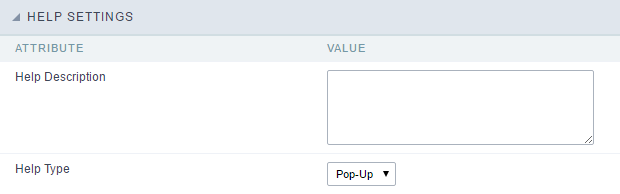
- Help Description : Allows to inform a text that will present to the user when he positions the mouse over the field.
- Help Type
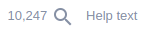
- Pop-Up : Selecting the pop-up type, it will display an icon beside the field that when clicked, you will view a pop-up with help description.
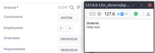 Help type - Pop-up configuration Interface.
- Hint : Passing the cursor over the field, you will view a hint with the help description.
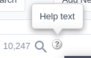 Help type - Hint configuration Interface.
- Text : It will display the help description beside the field.
 Help type - Text configuration Interface.