Select
 View video
View video
General Settings
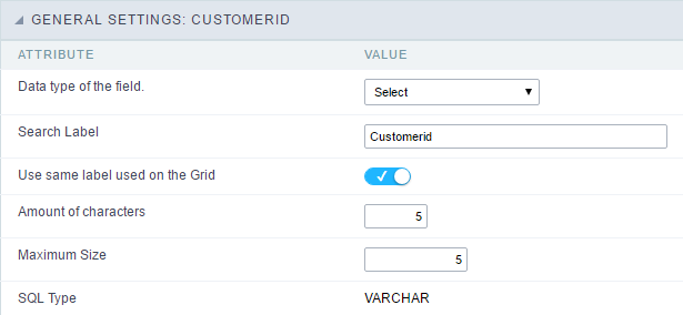 Select field Configuration Interface.
- Data Type : Define the type of field for the application. When set to Select, you can select multiple option from a combo box (Select Field).
- Search Label : Defines the title of a field in the application. For example: if the field is defined in the database as cmp_name_client, it will be more clear for the comprehension of the user if the name would be “Client Name”.
- Use same label used on the Grid : When this option is enabled, it allows to field to use the same title defined in the grid, in this case the Search Label is not used.
- Amount of characters : Define the amount of characters allowed for the field.
- Maximum Size : Defines the size of the field.
- SQL Type : Informs the data type of field in the database.
Field Behavior
 Select Field Behavior Interface of the Search Configuration.
- Use autocomplete : The field behaves as an autocomplete according to the values existing in the database.
- OnChange Submit : When enabled, it submits the search when there is modifications to the field.
- Show Condition : When enabled, it displays the condition of the search in the Grid, it will only work if there is at least one option selected.
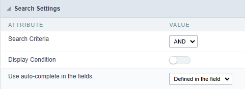
Search Lookup
A method used to offer the user a list of values that can be selected in the form applications. For example, the gender field in the Database with the values M or W can be presented like Man or Women or in a dynamic way, having these values recovered from the database.
 Lookup Settings Display for the field.
-
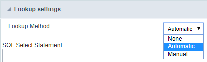
Lookup Methods
You will have available two types of lookup methods: Manual (informing manually the conditions of the select) or Automatic (using a database query).
Selecting the lookup type.
-
Lookup Method - Automatic
Lookup used to list the values that will be displayed on the Checkbox field. These values will be recovered dynamically using the Select command.
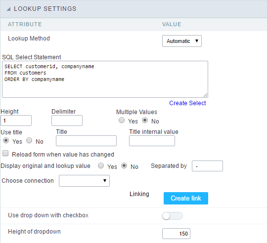 Automatic Lookup Interface.
- SQL Select Statement : Define the SQL command that will recover the values that will be displayed on the form field. The command needs to have the following structure:
SELECT key_field , display_field FROM tableThe value of the key_field will be stored in the table field.
-
Multiple Values : When enabled, allows to select more than one item from the list, separated by a delimitation.
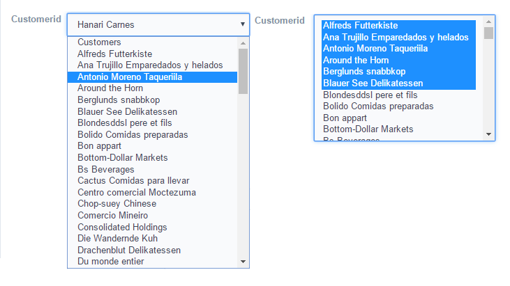
- Delimiter : Defines the character used to separate the values selected in the form. Only inform a value to this field if you need to separate the selected options with a different delimiter then (;).
- Height : Defines the height for the select object.
-
Use title : Allows to display a line of a title on the select object (Title Attribute) associated to a value informed manually (Title internal value).
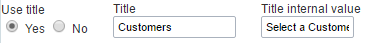
- Title internal value : Value Saved to the field when the line of the title is selected in the object.
- Title : Text displayed on the title of the Select object.
- Reload form when value has changed : With this option selected, the form will refresh if there is a change to the selected object in the field.
-
Display original and lookup value : Displays the value of the field and the value returned from the lookup.
- Separated by : Defines which character will be used to separate the values of the field with the value returned from the lookup. It is only necessary to inform this value of the option Display original and lookup value is enabled.
-
Choose connection : Allows you to select another specific connection existing in the project. The select command will be done on the second connection.
-
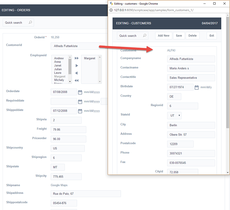
Link : Allows to create a link to another form allowing to manipulate the list displayed on the select field. After the manipulation, the select object it updated automatically.
- SQL Select Statement : Define the SQL command that will recover the values that will be displayed on the form field. The command needs to have the following structure:
-
Lookup Method - Manual
This method is used so that the developer can create manually the list of values that will be saved to the generated application. This method is mostly used when the database does not have a table that contains this information.
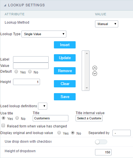 Manual Lookup Interface.
- Lookup Type : Define the functionality of the lookup, being: Single Value, Multiple Values (delimiter), Multiple Values (position) and Multiple Values (binary).
-
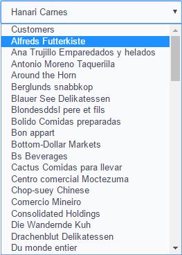
Single Value :
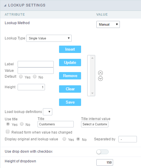 Setting up Single Value Lookup
- Label : Text that will be displayed in the item list of the select field.
- Value : Attribute that corresponds to the value that is stored in the table field. For example, the value M will be included into the table when the user will view in the list Man.
- Default : With this option enabled, the selected item will be inserted to the table when committed.
- Height : Defines the height for the select object.
-
Multiple Values (delimiter)
You can store various values for the select field. The values are separated by the informed delimiter. For example: the combination Sport, Cinema and Tourism selected in form will be stored like E;C;T in case the delimiter is ; (semi coma).
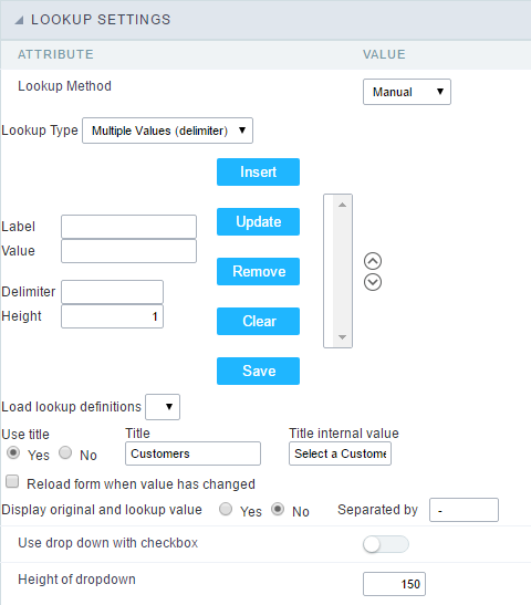 Setting up Multiple Values (delimiter)
- Label : Text that will be displayed in the item list of the select field.
- Value : Attribute that corresponds to the value that is stored in the table field. For example, the value M will be included into the table when the user will view in the list Man.
- Delimiter Characters used to separate Multiple Values in the table field. If not informed, the default delimiter is a semi coma (;).
- Height : Defines the height for the select object.
-
Multiple Values (position)
Allows to store a diversity of information selected on the field in only one string. For this information to be added, you need to inform the label, initial position and the number of bytes that each information occupies on a string.
For this example, Gender, Marital status and Hobby were used. Gender uses one byte as does the Martial Status, the Hobby will use two bytes.
The example below:
Label Value Start Size Man M 1 1 Women W 1 1 Divorced D 2 1 Single S 2 1 Study SD 3 2 Sports SP 3 2 Read RD 3 2 Example: Of you choose Man, Single and Read, in the database would be stored the following value MSRD.
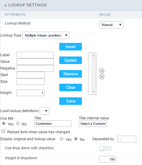 Setting up Multiple Values (position)
- Label : Text that will be displayed in the item list of the select field.
- Value : Attribute that corresponds to the value that is stored in the table field. For example, the value M will be included into the table when the user will view in the list Man.
- Negative : Value to be saved in the table in case there is not any valued selected on the field.
- Start : Starting position of the string that is going to be stored. The first position is always 1.
- Size : Amount of bytes that is going to occupy in the string.
- Height : Defines the height for the select object.
-
Multiple Values (binary)
Allows to store a diversity of information selected on the field in only one value.
In this example uses the following list (although it is not informed when inserting values to the list, each item has a value applied automatically according to the order):
Attribute Value Lookup Description 1 Sports 2 Culture 4 Pleasure 8 Reading 16 Music To store the data, it is done an internal sum of the decimal number. See the examples below.
Example 1: If the options Sports and Culture were selected, the number stored in the table would be 3.
Attribute Value Lookup Description 1 Sports 2 Culture 4 Pleasure 8 Reading 16 Music 1 (Sports) + 2 (Culture) = 3
Example 2: If the options Sports, Pleasure and Reading were selected, the number stored in the table would be 13.
Attribute Value Lookup Description 1 Sports 2 Culture 4 Pleasure 8 Reading 16 Music 1 (Sports) + 4 (Pleasure) + 8 (Reading) = 13
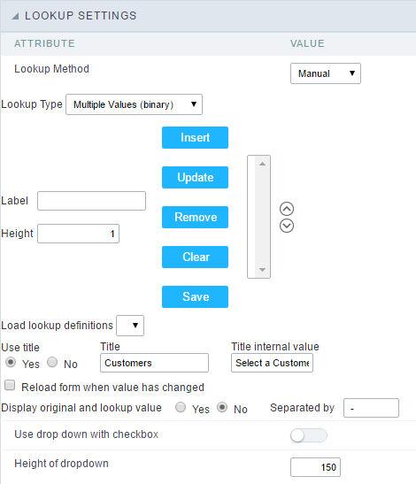 Editing Lookup Configuration Multiple Values (Binary)
- Label : Text that will be displayed in the item list of the select field.
- Height : Defines the height for the select object.
-
- Insert Button : Adds to the list the values informed on the fields Label and Value.
- Update Button : Modifies the attributes of the selected item.
- Remove Button : Remove the selected item from the list.
- Clear Button : Clear the Fields.
- Save Button : Allows the user to save all the items of the list, to use on other fields, just click on Load lookup definition.
- Load lookup definitions : Allows to refresh the list of values predefined when using the lookup. It will be listed the existing definitions in ScriptCase and the ones saved by the user.
-
Use title : Allows to display a line of a title on the select object (Title Attribute) associated to a value informed manually (Title internal value).

- Title internal value : Value Saved to the field when the line of the title is selected in the object.
- Title : Text displayed on the title of the Select object.
- Reload form when value has changed : With this option selected, the form will refresh if there is a change to the selected object in the field.
-
Display original and lookup value : Displays the value of the field and the value returned from the lookup.
 Displaying the original lookup.
 - Separated by : Defines which character will be used to separate the values of the field with the value returned from the lookup. It is only necessary to inform this value of the option Display original and lookup value is enabled.
- Lookup Type : Define the functionality of the lookup, being: Single Value, Multiple Values (delimiter), Multiple Values (position) and Multiple Values (binary).
-
Lookup Method - Actual value
This lookup is used to list all the values in the selected field.
This lookup will apply a “distinct” to your SQL query.
Ajax Processing
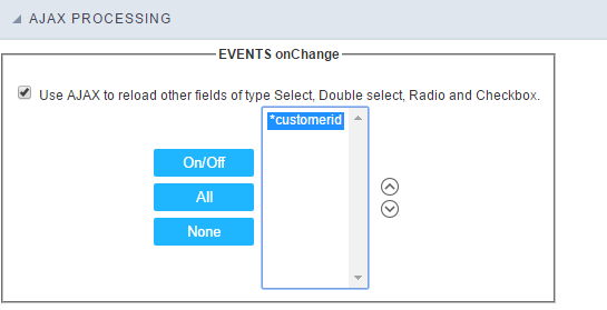 Ajax Processing configuration Interface.
Allows to define the field that will be reloaded when selecting a value that has the (onChange) trigger.
For example: a field of the type select with a list of states, and another select field with a list of cities. When selecting a state, the cities list is reloaded.
Display Settings
The Display Settings allows to define the CSS for the fields individually. For each Display Settings of Scriptcase, exists the same attributes available for this interface.
- CSS of the Title
- Font : Allows to choose the font type, that will be applied to the application field title.
- Font Size : Allows to choose the the font size, that will be applied to the application field title.
- Font Color :Allows to choose a color for the font from the color pallet.
- Background Color : Allows to define the color for the field, the color can be selected from the color pallet.
- Bold : Applies the bold style to the font.
- Underline : Applies the underline style to the font.
- Border Size : Applies the border size to the title of the field.
- Border Color : Allows to choose a color for the border, using a color pallet to apply to the title.
- Horizontal Alignment : Allows to position the label of the field in the desired position (left,right,center and justify).
- Vertical Alignment : Allows to position the label of the field in the desired position (baseline, sub, super, top, text-top, middle, bottom, text-bottom).
- Width : To define a width for the title of the field.
- Height : To define a height for the title of the field.
- CSS of the Field
- Font : Allows to choose the font type, that will be applied to the application field.
- Font Size : Allows to choose the the font size, that will be applied to the application field.
- Font Color :Allows to choose a color for the font from the color pallet.
- Background Color : Allows to define the color for the field, the color can be selected from the color pallet.
- Bold : Applies the bold style to the font.
- Underline : Applies the underline style to the font.
- Border Size : Applies the border size to the field.
- Border Color : Allows to choose a color for the border, using a color pallet to apply to the field.
- Horizontal Alignment : Allows to position the field in the desired position (left,right,center and justify).
- Vertical Alignment : Allows to position the field in the desired position (baseline, sub, super, top, text-top, middle, bottom, text-bottom).
- Width : To define a width for the field.
- Height : To define a height for the field.
- CSS of the Input Object
- Font : Allows to choose the font type, that will be applied to the Input Object. For example: Radio, Select, Text, etc
- Font Size : Allows to choose the the font size, that will be applied to the application field.
- Font Color :Allows to choose a color for the font from the color pallet.
- Background Color : Allows to define the color for the Input Object, the color can be selected from the color pallet.
- Bold : Applies the bold style to the font.
- Underline : Applies the underline style to the font.
- Border Size : Applies the border size to the Input Object.
- Border Color : Allows to choose a color for the border, using a color pallet to apply to the Input Object.
- Horizontal Alignment : Allows to position the Input Object in the desired position (left,right,center and justify).
- Vertical Alignment : Allows to position the Input Object in the desired position (baseline, sub, super, top, text-top, middle, bottom, text-bottom).
- Width : To define a width for the Input Object.
- Height : To define a height for the Input Object.
Help Settings
This feature allows that the instructions are documented to be used for the generated application, this helps the end user to understand better how the system works.
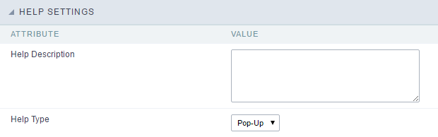
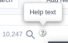
- Help Description : Allows to inform a text that will present to the user when he positions the mouse over the field.
- Help Type
- Pop-Up : Selecting the pop-up type, it will display an icon beside the field that when clicked, you will view a pop-up with help description.
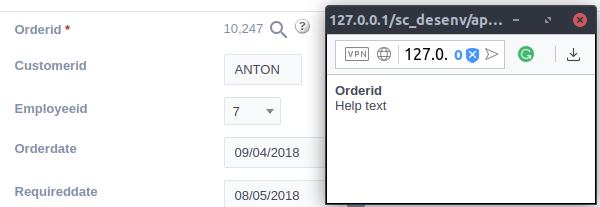 Help type - Pop-up configuration Interface.
- Hint : Passing the cursor over the field, you will view a hint with the help description.
 Help type - Hint configuration Interface.
- Text : It will display the help description beside the field.
 Help type - Text configuration Interface.