Form Settings
 View video
View video
General settings of the menu form where it is possible to configure some behavior of the application depending on the orientation used.
Settings
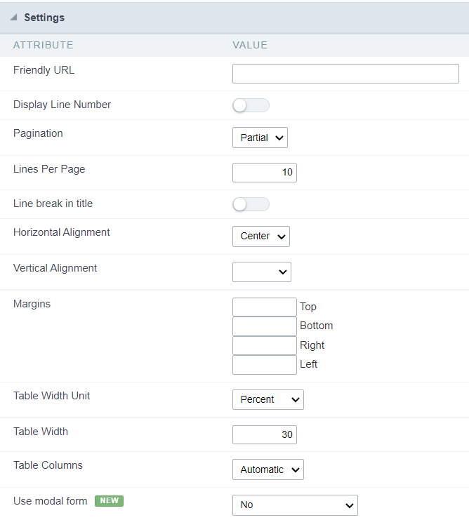
Check the details of each attribute available in the configuration block below.
Friendly URL
This attribute defines the application’s friendly URL.

Alphanumeric characters and some special characters are allowed, such as: hyphen (-), underscore (_), comma (,), and dot (.).
The use of accents or spaces is not allowed.
Some recommendations for definition are:
- Use keywords for identification.
- Use hyphens to separate words.
- Use only lowercase letters.
- Avoid using dates.
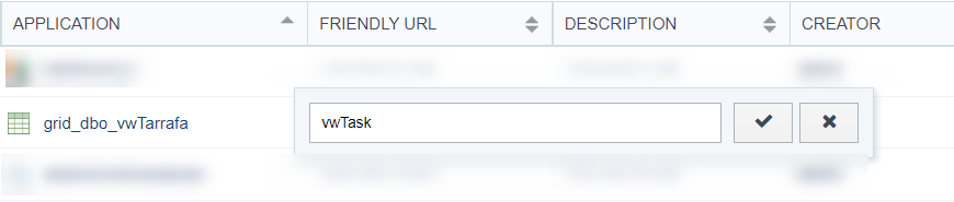
Example of an application using a Friendly URL
The friendly URL can also be defined in the application list on the project’s initial screen.
See the example below
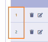
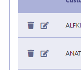
Display Line Number
This attribute defines whether or not the line counter is displayed in the application. The row counter will be positioned next to the options column.
This feature is only available for forms configured in the formats: Grid Editable and Grid Editable (View)
Example with display line number enabled
Example with display line number disabled
Pagination
This attribute defines the type of pagination used in the application: Partial and total
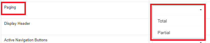
This attribute is only available for horizontal forms: Multiple Records, Editable Grid and Editable Grid (View)
Partial
Displays a limited amount of records per page, this amount is defined in the Lines per Page attribute, which is only available in this type of pagination.
Standard toolbar when using partial pagination.
When using partial pagination all navigation options are available in the application.

Total
Lists all listed records on a single page, removing navigation buttons.
Standard toolbar when using full pagination.
When using full pagination, navigation buttons are automatically hidden from the application toolbar.

Lines Per Page
Defines the maximum total of rows that will be displayed per page.
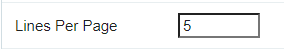
This attribute is only available in horizontal forms (Multiple Records, Editable Grid and Editable Grid (View)) configured to use partial pagination.
Application example with five rows per page
In the example below, the application is initially displayed with 5 records per page as defined by the developer.
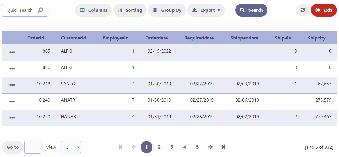
When using the Choose Quantity button on the application’s toolbar the developer allows the end user to define the number of lines displayed through the View button.
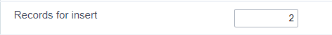
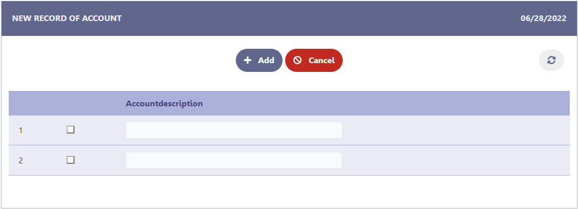
Records for Insert
Defines the number of rows available for simultaneous inclusion of records in the multiple records form. The value defined in the Records for Insert attribute works regardless of the total number of lines per page of the application.
This attribute is only available for Multiple Records forms
Example of Multiple Records forms in insert mode
When clicking on the New button, the rows for inclusion of the record will be displayed according to the configuration performed in the attribute.
Line break in title
This attribute defines whether or not the line break in the field label will be allowed.
This attribute is only available in horizontal forms (Multiple Records, Editable Grid and Editable Grid (View)) configured to use partial pagination.
When enabled, does not allow line breaks in the field label. In this way, even if the field occupies a smaller space than the label, as in the Customer Code field in the image below, the line will not be broken.
Example of line break in title enabled
When disabled, allows a line break in the field label. When using this option, the space destined to the label will be defined by the size of the field, in this way, if the ladel is larger than the space destined to the field, there will be a break in the line.
Example of line break in title disabled
Horizontal Alignment
Defines the horizontal alignment of the application and can be defined as: Centered, Left or Right.
The attribute’s default setting is Centered
Centered
Positions the application in the center of the page, respecting the margin definitions defined in the theme or in the margin attribute.
Application example with centered alignment
Left
Positions the application in the left corner of the screen, respecting the definitions of the margins defined in the theme or in the margin attribute.
Left-aligned application example
Right
Positions the application in the right corner of the screen, respecting the definitions of the margins defined in the theme or in the margin attribute.
Right-aligned application example
Vertical Alignment
This attribute defines the vertical alignment of the application and can be configured with the following options: No Value, Top, Center ou Bottom.
When using Top, Center or Bottom alignments, the margin attribute is disregarded.
See below for details on each of the alignment options.
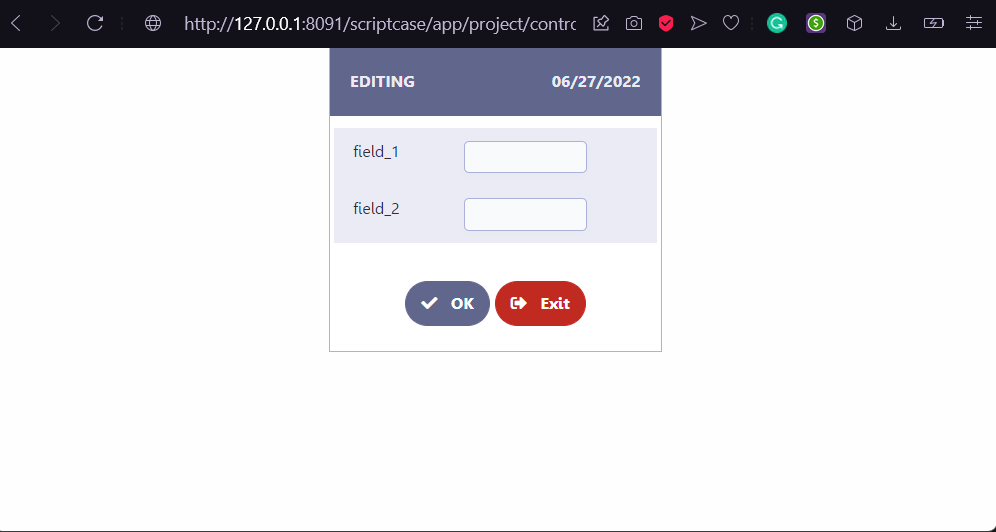
No Value
Standard vertical alignment for new applications. In this configuration, the application is positioned at the top of the screen respecting the margins defined in the margin attribute or in the definition of the theme used in the application.
Application example with standard alignment
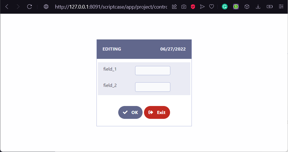
Top
Places the application at the top of the screen, disregarding the definitions of margins defined in the application theme or in the margin attribute.
Application example with alignment on the top
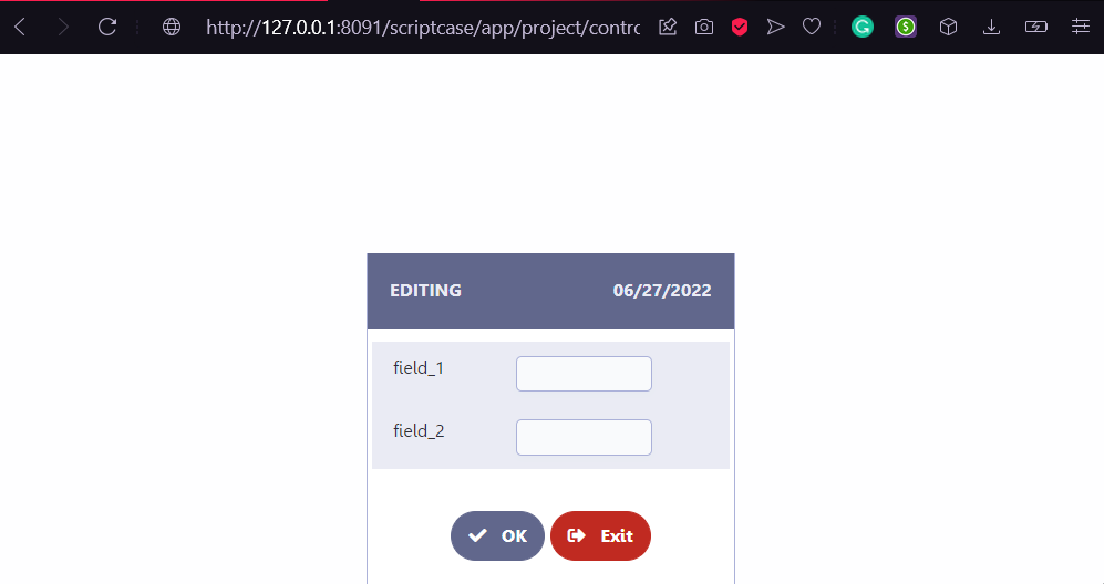
Center
Positions the application in the center of the screen, disregarding the definitions of the margins defined in the application theme or in the margin attribute.
Application example with Center alignment
Bottom
Places the application at the bottom of the screen, disregarding the definitions of margins defined in the application theme or in the margin attribute.
Application example with alignment on the bottom
Margins
Allows the developer to set the application’s margin values in pixels. If no value is specified, the application will use the default values from the configured theme.
Attention:
When configuring the Vertical Alignment attribute, the defined margin values will be ignored.
Example of how to use the attribute
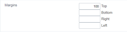
Table Width Unit
Define a unit of width used in the Width of Table attribute, responsible for defining the application extension.
The available options are: Percent, Pixel and auto.
Percentage
The application width will be defined using percentage as the width unit.
In this way, when inserting a value of 50 in the Width of Table attribute, the width of the application will be defined with: width: 50%;
In this case the application will have a variable width, defined by the available space.
For example, an application defined with a width of 50%, if opened in an iframe with a width of 800px it will occupy 400px. This same application opened in a space with 200px will occupy 100px.
Pixel
The width of the application will be defined using pixel as the unit of width.
In this way, when inserting a value of 50 in the Table Width attribute, the width of the application will be defined with: width: 50px;
In this case, the application will have a fixed width, occupying the defined value regardless of the available space.
For example, an application defined with a width of 800px, if opened in an iframe with a width of 500 pixels, it will occupy the defined 800px, creating a horizontal scroll within the iframe.
Automatic
When using this option, the Width of Table attribute will be disregarded and the size of the application will be calculated by the browser.
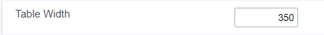
Table width
Defines the width of the application. In this attribute, only numbers must be used, the width unit that will be used is defined in the Unit of Table Width attribute.
When selecting automatic in the Table Width Unit, the value defined in this attribute is disregarded.
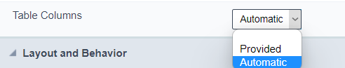
Table Columns
This parameter defines the width of the application fields. The available options are: Automatic and Informed.
This attribute is only available for single record forms and will be ignored when using Inputs with 100% width option.
Available values in the attribute:
Automatic
The field width is automatically calculated by the browser, which will adjust according to the entered text size.
Informed
In this case, the width of the fields is defined by the value informed in the Width of labels attribute, which uses pixel as the width unit.
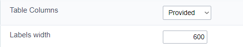
When selecting the informed value, the Width attribute of the labels is mandatory, if no value is informed, the generator will disregard the Table Columns attribute.
Labels Width
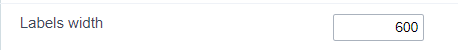
Defines the width of the application’s labels, using pixel as the width unit. To set the width, just enter the numbers as in the image above.
This attribute is only available when the Table Columns attribute has the value informed.
In this case, the Labels Width parameter becomes mandatory, if no value is informed, the Table Columns attribute will be disregarded.
Use modal form
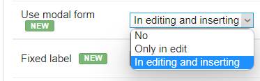
Only available in editable Grid (View) forms, this attribute defines the application’s behavior for adding and updating records.
The available options are:
- No - Inserting and updating of the record online.
- Only in edit - Inline inserting and record update in modal form
- In editing and inserting - Adding and updating the record in the modal form
For the Only in edit and In editing and inserting options, two new attributes will be displayed for defining the width and height of the modal where the form will be opened.
See each of the detailed options below.
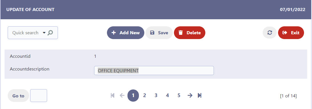
No
Default value of the attribute when creating a form, in this configuration the updating or insertion of data will be carried out in line.
Example of in-line registry editing
By clicking the edit icon  the fields will be enabled according to your configuration.

Example of adding an online record
By clicking the + New button a blank line will be added after the last record listed.
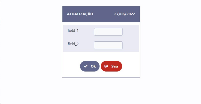
Only in edit
When selecting the option Only in edit, when clicking the edit icon a modal will open with a form for editing the selected record.
In this configuration the record inclusion remains in line.
The size of the modal is defined in the parameters Modal Width and Modal Height. Both use pixel as a unit of width, just informing numbers.
Record editing example in modal
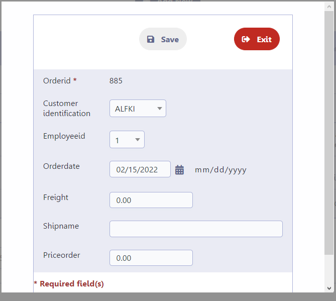
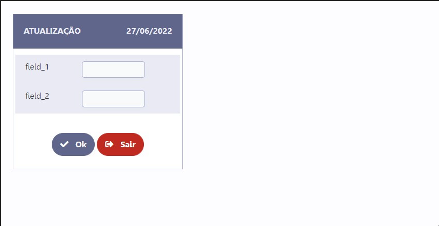
In editing and inserting
This option defines the use of the modal form for inclusion and editing of records.
The size of the modal is defined in the parameters Modal Width and Modal Height. Both use pixel as a unit of width, just informing numbers.
Using this setting in the Use modal form attribute allows the developer to individually define the fields that will be displayed in the modal form and those displayed when accessing the application. In practice, it is as if there were two applications, one for editing and including records open in the modal and another for displaying and deleting records.
Field configuration must be performed in the Field Positioning menu, check our documentation.
For more details watch the video Form horizontal (edição e inclusão com modal)
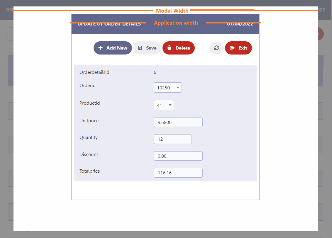
Modal Width
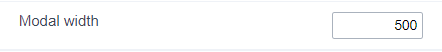
Set the width of the modal where the form will open. The attribute uses pixel as a unit of measure, so only numbers must be informed to define the width.
This attribute is only available for editable grid forms(view) where the attribute Use modal form is set to: On Editing or On Editing and Inserting.
The width of the application opened in the modal respects the definition of the Width of Table attribute.
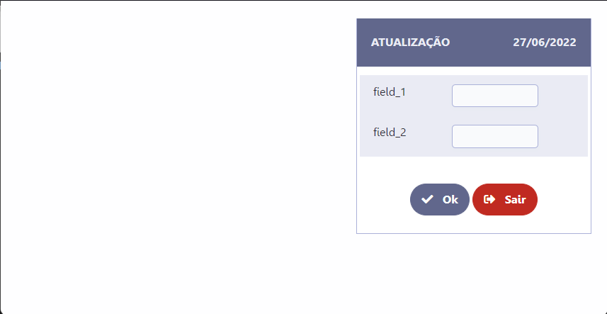
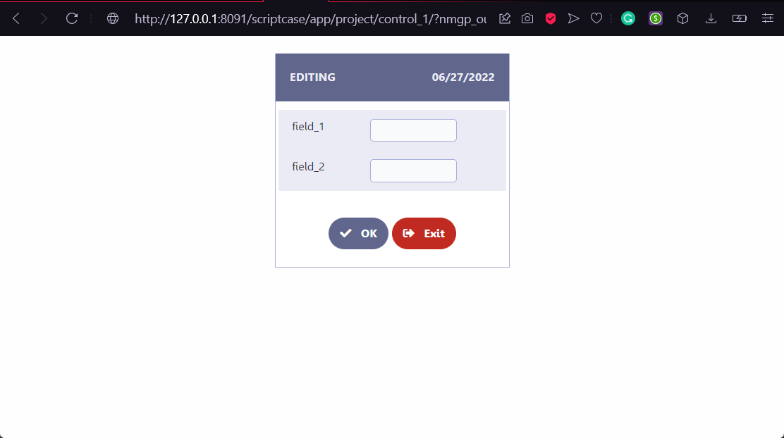
Example of the application opened in the modal
This attribute controls the Modal Width, which is basically the space available for the form to be displayed. The width of the application that will be opened respects the configuration of the Width of the Table of the Editable Grid Form (view).
Modal Height
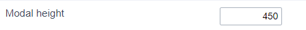
Defines the height of the modal where the form will be opened. The attribute uses pixel as a unit of measure, so only numbers must be informed to define the height.
This attribute is only available for editable grid forms(view) where the attribute Use modal form is set to: On Editing or On Editing and Inserting.
Example of the application open in the modal
This attribute controls the Modal Height, which is basically the space available for the form to be displayed. The height of the application that will be opened respects the number of fields selected for the modal form.
Layout and Behavior
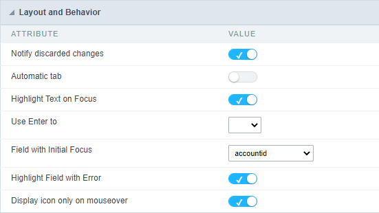
Check the details of each attribute available in the Layout and Behavior block below.
Notify discarded changes
This attribute defines the behavior of the application regarding changes that have not yet been saved if the user performs some reload of data action.
Data reload examples
- Use reload button
 .
. - Navigate between pages.
- Redirects to another application in the same window.
When Disabled, if the user performs any action that causes the data to be reloaded before the changes made are saved, the initiated action will be executed and the unsaved data will be lost.
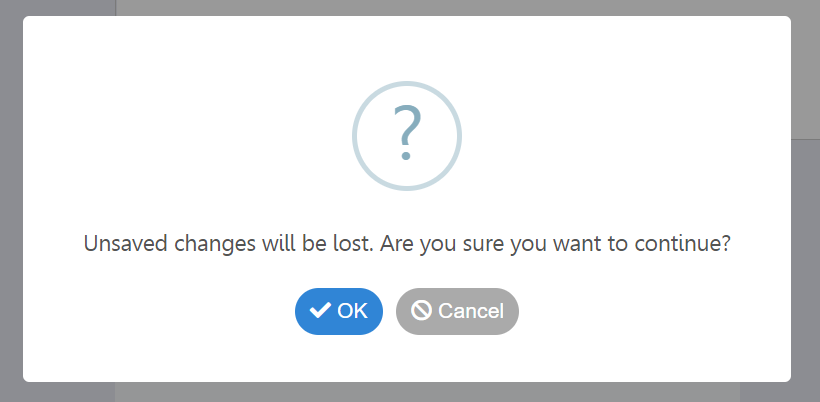
When enabled, whenever the user performs any action that causes the data to be recharged before it has been saved, an alert will be displayed informing about the possible loss of this data.
In this case, the user can choose to click OK which will continue the action started, culminating in the discard of unsaved changes or click Cancel which will cause the action started to be interrupted, keeping the unsaved data.
Example of discarded change notification
Some actions may cause the loss of unsaved data, for example: Navigating between records or using the reload button
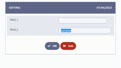
Automatic tab
Shifts focus to the next field when the number of characters in the current field reaches the limit defined in the settings.
Example of auto tab
In the example below, Field 1 has a limit of 3 characters. When filling in all the characters the focus changes to Field 2.
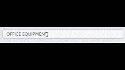
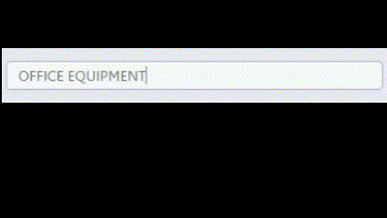
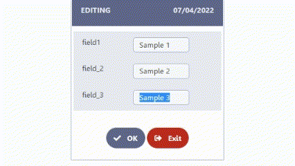
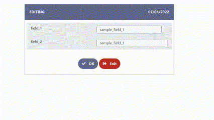
Select Field Content
Defines whether the field content will be selected or not when receiving focus.
When enabled all field contents are selected..
Example of field behavior with attribute enabled
When disabled the field content will not be selected.
Example of field behavior with attribute disabled
Use the Enter key to
This attribute defines the behavior of the enter key in the application, having as options: tabular and submit.
The submit property is not available for form applications.
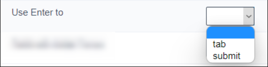
Tab
Allows the user to navigate between application fields using the enter key. The tabs follow the field order defined in the select fields menu.
Tab example with enter
To submit
Allows the user to submit the application using the enter key.
Example submit with enter
This option is not available for form applications.
Field with initial focus
Defines the field that will receive focus when the application is loaded. Enabling the user to start typing without having to use the mouse to focus on the field.
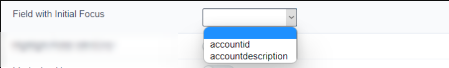
Example of initial focus
Focus field with error
Defines the behavior of the focus in relation to the fields that present an error when submitting the form.
When enabled, when submitting the form, the field with an error will receive focus. If more than one field has an error, the focus will be on the first field with an error, following the order defined in the Fields Position menu.
When disabled, when submitting the form, no field will receive autofocus in case of an error.
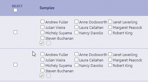
Check all checkboxes
This attribute controls the display of the Select column, allowing application users to check all the checkbox fields of the application or just a specific record.
This attribute is only available in Multiple Record forms
This column allows two different functions depending on the checked box, check the examples below.
By checking the checkbox below the Select label
In this case, all checkbox fields of the current application page will be checked.
When checking the checkbox in the record line
In this case, all fields of the record configured as checkboxes will be checked.
Display icon only on mouseover
Sets whether the theme sort icons
 will always be displayed or whether they will only be displayed on mouseover.
This attribute is only valid in Horizontal forms: Multiple Records, Grid Editable and Grid Editable(View).
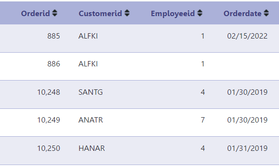
When Enabled, sort icons are displayed on mouseover only.
Sort icons displayed on mouseover
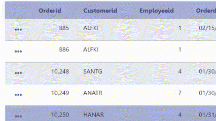
When Disabled, the sort icons will always be displayed in the application.
Sort icons always displayed