Form - Text Field
General Settings
This type of field allows the developer to create quickly inputs to insert and update data, where the final user can inform its data to be allocated in its database.
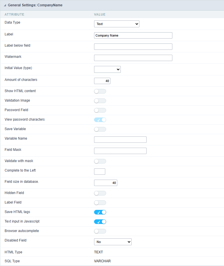
Type of Data
Defines the type of the field in the application. In this case we should select Text.
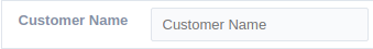
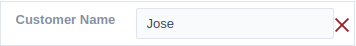
Label
Defines the title that will be displayed in the field when the application is executed. The terminology used in the interface is fundamental to the system have a good usability, whe should use names and familiar terms to the final user of the application, instead of using terms from the system.
For example, this text field that has the name customerid, the client would have a much better understanding of the functionality of the field when we define the label as Customer Name.
Not only a fixed text, the Label attribute allows the use of langs to define the field’s title, making it possible to use your application in a multi language project.
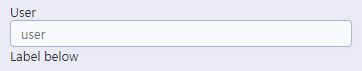
Label below field
Defines the message to be displayed below the field.
Watermark
Informing a text to the Watermark it will be displayed in the input a text as an example that can be informed in the field. The result after set will be this:
Initial Value(type)
Allows the initial definition to the field when the form is in insert mode. It is possible to choose between two options:
Defined Value: When this option is selected, the Initial Value attribute will be available, where we should inform the field’s initial value. For example, my initial value is Arlindo, when a new register is inserted, the field Seller Name will be initialized as Arlindo.
System Data: When this option is selected, the initial value will be the actual date of your computer’s system.
Amount of Characters
Allows to set the width of the text field’s input that varies with the amount of characters informed. Although, if the amount of characters typed are greater than the setting, the text will be pushed to the left, to keep the maximum amount of characters as defined.
Show HTML Content
When this option is active every HTML, CSS and JavaScript content that are in the database will be displayed with the main value.
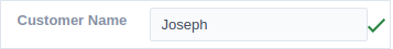
Validation Image
When this option is active, a image will be displayed next to the informed field if the field is according to the settings defined by the developer.
In the example below, the field was set to receive at least 5 characters, see what happens when informed only 4 characters:
However if informed 5 or more characters the field will be displayed as:
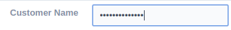
Password Field
When this option is active, the text field will be converted to the format used in password fields.
For example:
View password characters
By enabling this option, a button will be displayed in the password field so that the password is displayed when clicked.

Save Variable
Allows to save a session variable(global variable) with the field’s value, to be used in others applications.
For example, in the login form the username can be saved in session and displayed on the header of others applications.
Variable Name
In this attribute we should define the name of the session variable, active in the previous item, that will receive the field’s value.
We should inform only the variable’s name, - var_rating.

The method to use its value is global variable.
Field Mask
Defines the field mask. There are two types of mask described in the table below:
| Character | Description |
|---|---|
| X | It is overridden by any characters returned by the database. Filled is required and the value will be completed with leading zeros when there are fewer characters than the size of the mask. |
| Z | It is overridden by any characters returned by the database. Its filling is optional and when there are fewer characters than the mask size, nothing will be done about the characters that are missing. In addition the leading zeros will be suppressed. When used in conjunction with the X necessarily the use of this character is to the left of the mask. |
| 9 | It represents any numeric character (from 0-9) |
| A | It represents an alpha numeric character (A-Z,a-z) |
| * | It represents any alpha-numeric character (A-Z,a-z,0-9)entered by the user. |
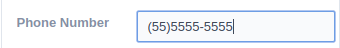
For example, it is possible to set the mast to display a telephone number:

It will be show with this format on runtime:
It is also possible to set the field mask like those examples:
Field mask examples:
Telephone number
| Field | Mask Input | Typed Value | Formatted Value |
|---|---|---|---|
| Phone Number | +99 99 9999 - 9999 | 123456789012 | +12 34 5678 - 9012 |
| Phone Number | (xx) xxxx - xxxx | 12345678 | (00) 1234 - 5678 |
| Phone Number | (xx) xxxx - xxxx | 1234567890 | (12) 3456 - 7890 |
| Phone Number | (zz) xxxx - xxxx | 12345678 | ( ) 1234 - 5678 |
| Software Key (Letters only) | AAAA-AAAA-AAAA-AAAA | QWERTYUIASDFGHJK | QWER-TYUI-ASDF-GHJK |
| Software Key (Letters and numbers) | xxxx-xxxx-xxxx-xxxx | Q1W2E3R4T5Y6U7I8 | Q1W2-E3R4-T5Y6-U7I8 |
| License Plate | AAA - 9999 | QWE1234 | QWE - 1234 |
| Scriptcase Serial Key | A999A999A999-** | D111H111G111DG2P | D111H111G111-DG2P |
| Multiple masks (Phone Number) | 9999-9999;(99)9999-9999; | 9999 999 9999 | +99 99 9999-9999 |
Validate with mask
When this option is active it is possible to insert the data with the mask set in the Field Mask option.
Complete to the left
When this option is used, the value defined will be added on the left of the information inserted in the field if the value is lower than the maximum set in the Maximum Size option.
Field size in database
Defines the field’s size related to the size set in the database. This value is already set automatically by default when the application is generated.
Hidden Field
When this option is active, the field will be hidden in the application on runtime.
Label Field
When this option is active, the field will be altered to only a label where the info will be displayed, where updates or inserts will not be possible.

Save HTML tags
When this option is active, it allows to HTML tags in the field to be inserted with the data, instead of being interpreted.
Text input in JavaScript
When this option is active, it will be show every JavaScript content inserted in the database with its main value.
This option can only be used using the Editable grid view.
Browser autocomplete
Specifies whether the field will allow the browser’s autocomplete feature. By default, autocomplete is enabled for fields.
- When disabled, the field will allow the browser’s autocomplete.
- When enabled, the field’s autocomplete will be blocked.
Disable Field
Allows the developer to disable the field, so the user can not type a value according with the option defined by the developer.
The available options are:
No - Initial value of the attribute, this option does not disable the field.
Update Mode - This option only disables the field when editing existing registers.
Insert Mode - This option only disables the field when inserting new registers.
Insert / Update Mode - This option disables the field when editing exciting registers or when inserting new registers.
HTML Type
HTML object used to display the field in the form.
SQL Type
Informs the type of the field in the database.
Values Format
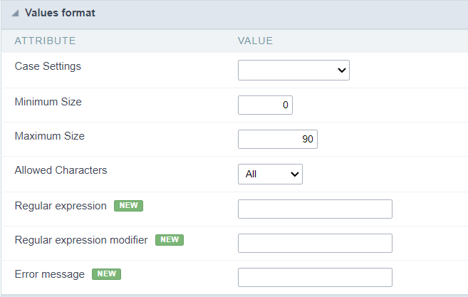 Format of Values Interface
Case Settings
Allows converting the letters of the field when it loses focus. The options are: Uppercase, Lowercase, Capitalize the first word, Capitalize all words.
Minimum Length
Determines the minimum number of characters a user must enter in the field.
Integer values greater than or equal to 0 must be provided.
Maximum Length
Determines the maximum number of characters a user can enter in the field.
Integer values greater than or equal to 0 must be provided.
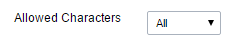
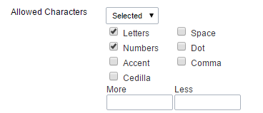
Allowed Characters
Allows to select a set of characters that can be typed into the field. The options are:
-
All : Allows any type of character to be typed into the field
-
Selected : Defines a set of characters allowed. Using the configuration below, will be allowed to type letters, numbers and other characters (defined in the attribute More). The letters a, b and c (defined in the Less Attribute) are not allowed.
Regular expression
Regular expression used to validate field content.
Regular expression modifier
Modifiers used in the field content validation regular expression.
Error message
Message to be displayed if the regular expression is not valid.
Database Value
Allows to define a value to be saved to the database.
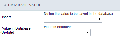 Database Values configuration Interface.
- Defined Value : Allows to specify the fixed value associated to global variables.
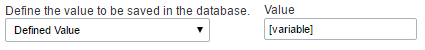 Defined Value configuration Interface.
- Auto Increment (automatic) : Allows to use the increment generated by the database. Used only when the field of the database is the type AUTO INCREMENT or similar. For the databases that use sequence like Oracle, PostGres and Firebird, it is necessary to inform the name of the sequence.
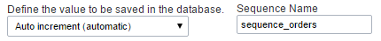 Auto Increment configuration Interface.
- Auto Increment (manual) : The application generated simulates an auto increment on the field. To include a value to the field it will automatically calculate the next id.
- Date of Insertion : When inserting a record, the field will contain the server date as a value.
- Data of Update : When updating a record, the value of the field will be the date of the server.
- User IP : The field will receive the IP of the machine that the application is be accessed by.
- Calculated by the database : The value of the field will be applied by the database. The field will not be used in update processes. For example: it will be updated by a Trigger.
- Null : The field will be informed the value null.
Lookup Settings
Method used to place a description next to the field.
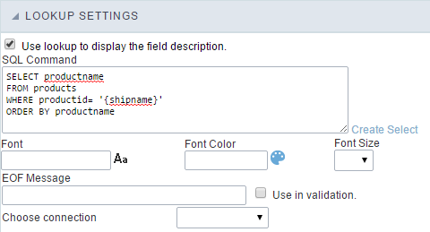
- Use lookup to display the field description. : When enabled, the lookup settings is enabled and opens more settings.
- SQL Command : Defines the SQL command that is going to recover the vales from the database. To build a SQL command, it is possible to use the SQL Builder tool. The SQL format needs to have the following format:
SELECT Field_displayed FROM table WHERE Key_Field = '{Form_Field}'
The Form field needs to be referenced buy the curly brackets {}. While running the application, the field within the curly brackets is replaced by it’s value in the table.
- Font : Defines the font used to display the lookup.
- Font Color : Defines the color in HEX for the lookup display.
- Font Size : Defines the font’s size in the lookup display.
- EOF Message : Defines a message that will be displayed if there is not any results for the record.
- Use in validation : When enabled, it will generate an automatic validation based on the lookup, in case there is not any records found, the message will display as a warning (when Updating or Including a record).

- Choose connection : Allows you to select another specific connection existing in the project. The select command will be done on the second connection.
Ajax Processing
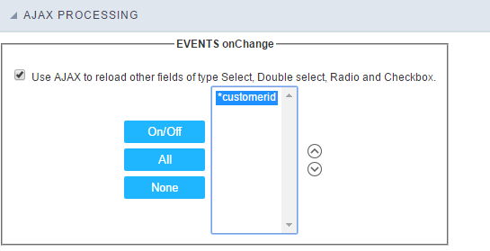 Ajax Processing configuration Interface.
Allows to define the field that will be reloaded when selecting a value that has the (onChange) trigger.
For example: a field of the type select with a list of states, and another select field with a list of cities. When selecting a state, the cities list is reloaded.
Display Settings
The Display Settings allows to define the CSS for the fields individually. For each Display Settings of Scriptcase, exists the same attributes available for this interface.
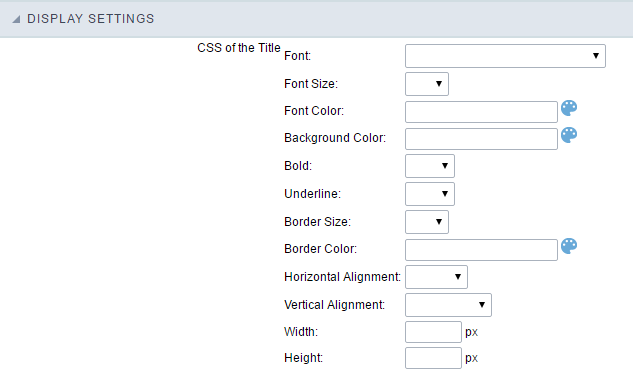
- CSS of the Title
- Font : Allows to choose the font type, that will be applied to the application field title.
- Font Size : Allows to choose the the font size, that will be applied to the application field title.
- Font Color :Allows to choose a color for the font from the color pallet.
- Background Color : Allows to define the color for the field, the color can be selected from the color pallet.
- Bold : Applies the bold style to the font.
- Underline : Applies the underline style to the font.
- Border Size : Applies the border size to the title of the field.
- Border Color : Allows to choose a color for the border, using a color pallet to apply to the title.
- Horizontal Alignment : Allows to position the label of the field in the desired position (left,right,center and justify).
- Vertical Alignment : Allows to position the label of the field in the desired position (baseline, sub, super, top, text-top, middle, bottom, text-bottom).
- Width : To define a width for the title of the field.
- Height : To define a height for the title of the field.
- CSS of the Field
- Font : Allows to choose the font type, that will be applied to the application field.
- Font Size : Allows to choose the the font size, that will be applied to the application field.
- Font Color :Allows to choose a color for the font from the color pallet.
- Background Color : Allows to define the color for the field, the color can be selected from the color pallet.
- Bold : Applies the bold style to the font.
- Underline : Applies the underline style to the font.
- Border Size : Applies the border size to the field.
- Border Color : Allows to choose a color for the border, using a color pallet to apply to the field.
- Horizontal Alignment : Allows to position the field in the desired position (left,right,center and justify).
- Vertical Alignment : Allows to position the field in the desired position (baseline, sub, super, top, text-top, middle, bottom, text-bottom).
- Width : To define a width for the field.
- Height : To define a height for the field.
- CSS of the Input Object
- Font : Allows to choose the font type, that will be applied to the Input Object. For example: Radio, Select, Text, etc
- Font Size : Allows to choose the the font size, that will be applied to the application field.
- Font Color :Allows to choose a color for the font from the color pallet.
- Background Color : Allows to define the color for the Input Object, the color can be selected from the color pallet.
- Bold : Applies the bold style to the font.
- Underline : Applies the underline style to the font.
- Border Size : Applies the border size to the Input Object.
- Border Color : Allows to choose a color for the border, using a color pallet to apply to the Input Object.
- Horizontal Alignment : Allows to position the Input Object in the desired position (left,right,center and justify).
- Vertical Alignment : Allows to position the Input Object in the desired position (baseline, sub, super, top, text-top, middle, bottom, text-bottom).
- Width : To define a width for the Input Object.
- Height : To define a height for the Input Object.
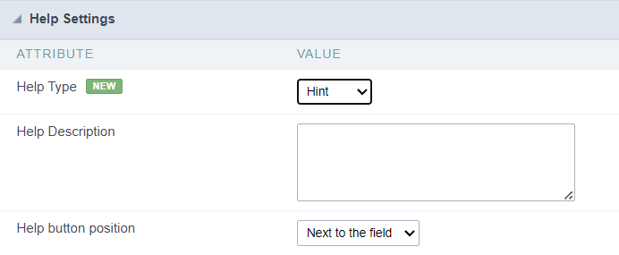
Help Settings
Allow the developer to set up instructions and hints about the field’s use, allowing the developer to help the users about the system usage.
Description of the settings attributes.
Help Description
In this area, you can set up a text that will be shown in the application according to the type of help selected below.
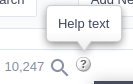
Help Type
Hint
Display a default icon ? beside the field. When the mouse is above the icon a help text will be displayed.
Text
Display a text inside of a <span></span> beside the field.

Pop-up
Display a default icon ? beside the field. To display the message just click in the icon that a Pop-up will be displayed with the help text.
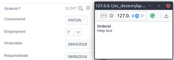
The icon displayed when selecting the types Hint or Pop-up vary according to the theme that is being used in the application. This icon can be modified in the CSS Buttons.
Tippy
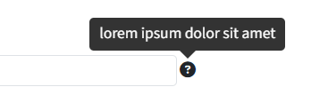
Displays a standard ? icon next to the field. When you hover the mouse over the icon, the message will be displayed in a more user-friendly way.
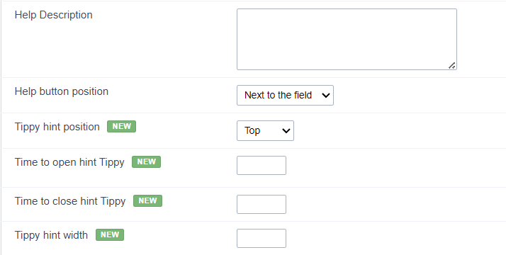
Help type settings (Tippy)
-
Help Description : Defines where the field’s help button will be displayed
-
Help button position : Defines the display position of the Tippy hint in relation to the field’s help icon
-
Time to open hin Tippy : Defines the time in milliseconds for the Tippy hint to be displayed after the mouse passes over the help icon.
-
Time to close hin Tippy : Sets the time in milliseconds for the Tippy hint to be hidden after the mouse leaves the help icon.
-
Tippy hint width : Sets the width of the Tippy hint in pixels.
Help button position (except Tippy)
Allow to set up where the help button will be displayed in the field, there are two options:
Beside: The help icon will be displayed beside the field.
Column: The help icon will be displayed beside the label of the field.