Form - Rating Field
General Settings
This field allows the developer to create a field for rating using stars (or any other image), where the final user can select a rate option.
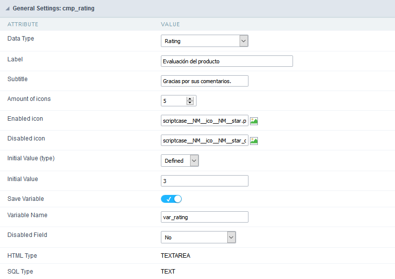
Attribute descriptions
Data Type
Define the field type to Rating.
Label
The Label option lets you define the title of a field. Example: If the database field name is “Stars”, You can display a different name for the user, like “Stars”.
Besides use a fixed text, the Label attribute allows the use of Langs to define the field title, allowing the internationalization of your application.
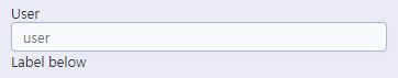
Label below field
Defines the message to be displayed below the field.
Subtitle
Define the subtitle of the field, below the ratings. Example: “Thank you for your feedback!”.
As in the Label, the subtitle attribute also allows the use of Langs for the internationalization of your application.
Amount of icons
It defines how many icons it will display in the field. The value set in this attribute must be according to the evaluation rules.
Initial Value (type)
Allow the definition of an initial value for the field when the form application is in insert mode. The only option available in this field is Defined. Selecting this option the attribute Initial Value will be showed for set the value.
Example: The initial value is 3 when inserting a new record, the rate field will initiate with 3 stars already selected.
The value defined in this attribute will overlap any value defined previously.
Save variable
It allows saving the value of the field in a session variable(Global variable) to use it in other applications. For example, you can save the user name in the login form and display its value on the header of other applications.
Variable Name
It allows setting the name of the session variable that will receive the field value.
We must inform only the variable name, - var_rating.

We can get the value as a global variable.
HTML Type
HTML Object to display the field in the form.
SQL Type
It informs the data type of field in the database.
Display Settings
The Display Settings allows to define the CSS values individually for each field. For each Display schema of ScriptCase, there are the same attributes available in Interface.
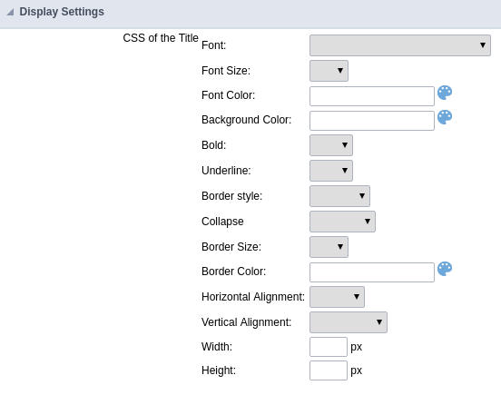
Display Settings configuration Interface.
- CSS of the Title
- Font : Select the font type, that will be applied to the application field title.
- Font Size : Defines the font size, that will be applied to the application field title.
- Font Color : Choose a color to the font by using a valid hexadecimal color value or from the color picker.
- Background Color : You can define the color for the field by using a valid hexadecimal color value or from the color picker.
- Bold : Applies the bold style to the font.
- Underline : Set the underline style to the font.
- Border style : Choose a style for the border.
- Collapse : Defines the collapse for the border.
- Border Size : Applies the border size to the title of the field.
- Border Color : Choose a color for the border, using a color palette to apply to the title.
- Horizontal Alignment : Position the label of the field in the wanted position (left,right,center and justify).
- Vertical Alignment : Position the label of the field in the wanted position (baseline, sub, super, top, text-top, middle, bottom, text-bottom).
- Width : Defines a width for the title of the field.
- Height : Set a height for the title of the field.
Help Settings
Allow the developer to set up instructions and hints about the field’s use, allowing the developer to help the users about the system usage.
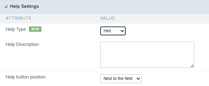
Description of the settings attributes.
Help Description
In this area, you can set up a text that will be shown in the application according to the type of help selected below.
Help Type
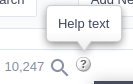
Hint
Display a default icon ? beside the field. When the mouse is above the icon a help text will be displayed.
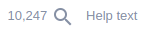
Text
Display a text inside of a <span></span> beside the field.
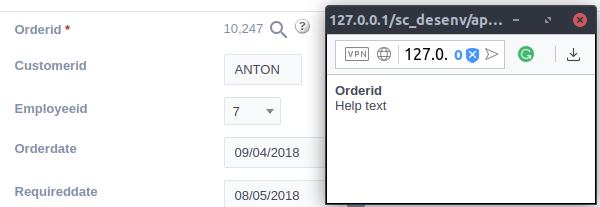
Pop-up
Display a default icon ? beside the field. To display the message just click in the icon that a Pop-up will be displayed with the help text.
The icon displayed when selecting the types Hint or Pop-up vary according to the theme that is being used in the application. This icon can be modified in the CSS Buttons.
Tippy
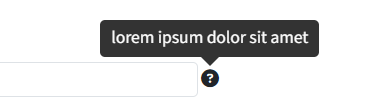
Displays a standard ? icon next to the field. When you hover the mouse over the icon, the message will be displayed in a more user-friendly way.
Help type settings (Tippy)
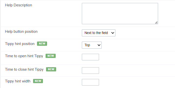
-
Help Description : Defines where the field’s help button will be displayed
-
Help button position : Defines the display position of the Tippy hint in relation to the field’s help icon
-
Time to open hin Tippy : Defines the time in milliseconds for the Tippy hint to be displayed after the mouse passes over the help icon.
-
Time to close hin Tippy : Sets the time in milliseconds for the Tippy hint to be hidden after the mouse leaves the help icon.
-
Tippy hint width : Sets the width of the Tippy hint in pixels.
Help button position (except Tippy)
Allow to set up where the help button will be displayed in the field, there are two options:
Beside: The help icon will be displayed beside the field.
Column: The help icon will be displayed beside the label of the field.