Control - Image (File Name) Field
General Settings
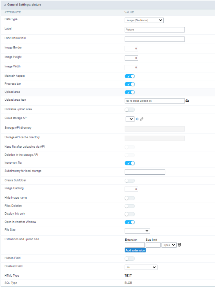
Data Type
Define the type of field. When setting it to Image (File Name), all the Images files are stored and loaded directly from the Database.
Label
The Label option lets you define the title of a field. Example: If the database field name is “cmp_name_client”, You can display a different name for the user, like “Client Name”.
Label below field
Defines the message to be displayed below the field.
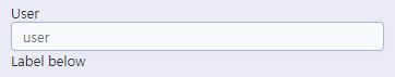
Image Border
The width of the Image border in Pixels.
Image Height
Image height size in Pixels.
Image Width
Image width size in Pixels.
Maintain Aspect
It maintains the original aspect ratio of the image when resizing it.
Progress bar
It displays a progress bar when sending the files to the server.
Upload area
It displays a drag and drop area to upload the file.
Upload area icon
Font-awesome icon for viewing in the file upload zone.
Clickable upload area
Hides the upload button and turns the upload area responsible for the upload function.
Cloud storage API
Profile with the API information (Dropbox, Google Drive or Amazon S3) used to upload the file to the cloud created in Tools > API
Storage API directory
Directory name for upload to the Cloud Storage API. Eg.: files/docs/{id}. The file will be saved in the root folder if this field is empty.
Storage API cache directory
Local directory for caching files sent to the cloud via the storage API
Keep file after uploading via API
It also saves the file in the default folder for images or documents after uploading to a cloud storage API.
Deletion in the storage API
When deleted in the application, the file will also be removed from the folder in the cloud storage API.
Increment file
It inserts a number increment into the file name if there is already another one with the same name in the upload folder.
Subdirectory for local storage
It sets the Sub-folder name of the stored files. It is relative to the directory of Document upload (see the Settings). It is possible to use global variables or local variables to format the name of the sub-folder.
Create Subfolder
It creates the sub-folder if not already created.
Image Caching
Time in minutes to store the image in the cache.
Hide image name
It displays only the image, without the name.
Files Deletion
It Deletes the files from the directory when deleting a record from the database.
Display link only
It allows showing a link to open the image in another window with the original size. ( with no re-dimensioning )
Open in Another Window
Allows to open the image in another window.
File Size
It allows defining the field to store the file size in the database.
Extensions and upload size
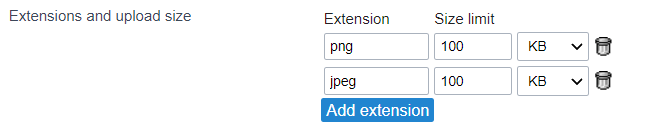
This setting defines the extensions allowed for uploading and the maximum size of each one.
This setting is important for the security of your project, as it prevents unwanted files from being uploaded.
Note If no value is informed, all extensions will be allowed. The file size will be limited by your PHP configuration.
Hidden Field
This option hides the field from the application, but its value is still available for JavaScript or PHP processing.
Disabled Field
Defines if the field will be disabled in “Insert Mode”, “Update Mode” or in “Insert and Update Mode”.
HTML Type
HTML Object to display the field in the form.
SQL Type
It informs the data type of field in the database.
Display Settings
The Display Settings allows to define the CSS for the fields individually. For each Display Settings of Scriptcase, exists the same attributes available for this interface.
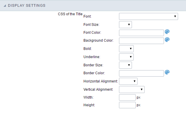
- CSS of the Title
- Font : Allows to choose the font type, that will be applied to the application field title.
- Font Size : Allows to choose the the font size, that will be applied to the application field title.
- Font Color :Allows to choose a color for the font from the color pallet.
- Background Color : Allows to define the color for the field, the color can be selected from the color pallet.
- Bold : Applies the bold style to the font.
- Underline : Applies the underline style to the font.
- Border Size : Applies the border size to the title of the field.
- Border Color : Allows to choose a color for the border, using a color pallet to apply to the title.
- Horizontal Alignment : Allows to position the label of the field in the desired position (left,right,center and justify).
- Vertical Alignment : Allows to position the label of the field in the desired position (baseline, sub, super, top, text-top, middle, bottom, text-bottom).
- Width : To define a width for the title of the field.
- Height : To define a height for the title of the field.
- CSS of the Field
- Font : Allows to choose the font type, that will be applied to the application field.
- Font Size : Allows to choose the the font size, that will be applied to the application field.
- Font Color :Allows to choose a color for the font from the color pallet.
- Background Color : Allows to define the color for the field, the color can be selected from the color pallet.
- Bold : Applies the bold style to the font.
- Underline : Applies the underline style to the font.
- Border Size : Applies the border size to the field.
- Border Color : Allows to choose a color for the border, using a color pallet to apply to the field.
- Horizontal Alignment : Allows to position the field in the desired position (left,right,center and justify).
- Vertical Alignment : Allows to position the field in the desired position (baseline, sub, super, top, text-top, middle, bottom, text-bottom).
- Width : To define a width for the field.
- Height : To define a height for the field.
- CSS of the Input Object
- Font : Allows to choose the font type, that will be applied to the Input Object. For example: Radio, Select, Text, etc
- Font Size : Allows to choose the the font size, that will be applied to the application field.
- Font Color :Allows to choose a color for the font from the color pallet.
- Background Color : Allows to define the color for the Input Object, the color can be selected from the color pallet.
- Bold : Applies the bold style to the font.
- Underline : Applies the underline style to the font.
- Border Size : Applies the border size to the Input Object.
- Border Color : Allows to choose a color for the border, using a color pallet to apply to the Input Object.
- Horizontal Alignment : Allows to position the Input Object in the desired position (left,right,center and justify).
- Vertical Alignment : Allows to position the Input Object in the desired position (baseline, sub, super, top, text-top, middle, bottom, text-bottom).
- Width : To define a width for the Input Object.
- Height : To define a height for the Input Object.
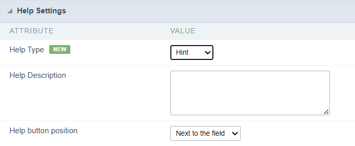
Help Settings
Allow the developer to set up instructions and hints about the field’s use, allowing the developer to help the users about the system usage.
Description of the settings attributes.
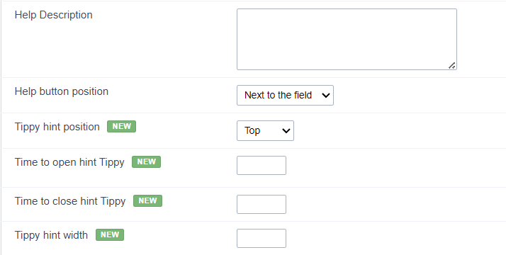
Help Description
In this area, you can set up a text that will be shown in the application according to the type of help selected below.
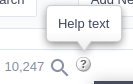
Help Type
Hint
Display a default icon ? beside the field. When the mouse is above the icon a help text will be displayed.
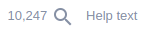
Text
Display a text inside of a <span></span> beside the field.
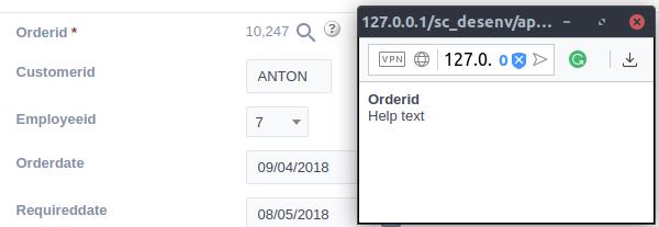
Pop-up
Display a default icon ? beside the field. To display the message just click in the icon that a Pop-up will be displayed with the help text.
The icon displayed when selecting the types Hint or Pop-up vary according to the theme that is being used in the application. This icon can be modified in the CSS Buttons.
Tippy
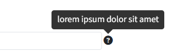
Displays a standard ? icon next to the field. When you hover the mouse over the icon, the message will be displayed in a more user-friendly way.
Help type settings (Tippy)
-
Help Description : Defines where the field’s help button will be displayed
-
Help button position : Defines the display position of the Tippy hint in relation to the field’s help icon
-
Time to open hin Tippy : Defines the time in milliseconds for the Tippy hint to be displayed after the mouse passes over the help icon.
-
Time to close hin Tippy : Sets the time in milliseconds for the Tippy hint to be hidden after the mouse leaves the help icon.
-
Tippy hint width : Sets the width of the Tippy hint in pixels.
Help button position (except Tippy)
Allow to set up where the help button will be displayed in the field, there are two options:
Beside: The help icon will be displayed beside the field.
Column: The help icon will be displayed beside the label of the field.