Menu Toolbar
 View video
View video
This article describes the menu application toolbar and provides information on how to add new items and how to configure them.
Toolbar buttons
Resources for creating menu items Below are the options for adding items to the toolbar. Added items are displayed in the list of items.
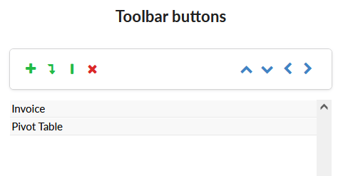
Table with the description of each of the options for creating and ordering the toolbar items.
| Title | Icon | Description |
|---|---|---|
| Insert item |  |
Add a new item to the menu toolbar. |
| Insert subitem |  |
Add a sub-item to the menu toolbar. For this, some item must be previously selected. Otherwise an item will be added. |
| Add Separator |  |
Adds an item separator to the toolbar. |
| Remove |  |
Remove the selected item from the toolbar |
| Move up |  |
The move up button changes the order of the selected item, moving it up. |
| Move down |  |
The move down button changes the order of the selected item, moving it down. |
| Move left |  |
The move left button changes the position of an item, moving it to the left. In this way, an item added as a sub-item can be turned into an item. |
| Move right |  |
The move left button changes the position of an item, moving it to the right. In this way, an item can be turned into a sub-item. This button is only active if the selected item is positioned below another item In the toolbar it is only possible to create one level of items. |
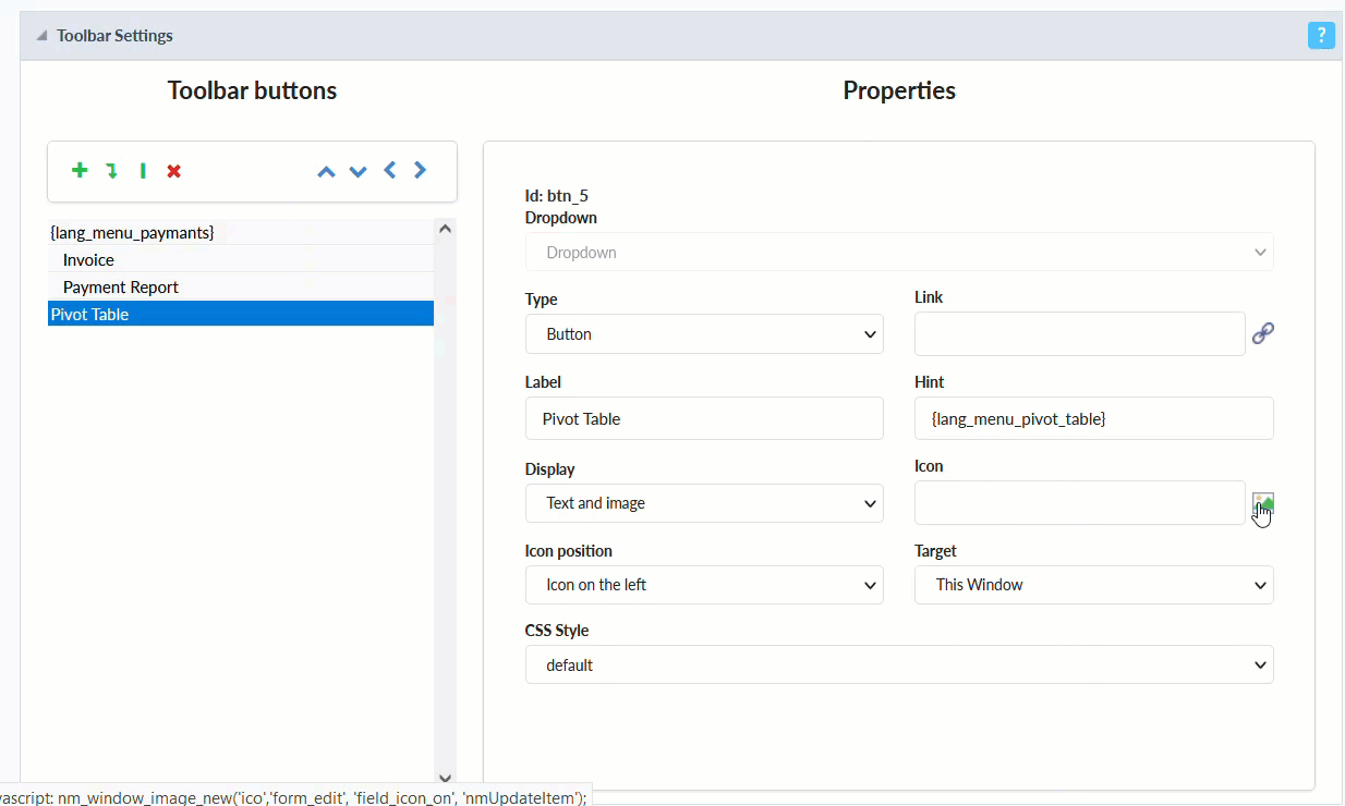
Button Properties
Properties are available by selecting one of the previously added toolbar buttons.
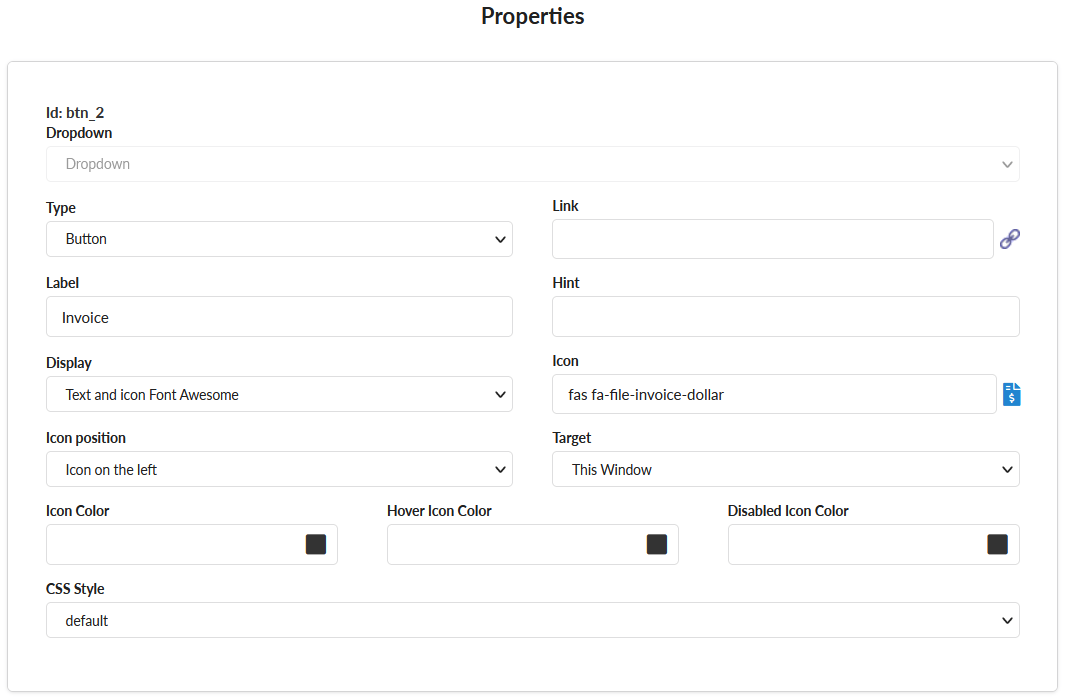
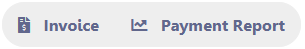
Dropdown
Defines the display format of subitems
Dropdown - The subitems displayed in the list.
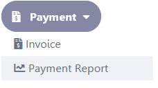
Side by side - Subitems will be displayed side by side in the toolbar.
Type
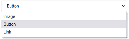
Defines the type of button that will be displayed.
The available options are:
Image
When selecting this option only the image will be displayed, without any CSS application to the button.
Below is an example of a button configured as an image
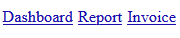
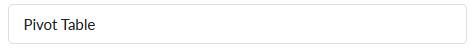
Button
Below is an example of a standard button
Link
In this option, only the button’s label will be displayed in the form of a link, without any application of css to the button.
Below is an example of a button configured as a link
Link
Allows selecting the application through his name or by a link.
Label
Defines the title that will be shown on the button when the application is run.
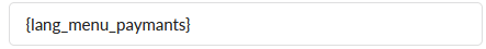
In addition to a fixed text, the Label attribute allows the use of langs to define the button’s title, making it possible to use your application in a multi-language project.
Using a fixed text
Using a lang
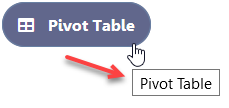
Hint
Displays a message in the hover of the button.
For the feature to work, just add a text or language in the Hint attribute, as in the example below.
Using a fixed text
Using a lang
See below the behavior of each of them:
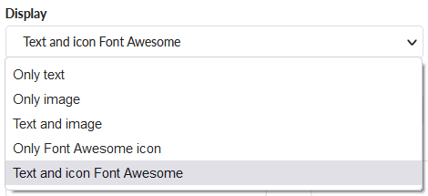
Display
Defines the way the button will be displayed on the toolbar. The options are Only text, Only image, Text and image, Only Font Awesome icon and Text and icon Font Awesome
See below the behavior of each of them:
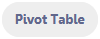
Only text
Displays only the text entered in the Label attribute.
Only image
Displays only the image informed in the Icon attribute.

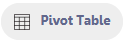
Text and image
Displays the text and image informed in the attributes Label and Icon, respectively.
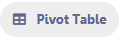
Only Font Awesome icon
Display Font Awesome icon informed in the attribute Icon.
Text and icon Font Awesome
Displays Font Awesome texts and icons, informed in the attributes Label and Icon, respectively.
Icon
Defines the icon or image that is shown on the button.
This attribute works in two ways, to select a image or Font Awesome icon, it will depend on the option selected in the Display attribute.
When selected Only image or Text and image
If on the attribute Display was selected, Only image or Text and image, you need select a image.
See how add a image
When selected Only Font Awesome Icon or Text and icon Font Awesome
If on the attribute Display was selected, Only Font Awesome Icon or Text and icon Font Awesome, you need select a Font Awesome Icon for the icon attribute.
See how add a Font Awesome Icon
![how add a Font Awesome Icon][gif_selecting_a_font_awesome_icon_attribute]
.png [gif_selecting_a_font_awesome_icon_attribute]: ../../../../assets/images/docs/app/menu/toolbar/selecting_a_font_awesome_icon_attribute.gif .png
Icon Position
Defines the position of the Text or Image (Text to the right, Image to the right).
Target
Allows defining how to display the applications: In the same window or in a new one.
Icon Color
Defines the Font Awesome icon color. If no value is informed, the icon will receive the default color of the button theme.
The icon Color option is available whenever any Font Awesome option to set in the Display attribute.
You can set the icon color in the following ways.
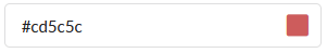
Informing a HEX code
Selecting a color
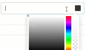
When selecting a color, the HEX value will be inserted into the field automatically.
Informing the color name
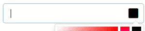
When informing the color name, the HEX value will be inserted in the field automatically.
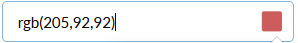
Informing a RGB code
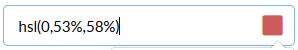
Informing a HSL code
.png gif_informing_name: ../../../../assets/images/docs/app/menu/toolbar/informing_name.gif
Hover Icon Color
Defines the Font Awesome icon color when hover in the button. If no value is informed, the icon will receive the default color of the button theme.
The Hover Icon Color option is available whenever any Font Awesome option to set in the Display attribute.
You can set the icon color in the following ways.
Informing a HEX code
Selecting a color
When selecting a color, the HEX value will be inserted into the field automatically.
Informing the color name
When informing the color name, the HEX value will be inserted in the field automatically.
Informing a RGB code
Informing a HSL code
.png gif_informing_name: ../../../../assets/images/docs/app/menu/toolbar/informing_name.gif
Disabled Icon Color
Defines the Font Awesome icon color when the button is disabled. If no value is informed, the icon will receive the default color of the button theme.
The Disabled Icon Color option is available whenever any Font Awesome option to set in the Display attribute.
You can set the icon color in the following ways.
Informing a HEX code
Selecting a color
When selecting a color, the HEX value will be inserted into the field automatically.
Informing the color name
When informing the color name, the HEX value will be inserted in the field automatically.
Informing a RGB code
Informing a HSL code
CSS Style
Define the style of the buttons