Search - Integer Field
On this page, you can configure settings related to your field of type Number. Since the use of specific symbols display until the mode in which they are displayed. And thus, boost your application.
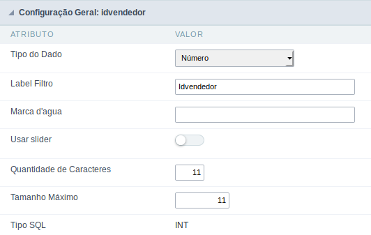
Data type:
It sets the application field type. When the field is set as Number, it is permissible to define formatting rules of integers.
Watermark
Informing a text for the watermark it will be displayed on the input text with an example of what can be reported in the field. The result after that will be configured:
Use slider:
It displays a slider component in the field. So you can increase or decrease the value sliding the cursor. You can also customize the increment value, if it increments the value 1 by 1, 2, 5, 10… N.
Amount of characters
It allows you to set the width of the input text field according to the amount of characters. However, if the quantity entered is greater than the set for the characters, the text will be pushed to the left, in order to ensure the maximum amount of characters set in the option of Values formatting.
Tipo SQL:
Reports the SQL type of the field as it is configured in the database.
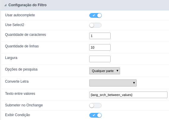
Use autocomplete:
The field turns into autocomplete automatically according to the values in the database.
Amount of characters:
Sets the amount of characters to start the search.
Number of rows:
It sets the maximum number of rows to list the search result.
Width:
it sets the width in pixels for the results.
Search options:
It sets the validation that will be made to get the search result.
Position between values:
It sets the position that objects will be displayed.
Text between values:
Text that will appear between the values.
Submit in Onchange:
Allows you to submit the filter when there are changes in the field.
Display Condition:
Allows you to display or not the condition of the filter, it will only work if the filter has at least an option.
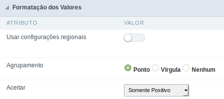
Use regional settings:
It allows you to apply regional settings to the number fields formating. When this option is not selected it will be displayed the attributes group, minus sign and negative number format.
Grouping:
It allows you to define which character is used to separate thousands. This option is only available when the option to use regional settings is disabled.
Accept:
It allows to define if the field accept only negative values, positive-only or both.
Lookup Settings
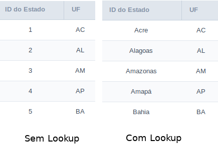
The Lookup is a way used to provide the end user a list of values description/name where the items can be selected and used in the application. For example, for a field sex that in the database is represented with M or F values can be presented as male or female dynamically with the lookup. So you will be able to retrieve these values from a database table or manually, if the reference table does not exist.
Example:
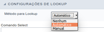
Lookup Methods
There are two lookup methods available:
Manual: To use this method it is necessary to inform the selection conditions manually to the Lookup.
Automatic: To use this method it is necessary to use a lookup query from the database to access the reference table.
Editing-automatic lookup:
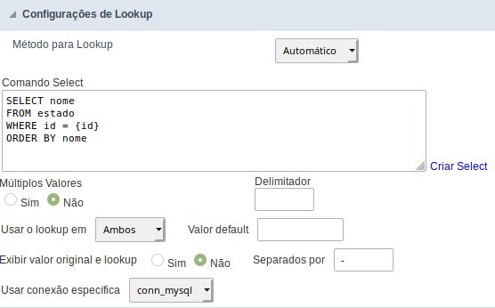
Select Command:
It sets the SQL command that will retrieve the value to display inside the Grid field. The command must have the following format
SELECT field_to_be_diplayed FROM table WHERE key_field = {grid_field}
The Grid field must be always referenced between curly braces {}, So at run time, the field braces will be replaced by its value in the table.
Multiple Options:
When the Select command informed return multiple values, the option must be selected.
Delimiter:
It sets the tab of values returned by the Select command, this option should be filled when the “Yes” option is checked in the multiple attribute options.
Use the lookup in:
Grid: It applies the lookup in all Grid modules (HTML, PDF, XML, CSV, and RTF).
Summary: It applies the lookup only to the Summary (HTML and PDF).
Both This is equivalent to check Grid and Summary options.
Default Value:
Defines a default value, used in cases where the stored value does not match any value from the list.
Display original value and lookup:
When selected No, is only displayed the value returned by the Select command. Otherwise, it returns the original value of the field and the value that is returned by the Select command separated by character set in separated by.
Separated By:
Sets the character(s) that will be used to separate the original value of the field and the value that is returned by the Select command. This option should be filled when is checked Yes in the Show original value and lookup.
Use a specific connection:
This option allows you to select another existing connection in the project, other than the current connection, to select the values for the lookup.
Edit Lookup - Manual:
Lookup used to modify the display of the field with predefined values.
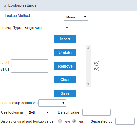
Lookup Types
It sets the operating mode of the lookup can be: single value, multiple values (delimiter), multiple values (position) and multiple values (binary).
Single value: it will be displayed only one value for the field. There is a direct replacement of the value stored in the Bank for a label defined in a list.
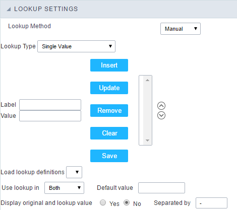
Label: Text that will be displayed in the Grid.
Value: Attribute that matches the value stored in the table. For example, the value of “M” will be replaced by “Male”.
Multiple Values (Delimiter):
By using this option it will be displayed multiple values for the selected field. The values must be separated by a delimiter to be informed. A replacement of parts from a string stored in the field, separated by a delimiter for values contained in a list.
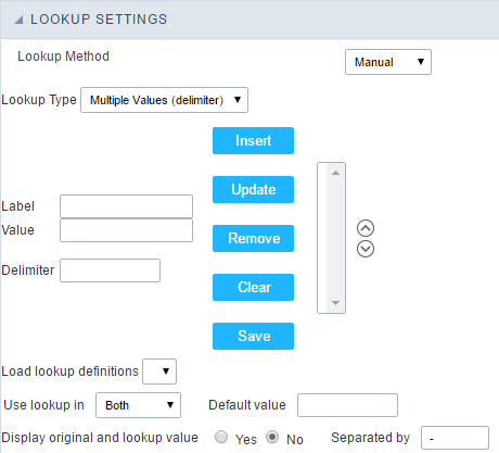
Label: Text that will be displayed in the Grid.
Value: Attribute that matches the value stored in the table. For example, the value S;M will be replaced by Sports and Movies.
Delimiter: Character used to separate the values within the same string.
Multiple Values (Position)
Allows you to recover information stored in a single string of the selected field. In order for this information to be retrieved must be informed, in addition to the label, the starting position and the number of bytes that each information occupies within the string.
As an example we will use a string to store Sex, Marital status and Hobby respectively. Sex occupies one byte, Status one byte and Hobby two bytes .
For this purpose we define the list as:
| Label | Value | Start | Size |
|---|---|---|---|
| Male | M | 1 | 1 |
| Female | F | 1 | 1 |
| Married | M | 2 | 1 |
| Single | S | 2 | 1 |
| Study | ST | 3 | 2 |
| Sportes | SP | 3 | 2 |
| Reading | LE | 3 | 2 |
Example: the string MMST would be presented in the query as: Male Married Study
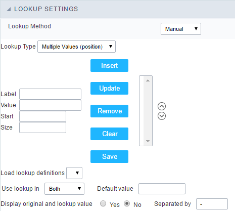
Label: Text that will be displayed in the Grid.
Value: Attribute that matches the value stored in the table. For example, the value M will be replaced by Male.
Start: : Starting position in the string where the information is recorded. The first position is always 1.
Size : Number of bytes that the information occupies in the string.
Multiple values (binary):
It allows you to retrieve several information stored in decimal form of the selected field.
As examples we will use the following list (although not informed in the interface of inclusion of values in the list, each item has a value assigned automatically according to the order):
| Assigned value | Description in Lookup |
|---|---|
| 1 | Sports |
| 2 | Culture |
| 4 | Leisure |
| 8 | Reading |
| 16 | Music |
To display the data, a decomposition of the decimal number stored in the bank is performed. For example, numbers 11 and 12 (written in the database) would be decomposed as follows:
11 = 1 + 2 + 8 = (Sports - Culture - Reading)
| Assigned value | Description in Lookup |
|---|---|
| 1 | Sports |
| 2 | Culture |
| 4 | Leisure |
| 8 | Reading |
| 16 | Music |
12 = 4 + 8 = ( Leisure - Reading)
| Assigned value | Description in Lookup |
|---|---|
| 1 | Sports |
| 2 | Culture |
| 4 | Leisure |
| 8 | Reading |
| 16 | Music |
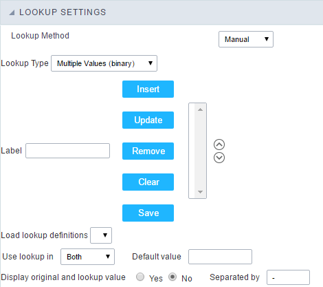
Label:
Text that will be displayed in the Grid.
Include Button:
Includes in the list the values populated in the Label and value fields.
Alter Button:
It changes the attributes of the selected item.
Delete Button:
Deletes the selected item.
Clean Button:
It cleans the fields
Save Button:
Allows the user to save the entire list, for later use using the Load Lookup definition option.
Load Lookup definition:
Allows you to load a predefined value list for use as a lookup.
Use the lookup in:
Grid: It applies the lookup in all Grid modules (HTML, PDF, XML, CSV, and RTF).
Summary: It applies the lookup only to the Summary (HTML and PDF).
Both This is equivalent to check Grid and Summary options.
Default Value:
Defines a default value, used in cases where the stored value does not match any value from the list.
Display original value and lookup:
When selected No, is only displayed the value returned by the Select command. Otherwise, it returns the original value of the field and the value that is returned by the Select command separated by character set in separated by.
Separated By:
Sets the character(s) that will be used to separate the original value of the field and the value that is returned by the Select command. This option should be filled when is checked Yes in the Show original value and lookup.
Display Settings
The Display Settings allows to define the CSS for the fields individually. For each Display Settings of Scriptcase, exists the same attributes available for this interface.
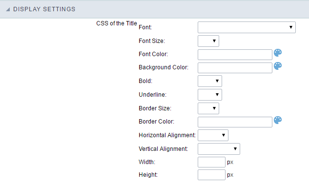
- CSS of the Title
- Font : Allows to choose the font type, that will be applied to the application field title.
- Font Size : Allows to choose the the font size, that will be applied to the application field title.
- Font Color :Allows to choose a color for the font from the color pallet.
- Background Color : Allows to define the color for the field, the color can be selected from the color pallet.
- Bold : Applies the bold style to the font.
- Underline : Applies the underline style to the font.
- Border Size : Applies the border size to the title of the field.
- Border Color : Allows to choose a color for the border, using a color pallet to apply to the title.
- Horizontal Alignment : Allows to position the label of the field in the desired position (left,right,center and justify).
- Vertical Alignment : Allows to position the label of the field in the desired position (baseline, sub, super, top, text-top, middle, bottom, text-bottom).
- Width : To define a width for the title of the field.
- Height : To define a height for the title of the field.
- CSS of the Field
- Font : Allows to choose the font type, that will be applied to the application field.
- Font Size : Allows to choose the the font size, that will be applied to the application field.
- Font Color :Allows to choose a color for the font from the color pallet.
- Background Color : Allows to define the color for the field, the color can be selected from the color pallet.
- Bold : Applies the bold style to the font.
- Underline : Applies the underline style to the font.
- Border Size : Applies the border size to the field.
- Border Color : Allows to choose a color for the border, using a color pallet to apply to the field.
- Horizontal Alignment : Allows to position the field in the desired position (left,right,center and justify).
- Vertical Alignment : Allows to position the field in the desired position (baseline, sub, super, top, text-top, middle, bottom, text-bottom).
- Width : To define a width for the field.
- Height : To define a height for the field.
- CSS of the Input Object
- Font : Allows to choose the font type, that will be applied to the Input Object. For example: Radio, Select, Text, etc
- Font Size : Allows to choose the the font size, that will be applied to the application field.
- Font Color :Allows to choose a color for the font from the color pallet.
- Background Color : Allows to define the color for the Input Object, the color can be selected from the color pallet.
- Bold : Applies the bold style to the font.
- Underline : Applies the underline style to the font.
- Border Size : Applies the border size to the Input Object.
- Border Color : Allows to choose a color for the border, using a color pallet to apply to the Input Object.
- Horizontal Alignment : Allows to position the Input Object in the desired position (left,right,center and justify).
- Vertical Alignment : Allows to position the Input Object in the desired position (baseline, sub, super, top, text-top, middle, bottom, text-bottom).
- Width : To define a width for the Input Object.
- Height : To define a height for the Input Object.
Help Settings
Allow the developer to set up instructions and hints about the field’s use, allowing the developer to help the users about the system usage.
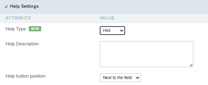
Description of the settings attributes.
Help Description
In this area, you can set up a text that will be shown in the application according to the type of help selected below.
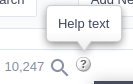
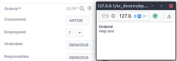
Help Type
Hint
Display a default icon ? beside the field. When the mouse is above the icon a help text will be displayed.
Text
Display a text inside of a <span></span> beside the field.

Pop-up
Display a default icon ? beside the field. To display the message just click in the icon that a Pop-up will be displayed with the help text.
The icon displayed when selecting the types Hint or Pop-up vary according to the theme that is being used in the application. This icon can be modified in the CSS Buttons.
Tippy
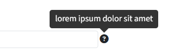
Displays a standard ? icon next to the field. When you hover the mouse over the icon, the message will be displayed in a more user-friendly way.
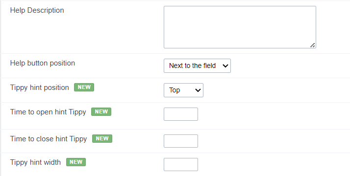
Help type settings (Tippy)
-
Help Description : Defines where the field’s help button will be displayed
-
Help button position : Defines the display position of the Tippy hint in relation to the field’s help icon
-
Time to open hin Tippy : Defines the time in milliseconds for the Tippy hint to be displayed after the mouse passes over the help icon.
-
Time to close hin Tippy : Sets the time in milliseconds for the Tippy hint to be hidden after the mouse leaves the help icon.
-
Tippy hint width : Sets the width of the Tippy hint in pixels.
Help button position (except Tippy)
Allow to set up where the help button will be displayed in the field, there are two options:
Beside: The help icon will be displayed beside the field.
Column: The help icon will be displayed beside the label of the field.