Search Application Mobile Optimization
The Mobile settings allows to define the automatic optimization of generated applications to run on mobile devices.
See below the available settings.
Enable mobile optimization
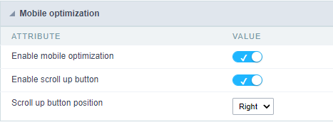
This option changes how the application HTML elements works, adapting them automatically to run on mobile devices.
It enables this option by default when creating a new application.
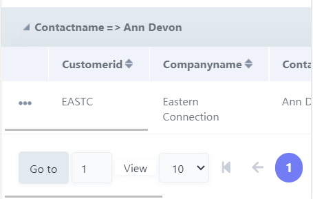
See some examples of adapted screen:
Enable back to top button
It enables the displaying of the button back to top button in the Grid, Filter, Detail and Summary modules.

It enables this option by default when creating a new application.
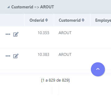
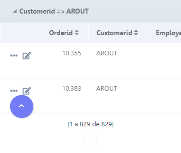
Back to top button position
Defines the position of the back to the top button:
The options are:
- Right - Position the button in the bottom right corner;
- Left - Position the button in the bottom left corner;
When creating a new application, the button is configured on the right by default.
See below for placement examples.
Button in the bottom right corner
Button in the bottom left corner
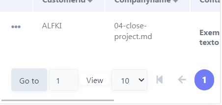
Pin the bottom toolbar
Defines the behavior of the lower toolbar when running the application on mobile devices with the Simplified toolbar option disabled.
When enabling these options, the lower toolbar will behave similarly to the upper toolbar, remaining fixed on the screen and thus facilitating access to the configured resources.
Example of fixed bottom toolbar
If you choose to uncheck this feature, the lower toolbar will be fixed at the end of the application, so access to the configured buttons will only be available when scrolling to the end of the page.
Example of Traditional Toolbar
This setting is available when the Simplified Toolbar options is turned off.