Calendar - Multiple Lines Text Field
General Settings
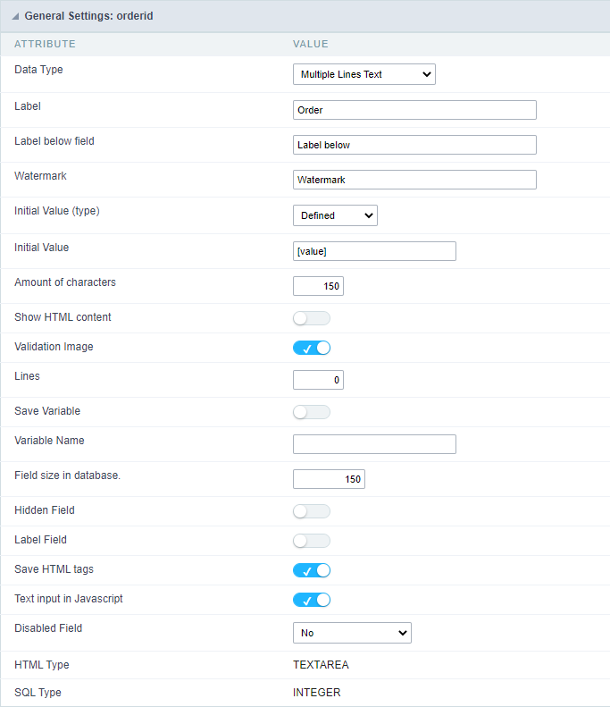 Multiple Lines Text field configuration Interface.
- Data Type : Define the type of field for the application. When set to Multiple Lines Text , you can inform a Text value to the field in multiple lines.
-
Label : Defines the title of a field in the application. For example: if the field is defined in the database as cmp_name_client, it will be more clear for the comprehension of the user if the name would be “Client Name”.
- Label below field : Defines the message to be displayed below the field.
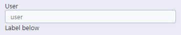
- Watermark : Create a placeholder for the selected field.
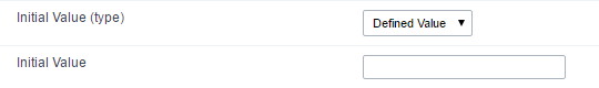
- Initial Value (type) : Allows you to define the initial value for the field when in insert mode. The options are:
- Defined Value : The field will receive the value from the text field of the defined value option.
- System Date : The field will receive the current server date.
If you select the System Date, then it is not necessary to inform the Initial Value attribute.
- Initial Value : you will inform the Defined Value here.
 Initial Value Configuration Interface.
- Amount of characters : Define the amount of characters allowed for the field.
- Validation Image : Allows to display an image next to the field when it is being validated.
-
Lines : Allows to define the amount of lines that the field will have at start.
- Save Variable : Allows to save a variable in the session with the value of the field, that can be used in other applications. For example, in the login form the user name can be saved in the session so that it can be displayed on the header of other applications.
- Variable Name : Allows to define the name for the session variable that will receive the field value.
- Field size in database : Determines the field size in bytes. it is used to determine the max size of characters that is allowed to type in.
- Hidden Field : This option makes the field hidden, but still allows it’s value to be processed through JavaScript or PHP.
- Label Field : This options make the field behave as a Read Only field, not allowing modifications to its value while in Insert or Update Mode.
 Label Configuration Interface.
- Save HTML tags : This option allows to save the HTML content of the field to the database.
- Text input in JavaScript : Allows to save JavaScript code informed in the field to the database.
- Disabled Field : Defines if the field will be disabled in “Insert Mode”, “Update Mode” or in “Insert and Update Mode”.
- HTML Type : HTML Object that will be used to display the field in the form.
- SQL Type : Informs the data type of field in the database.
Values Format
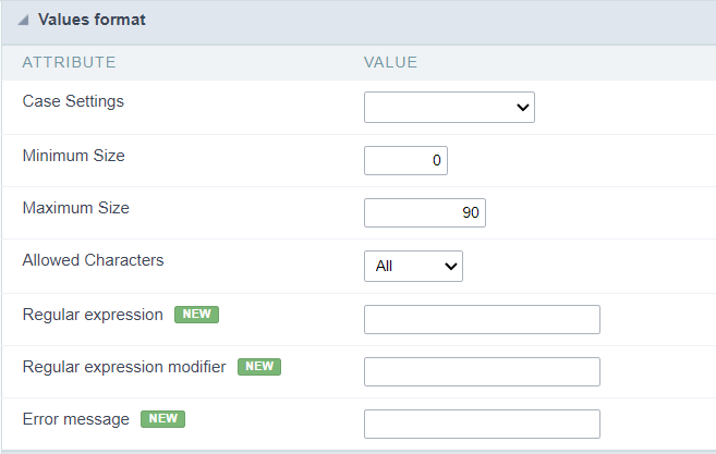 Format of Values Interface
Case Settings
Allows converting the letters of the field when it loses focus. The options are: Uppercase, Lowercase, Capitalize the first word, Capitalize all words.
Minimum Length
Determines the minimum number of characters a user must enter in the field.
Integer values greater than or equal to 0 must be provided.
Maximum Length
Determines the maximum number of characters a user can enter in the field.
Integer values greater than or equal to 0 must be provided.
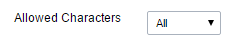
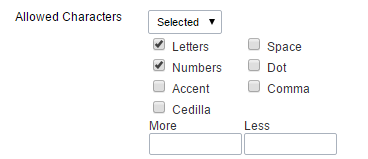
Allowed Characters
Allows to select a set of characters that can be typed into the field. The options are:
-
All : Allows any type of character to be typed into the field
-
Selected : Defines a set of characters allowed. Using the configuration below, will be allowed to type letters, numbers and other characters (defined in the attribute More). The letters a, b and c (defined in the Less Attribute) are not allowed.
Regular expression
Regular expression used to validate field content.
Regular expression modifier
Modifiers used in the field content validation regular expression.
Error message
Message to be displayed if the regular expression is not valid.
Database Value
Allows to define a value to be saved to the database.
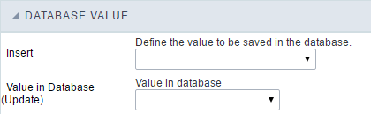 Database Values configuration Interface.
- Defined Value : Allows to specify the fixed value associated to global variables.
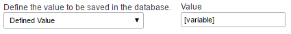 Defined Value configuration Interface.
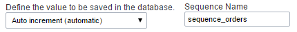
- Auto Increment (automatic) : Allows to use the increment generated by the database. Used only when the field of the database is the type AUTO INCREMENT or similar. For the databases that use sequence like Oracle, PostGres and Firebird, it is necessary to inform the name of the sequence.
 Auto Increment configuration Interface.
- Auto Increment (manual) : The application generated simulates an auto increment on the field. To include a value to the field it will automatically calculate the next id.
- Date of Insertion : When inserting a record, the field will contain the server date as a value.
- Data of Update : When updating a record, the value of the field will be the date of the server.
- User IP : The field will receive the IP of the machine that the application is be accessed by.
- Calculated by the database : The value of the field will be applied by the database. The field will not be used in update processes. For example: it will be updated by a Trigger.
- Null : The field will be informed the value null.
Lookup Settings
Method used to place a description next to the field.
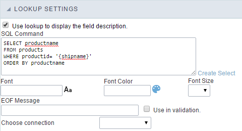
- Use lookup to display the field description. : When enabled, the lookup settings is enabled and opens more settings.
- SQL Command : Defines the SQL command that is going to recover the vales from the database. To build a SQL command, it is possible to use the SQL Builder tool. The SQL format needs to have the following format:
SELECT Field_displayed FROM table WHERE Key_Field = '{Form_Field}'
The Form field needs to be referenced buy the curly brackets {}. While running the application, the field within the curly brackets is replaced by it’s value in the table.
- Font : Defines the font used to display the lookup.
- Font Color : Defines the color in HEX for the lookup display.
- Font Size : Defines the font’s size in the lookup display.
- EOF Message : Defines a message that will be displayed if there is not any results for the record.
- Use in validation : When enabled, it will generate an automatic validation based on the lookup, in case there is not any records found, the message will display as a warning (when Updating or Including a record).

- Choose connection : Allows you to select another specific connection existing in the project. The select command will be done on the second connection.
Display Settings
The Display Settings allows to define the CSS for the fields individually. For each Display Settings of Scriptcase, exists the same attributes available for this interface.
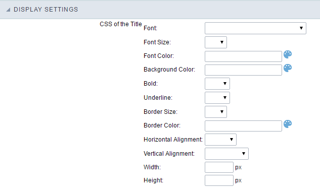
- CSS of the Title
- Font : Allows to choose the font type, that will be applied to the application field title.
- Font Size : Allows to choose the the font size, that will be applied to the application field title.
- Font Color :Allows to choose a color for the font from the color pallet.
- Background Color : Allows to define the color for the field, the color can be selected from the color pallet.
- Bold : Applies the bold style to the font.
- Underline : Applies the underline style to the font.
- Border Size : Applies the border size to the title of the field.
- Border Color : Allows to choose a color for the border, using a color pallet to apply to the title.
- Horizontal Alignment : Allows to position the label of the field in the desired position (left,right,center and justify).
- Vertical Alignment : Allows to position the label of the field in the desired position (baseline, sub, super, top, text-top, middle, bottom, text-bottom).
- Width : To define a width for the title of the field.
- Height : To define a height for the title of the field.
- CSS of the Field
- Font : Allows to choose the font type, that will be applied to the application field.
- Font Size : Allows to choose the the font size, that will be applied to the application field.
- Font Color :Allows to choose a color for the font from the color pallet.
- Background Color : Allows to define the color for the field, the color can be selected from the color pallet.
- Bold : Applies the bold style to the font.
- Underline : Applies the underline style to the font.
- Border Size : Applies the border size to the field.
- Border Color : Allows to choose a color for the border, using a color pallet to apply to the field.
- Horizontal Alignment : Allows to position the field in the desired position (left,right,center and justify).
- Vertical Alignment : Allows to position the field in the desired position (baseline, sub, super, top, text-top, middle, bottom, text-bottom).
- Width : To define a width for the field.
- Height : To define a height for the field.
- CSS of the Input Object
- Font : Allows to choose the font type, that will be applied to the Input Object. For example: Radio, Select, Text, etc
- Font Size : Allows to choose the the font size, that will be applied to the application field.
- Font Color :Allows to choose a color for the font from the color pallet.
- Background Color : Allows to define the color for the Input Object, the color can be selected from the color pallet.
- Bold : Applies the bold style to the font.
- Underline : Applies the underline style to the font.
- Border Size : Applies the border size to the Input Object.
- Border Color : Allows to choose a color for the border, using a color pallet to apply to the Input Object.
- Horizontal Alignment : Allows to position the Input Object in the desired position (left,right,center and justify).
- Vertical Alignment : Allows to position the Input Object in the desired position (baseline, sub, super, top, text-top, middle, bottom, text-bottom).
- Width : To define a width for the Input Object.
- Height : To define a height for the Input Object.
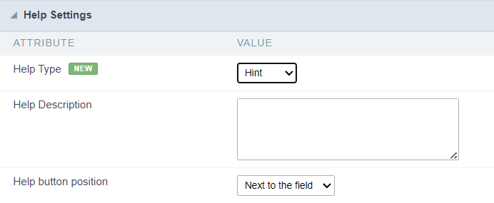
Help Settings
Allow the developer to set up instructions and hints about the field’s use, allowing the developer to help the users about the system usage.
Description of the settings attributes.
Help Description
In this area, you can set up a text that will be shown in the application according to the type of help selected below.
Help Type
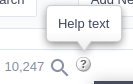
Hint
Display a default icon ? beside the field. When the mouse is above the icon a help text will be displayed.
Text
Display a text inside of a <span></span> beside the field.

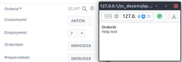
Pop-up
Display a default icon ? beside the field. To display the message just click in the icon that a Pop-up will be displayed with the help text.
The icon displayed when selecting the types Hint or Pop-up vary according to the theme that is being used in the application. This icon can be modified in the CSS Buttons.
Tippy
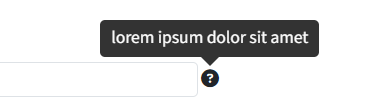
Displays a standard ? icon next to the field. When you hover the mouse over the icon, the message will be displayed in a more user-friendly way.
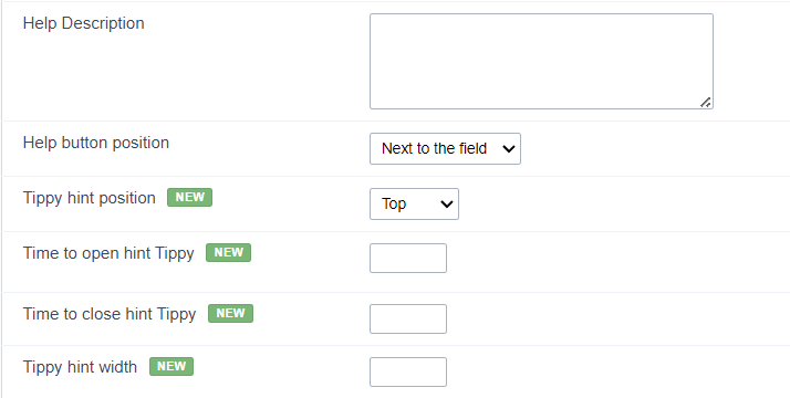
Help type settings (Tippy)
-
Help Description : Defines where the field’s help button will be displayed
-
Help button position : Defines the display position of the Tippy hint in relation to the field’s help icon
-
Time to open hin Tippy : Defines the time in milliseconds for the Tippy hint to be displayed after the mouse passes over the help icon.
-
Time to close hin Tippy : Sets the time in milliseconds for the Tippy hint to be hidden after the mouse leaves the help icon.
-
Tippy hint width : Sets the width of the Tippy hint in pixels.
Help button position (except Tippy)
Allow to set up where the help button will be displayed in the field, there are two options:
Beside: The help icon will be displayed beside the field.
Column: The help icon will be displayed beside the label of the field.