Procedure - Percent Field
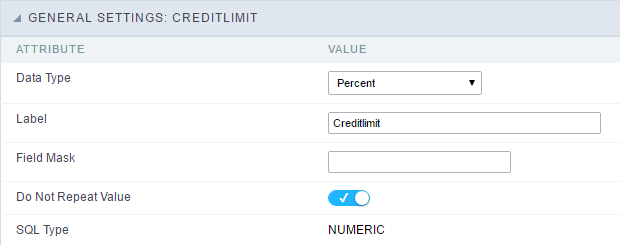
General Settings
 Percentage field Configuration Interface.
Data Type
Define the field type to Percentage.
Label
The Label option lets you define the title of a field. Example: If the database field name is “cmp_name_client”, You can display a different name for the user, like “Client Name”.
Accumulated
It defines the field to accumulate values of another field. This option is only available for virtual fields.
Accumulator field
It is available when the option “Accumulated” is enabled. This configuration defines which field will accumulate the values. The field should be Integer, Currency, or Decimal.
Grid Mask
It defines a mask for the field value. There is two types of masks:
| Character | Description |
|---|---|
| X | It sets the placeholder to any character for replacing. If the entered number of characters is less than the mask size, It completes the field value with zeros (Filling full-size field entry is required). |
| Z | It sets the placeholder to any character for replacing, but it suppresses zeros at field left (Complete field filling is optional). Use it on the left when combined with the X mask. |
Mask Examples
| Mask | Field Value | Formatted Value |
|---|---|---|
| (xx) xxxx - xxxx | 1234567890 | (12) 3456 - 7890 |
| (xx) xxxx - xxxx | 12345678 | (00) 1234 - 5678 |
| (zz) xxxx - xxxx | 1234567890 | (12) 3456 - 7890 |
| (zz) xxxx - xxxx | 12345678 | ( ) 1234 - 5678 |
| (zz) xxxx - xxxx | 0012345678 | ( ) 1234 - 5678 |
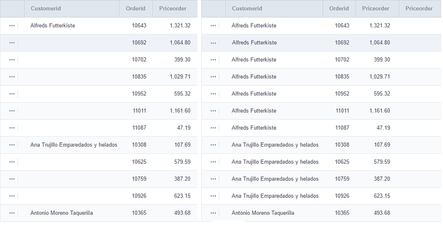
Do Not Repeat Value
Do not repeat the value of the field if it is the same as the previous record.
SQL Type
It informs the data type of field in the database.
Values Format
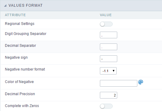 Format of Values with Regional Settings.
Regional Settings
It allows applying the Regional Settings to format the dates of the field. When not enabled, it displays the attributes Grouping, Negative Symbol and negative number format.
Digit Grouping Separator
It defines the character to separate the thousands.
Decimal Separator
It defines the decimal separator.
Negative sign
It defines the character to represent negative numbers.
Negative number format
It defines the position of the Negative sign.
Color of Negative
It defines a color for the field when the value is negative.
Decimal Precision
It defines the number of decimal places for the field.
Complete with zeros
Defines the decimal places that will or not be completed zeros to the right. Example: The value is 125,50, but the decimal precision is 3. If the option is enabled, then the value will 125,500.
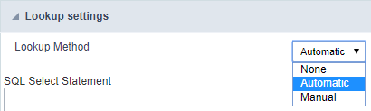
Lookup Settings
A method used to offer the user a list of values that can be selected in the form applications. For example, the gender field in the Database with the values M or W can be presented like Man or Women or in a dynamic way, having these values recovered from the database.
- Lookup Methods
You will have available two types of lookup methods: Manual (informing manually the conditions of the select) or Automatic (using a database query).
- Lookup Method - Automatic
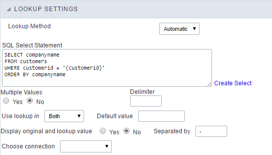
- SQL Select Statement : Define the SQL command that will recover the values that will be displayed on the form field. The command needs to have the following structure:
SELECT display_field FROM table WHERE key_field = {grid_field}
The Grid field needs to be referenced buy the curly brackets {}. While running the application, the field within the curly brackets is replaced by it’s value in the table.
- Multiple Values : When enabled, allows to select more than one item from the list, separated by a delimiter.
- Delimiter : Defines the character used to separate the values selected in the form. Only inform a value to this field if you need to separate the selected options with a different delimiter then (;).
- Use lookup in :
- Grid : Applies the lookup to all the Grid formats (HTML, PDF, XML , CSV and RTF).
- Summary : Applies the lookup only for the summary (HTML and PDF).
- Both : Applies to both the Grid and Summary.
- Default value : Defines the default value, used in the cases where the select command does not return any values.
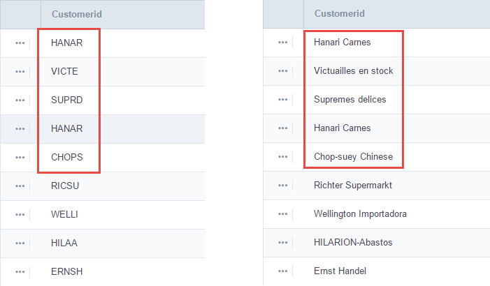
- Display original and lookup value : When selected No, its displayed on it the value from the select command. Otherwise, it will be displayed the original value of the field and the value returned from the select command separated by the character in the “Separated by” field.
- Separated by : Defines which character will be used to separate the values of the field with the value returned from the lookup. It is only necessary to inform this value of the option Display original and lookup value is enabled.
- Choose connection : Allows you to select another specific connection existing in the project. The select command will be done on the second connection.
Lookup Method - Manual
This method is used so that the developer can create manually the list of values that will be saved to the generated application. This method is mostly used when the database does not have a table that contains this information.
- Lookup Type : Define the functionality of the lookup, being: Single Value, Multiple Values (delimiter), Multiple Values (position) and Multiple Values (binary).
- Single Value :
It will be displayed only one value for the field. And it will replace the stored value from the table with the one defined on the item label.
- Label : Text that will be displayed in the item list of the select field.
-
Value : Attribute that corresponds to the value that is stored in the table field. For example, the value M will be included into the table when the user will view in the list Man.
- Multiple Values (Delimiter)
It can be displayed various values for the selected field. The values should be separated by a delimiter that will be informed. It is done a replacement on the parts of the field, separated by the delimiter, with the values contained in the list.
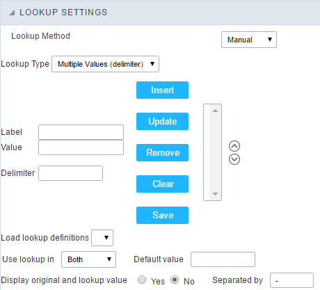
- Label : Text that will be displayed in the item list of the select field.
- Value : Attribute that corresponds to the value that is stored in the table field. For example, the value M will be included into the table when the user will view in the list Man.
-
Delimiter Characters used to separate Multiple Values in the table field. If not informed, the default delimiter is a semi coma (;).
- Multiple Values (position)
Allows to store a diversity of information selected on the field in only one string. For this information to be added, you need to inform the label, initial position and the number of bytes that each information occupies on a string.
For this example, Gender, Marital status and Hobby were used. Gender uses one byte as does the Martial Status, the Hobby will use two bytes.
The example below:
| Label | Value | Start | Size |
|---|---|---|---|
| Man | M | 1 | 1 |
| Women | W | 1 | 1 |
| Divorced | D | 2 | 1 |
| Single | S | 2 | 1 |
| Study | SD | 3 | 2 |
| Sports | SP | 3 | 2 |
| Read | RD | 3 | 2 |
Example: Of you choose Man, Single and Read, in database would be stored the following value MSRD.
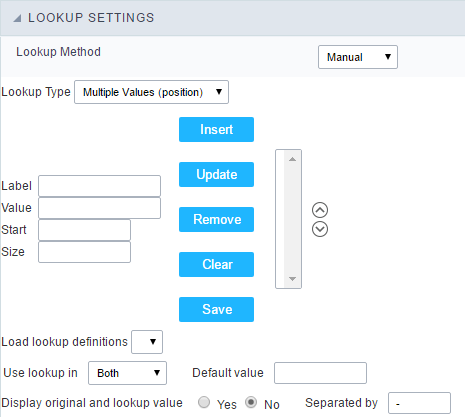
- Label : Text that will be displayed in the Grid.
- Value : Attribute that corresponds to the value that is stored in the table field. For example, the value M will be included into the table when the user will view in the list Man.
- Start : Starting position of the string that is going to be stored. The first position is always 1.
- Size : Amount of bytes that is going to occupy in the string.
Multiple Values (binary)
Allows to store a diversity of information selected on the field in only one value.
In this example uses the following list (although it is not informed when inserting values to the list, each item has a value applied automatically according to the order):
| Attribute Value | Lookup Description |
|---|---|
| 1 | Sports |
| 2 | Culture |
| 4 | Pleasure |
| 8 | Reading |
| 16 | Music |
To store the data, it is done an internal sum of the decimal number. See the examples below.
Example 1: If the options Sports and Culture were selected, the number stored in the table would be 3.
| Attribute Value | Lookup Description |
|---|---|
| 1 | Sports |
| 2 | Culture |
| 4 | Pleasure |
| 8 | Reading |
| 16 | Music |
1 (Sports) + 2 (Culture) = 3
Example 2: If the options Sports, Pleasure and Reading were selected, the number stored in the table would be 13.
| Attribute Value | Lookup Description |
|---|---|
| 1 | Sports |
| 2 | Culture |
| 4 | Pleasure |
| 8 | Reading |
| 16 | Music |
1 (Sports) + 4 (Pleasure) + 8 (Reading) = 13
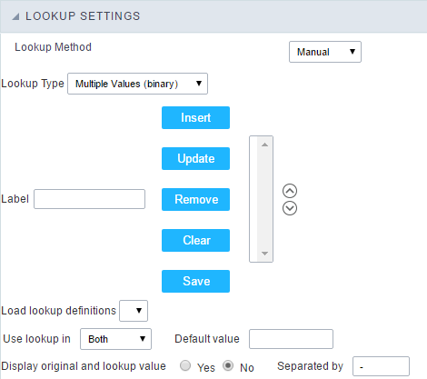
- Label : Text that will be displayed in the Grid.
- Insert Button : Adds to the list the values informed on the fields Label and Value.
- Update Button : Modifies the attributes of the selected item.
- Remove Button : Remove the selected item from the list.
- Clear Button : Clear the Fields.
- Save Button : Allows the user to save all the items of the list, to use on other fields, just click on Load lookup definition.
-
Load lookup definitions : Allows to refresh the list of values predefined when using the lookup. It will be listed the existing definitions in ScriptCase and the ones saved by the user.
- Use lookup in :
- Grid : Applies the lookup to all the Grid formats (HTML, PDF, XML , CSV and RTF).
- Summary : Applies the lookup only for the summary (HTML and PDF).
- Both : Applies to both the Grid and Summary.
- Default value : Defines the default value, used in the cases where the select command does not return any values.
- Display original and lookup value : When selected No, its displayed on it the value from the select command. Otherwise, it will be displayed the original value of the field and the value returned from the select command separated by the character in the “Separated by” field.
- Separated by : Defines which character will be used to separate the values of the field with the value returned from the lookup. It is only necessary to inform this value of the option Display original and lookup value is enabled.
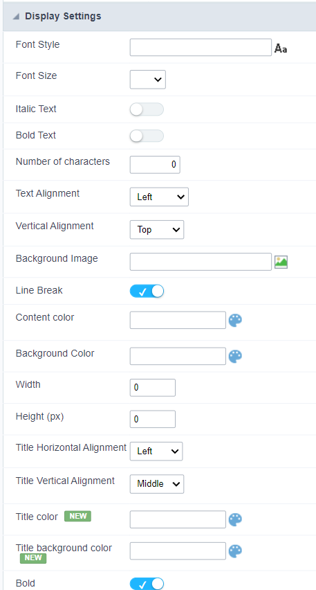
Display Settings
The Display Settings allows to define the CSS values individually for each field. For each Display schema of scriptcase, there are the same attributes available in Interface.
Display Settings configuration Interface.
- Display Settings
- Text Font : Allows choosing the font type, which will be applied in the application field.
- Font Size : Allows choosing the font size, which will be applied to the application object.
- Italic Text : Allows to apply the italic type in the font.
- Bold Text : Allows you to apply bold type to the font.
- Number of characters : Number of characters to display.
- Text Alignment : Allows you to position the field in the desired location (left, right, center and justified).
- Vertical Alignment : Allows you to position the field in the desired location (top, middle or bottom).
- Background Image : Allows you to add a background image to the field.
- Line Break : Enables the possibility of a line break for the field.
- Content color : Changes the content color of the query field and the grouped field, when available.
- Background color : Allows choosing the color, using a color palette to be applied as the background of the application field.
- Width : To define the width of the field.
- Height : To set the height of the field.
- Title Horizontal Alignment : Allows you to define the horizontal alignment for the field title (left, right or centered).
- Title Vertical Alignment : Allows you to define the vertical alignment for the field title (top, middle or bottom).
- Title color : Allows you to choose a color for the field title using a color palette.
- Title background color : Allows choosing a color for the background of the field title using a color palette.
- Bold : Displays the field title in bold
Line Chart
Using this guide, you can define ac chart for each line.
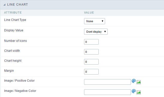
- Line Chart Type : There are two types of charts that can be used. Below you can see their description:
-
Bar Chart : This option allows to display a bar chart relating to the column that you are working with. The size of the bars is done by math relating to the Grand Total of the column. The value informed in the width of the chart defines the size of the images that will be displayed.
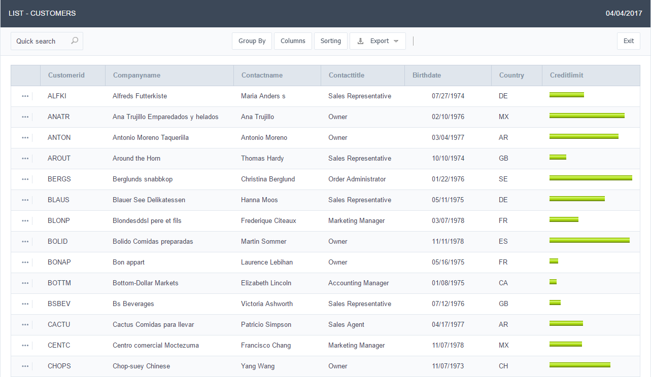
In the example shown above, the width of the Chart is 200 pixels.
-
Line Chart : This option allows to display a Line Chart relating to the column that you are working with . The amount of lines are done by dividing the value of a column by the value informed to the number of icons.
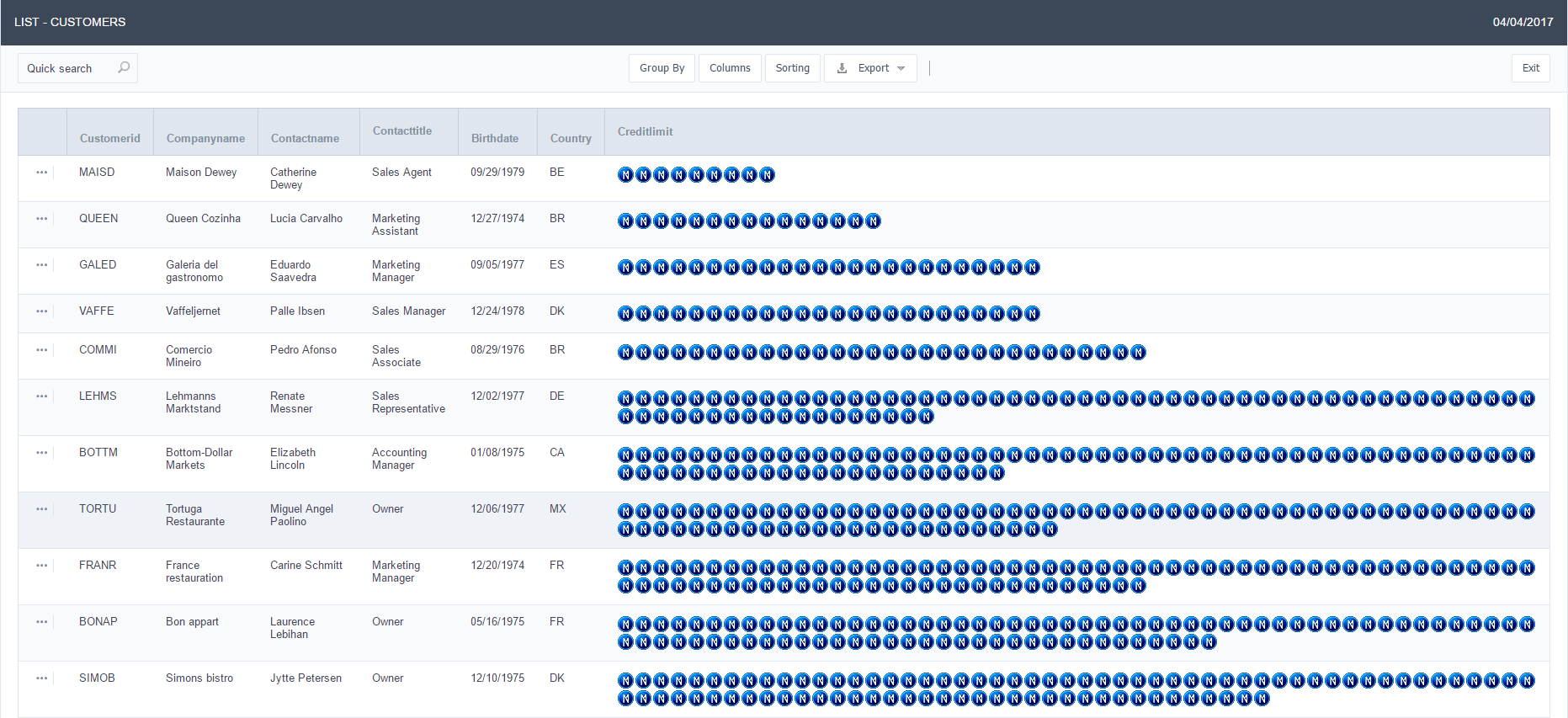
In the example above, the field Number of Icons, it was informed the value 1000, so the number of stars besides, it determined by dividing the displayed value by 1000.
- Display Value : It will display the value and the chart at the same time, the value being on the left or right side of the bar or lines.
- Number of Icons : Determines the amount of icons (figures) that will appear for each value on this field. This value will be presented by the dividing the value of the column by the Number of Icons.
- Chart width : Width of the chart in pixels. This field is used by the option Bar Chart. In case it is not informed, the value used is 200 pixels.
- Chart height : Height of the chart in pixels. This field is used by the option Bar Chart.
- Margin : Charts margin. This option is only used by the bar chart.
- Image / Positive Color : The way that it is informed will variate depending on the options below:
- Bar Chart : Inform a color for the field that will be used to form the chart image. Click the icon beside to choose the color.
- Line Chart : Inform an image name for the field that will be used like an icon. Click the icon beside to choose the image “Icon”.
- Image / Negative Color : The information passed to this field follows the same criteria as the Image / Positive Color field. This parameter will be used in the case the value is negative.
//## PDF Configuration {#id-06}
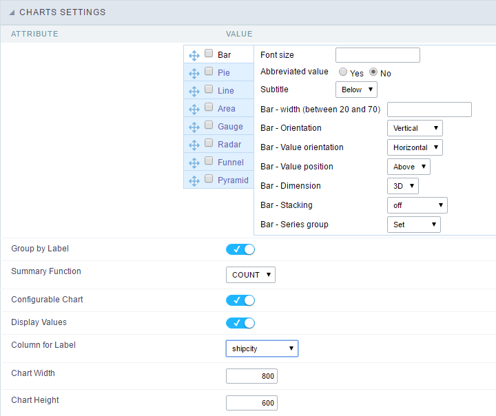
Chart Settings
By using this option, you will see an icon on the Field Title, this icon displays a chart relating to the field.
On this type option you need to choose two columns to build the chart. The first one is the field its self that you are working with, and the second one is the you chose and is called “Column for Label”.
 Bar Chart Interface.
- Group by Label : Groups the values of the column by the label. Similar to the effect of the group by of the a Select.
- Summary Function : Function that summarizes the data applied to the column. The functions that can be used on the field are the following: Count, Sum, Max, Min and Avg.
- Configurable Chart : Allows the user to setup the parameters of the chart creation when the application is running.
- Display Values : Displays the values of the generated chart.
- Column for Label : Selecting the column that will be the label for the field.
- Chart Width : Width of the chart, in pixels.
- Chart Height : Height of the chart, in pixels.
Chart Layout
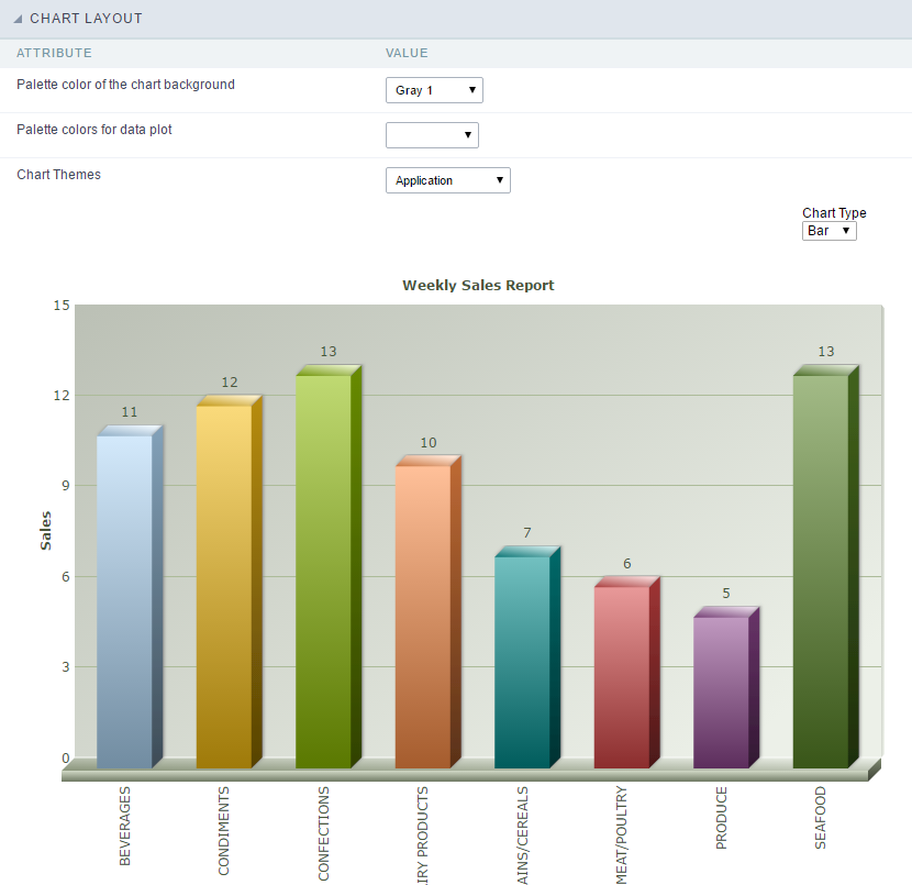 Chart layout settings interface.