Procedure - Rating Field
This field allows the developer to create a field to display the data previously added using stars (or any other image).
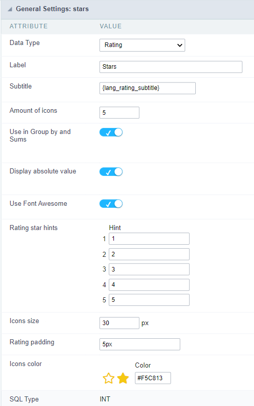
Attribute descriptions
Data Type
Define the field type to Rating.
Label
The Label option lets you define the title of a field. Example: If the database field name is “Stars”, You can display a different name for the user, like “Stars”.
Besides use a fixed text, the Label attribute allows the use of Langs to define the field title, allowing the internationalization of your application.
Subtitle
Define the subtitle of the field, below the ratings. Example: “Thank you for your feedback!”.
As in the Label, the subtitle attribute also allows the use of Langs for the internationalization of your application.
Amount of icons
It defines how many icons it will display in the field. The value set in this attribute must be according to the evaluation rules.
Use in Group by and Sums
Allows the field to be used instead of the value when the field is selected in the (static or dynamic) group by or in the totalization of the summary. To do this, just add the fields in the dynamic or static group by column to be able to visualize the grouping performed in the query.
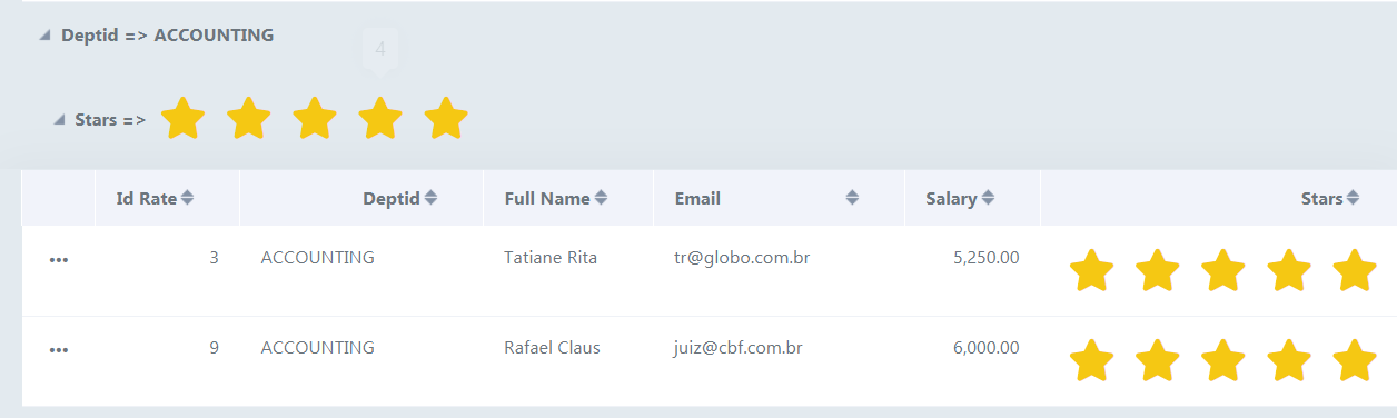
Example of the Rating field in the summary.
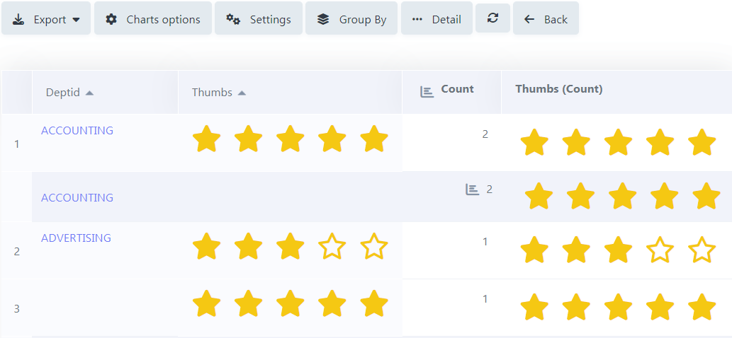
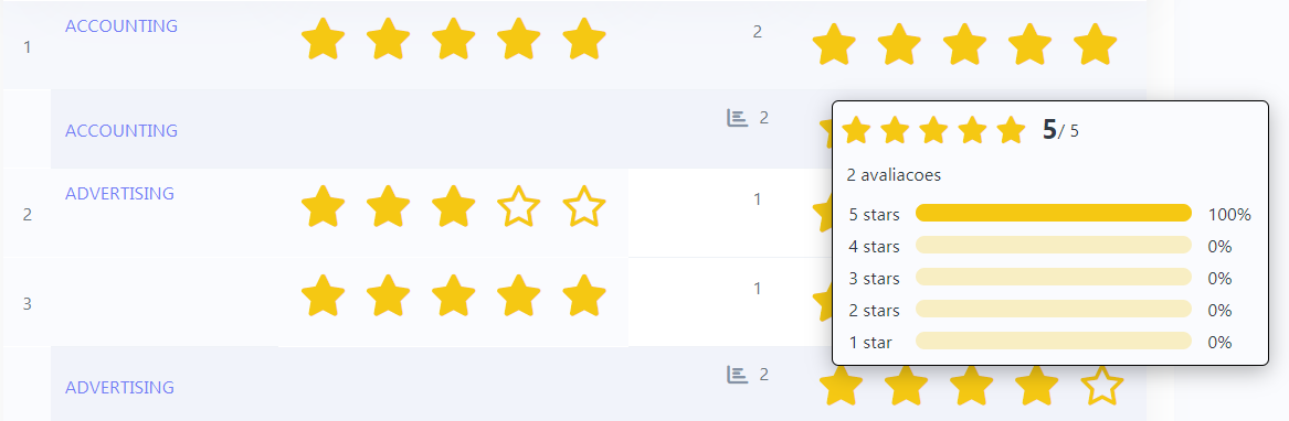
In the summary, when hovering the mouse over the field, a small window detailing the ratings that were carried out both in each record and in total will be displayed, as shown in the image below.
Display absolute value
Allows the exact number of ratings that each star received to be displayed in the detailing window, next to the percentage, when summing up the summary.
With this flag turned off, the grouping will only display the voting percentage, leaving out the exact number of ratings.
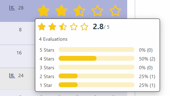
In the case of the result of the ratings, this result is calculated through the weighted average (Sum/Total of Evaluations) as in the example below:
For example: in the image above, we have a total of 4 ratings carried out, where:
0 rating for 5 stars
2 ratings for 4 stars
0 rating for 3 stars
1 rating for 2 stars
1 rating for 1 star
Considering that the number of stars refers to the weight each one has, we have the following:
5 stars = 0 rating x 5 (weight) = 0
4 stars = 2 ratings x 4 (weight) = 8
3 stars = 0 rating x 3 (weight) = 0
2 stars = 1 rating x 2 (weight) = 2
1 star = 1 rating x 1 (weight) = 1
Sum = 11
We took the result of the sum and divided it by the total number of evaluations, which was 4.
Sum/Total of Evaluations = 11/4 = 2.75 ≈ 2.8.
As only 1 value after the comma will always be displayed in the detail window, rounding will occur upwards when the values after the comma are above the central value, and downwards when it is less than the central value.
Ex.: 2.75 ≈ 2.8.
Use Font Awesome
Allows you to use Font Awesome icons to represent stars instead of images.
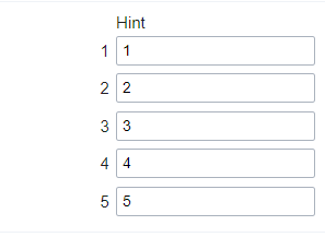
Rating Star Hints
Defines the hint for each star
Icon size
Sets the pixel size of star icons.
Rating Padding
Defines the padding value in pixels for separating each star.
Icons Color
Allows you to define the color of the stars; the color is passed in hexadecimal.
SQL Type
It informs the data type of field in the database.
Configuração da Visualização
You can set CSS values for the field individually. Thus, for example, you can highlight one field of the others in the application. As CSS field properties, when changed, they are added to a class created automatically by ScriptCase for each application field.
Individual field CSS settings, when inserted, override theme settings (CSS of applications (Themes)) selected for application.
The settings are divided into three property blocks, these blocks are:
CSS of Title
This makes it possible to change the CSS properties of the field’s Label.
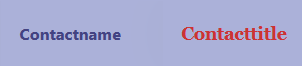
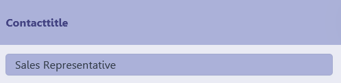
In the example below, You can see the difference of field title configurations. While the field Contactname have the same formatting, inherits the theme of the application, the field Contacttitle have a different formation of of others, from the changes made in the CSS of the field.
CSS of field
Changes the CSS properties of the <td> where the input object (where the user enters data for insertion into a form) is positioned.
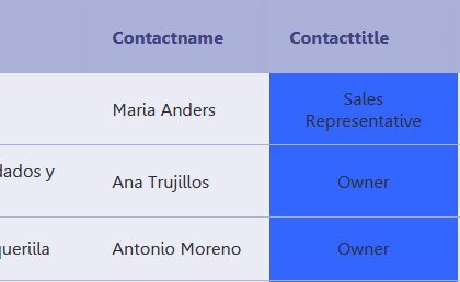
In the image below, you can see where the change is applied.
Field Contacttitle with changes to Field CSS properties, changing background color and horizontal alignment
CSS of Input object
Changes the CSS properties in the Input of field object, where the user type the data in a form.
Field with changes to CSS properties of Input Object, changing background color and input source color
CSS properties
The available configuration options are basically the same for each of the configuration blocks above.
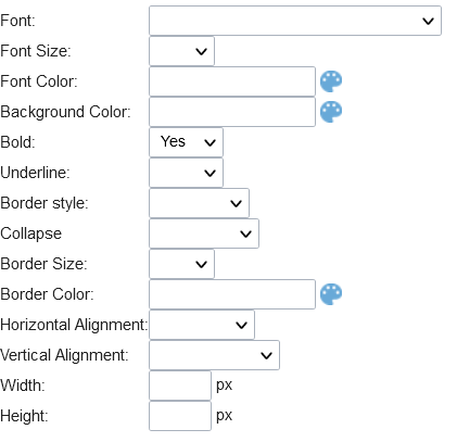
description of available configuration attributes
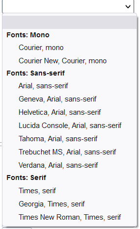
Font
Changes the font of the text according to the fonts selected using the font-family property.
In this option, some types of fonts are provided to you (as shown below).
Font Size
Changes the font size of the text using the property font-size in the field class.
You need to select the available value from our list, the measure used for this property is the pixel.
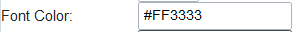
Font Color
Define the font color used by the property color in the field class.
Background color
Define the background color using the property background-color in the field class.
The colors that will be used in the two color properties listed above, Font color and Background color, can be entered via the color palette -  - available next to the field or manually entered values in the accepted formats that are: Hexadecimal, RGB, RGBA, HSL, HSLA or o Color name.
Color palette
By clicking on the color palette icon - - next to the field, a window will open with some default colors.
When you select one of the colors, a value in hexadecimal format (HEX) will be entered, representing the chosen color.
Hexadecimal
Acronym for hexadecimal, this code is composed of the pound sign (#) plus six digits.
The first two define the intensity of the color red, the middle two are green and the last two are blue.
Bold
Applies bold style to the font.
Underline
Lets you apply the underlined style to the font.
Border style
Defines the border font style.
Border Collapse
Defines the border collapse.
Border size
Changes the size of the title border.
Border color
Chooses the border color , using a color palette to apply to the title.
Horizontal alignment
Position the filter label at desired location (left,rigth,center e justify).
Vertical alignment
Position the label of the filter in the wanted location baseline, sub, super, top, text-top, middle, bottom, text-bottom).
Not available in Input Object CSS
Width
To set the width of the title.
Height
To set the height of the title.
Allow the developer to set up instructions and hints about the field’s use, allowing the developer to help the users about the system usage.
Description of the settings attributes.
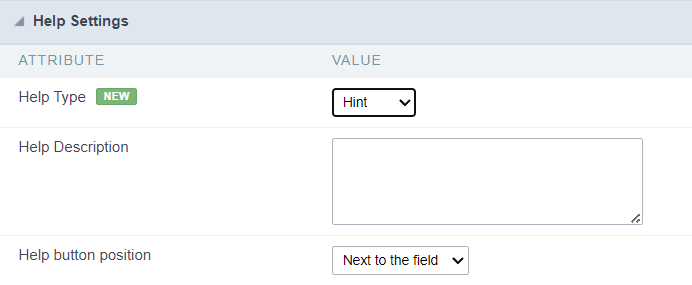
Help Description
In this area, you can set up a text that will be shown in the application according to the type of help selected below.
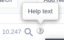
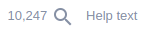
Help Type
Hint
Display a default icon ? beside the field. When the mouse is above the icon a help text will be displayed.
Text
Display a text inside of a <span></span> beside the field.
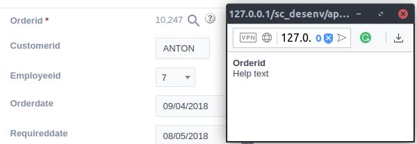
Pop-up
Display a default icon ? beside the field. To display the message just click in the icon that a Pop-up will be displayed with the help text.
The icon displayed when selecting the types Hint or Pop-up vary according to the theme that is being used in the application. This icon can be modified in the CSS Buttons.
Tippy
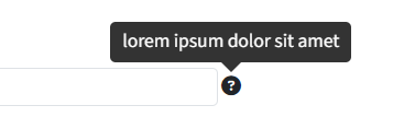
Displays a standard ? icon next to the field. When you hover the mouse over the icon, the message will be displayed in a more user-friendly way.
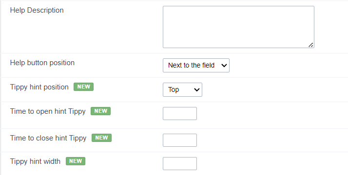
Help type settings (Tippy)
-
Help Description : Defines where the field’s help button will be displayed
-
Help button position : Defines the display position of the Tippy hint in relation to the field’s help icon
-
Time to open hin Tippy : Defines the time in milliseconds for the Tippy hint to be displayed after the mouse passes over the help icon.
-
Time to close hin Tippy : Sets the time in milliseconds for the Tippy hint to be hidden after the mouse leaves the help icon.
-
Tippy hint width : Sets the width of the Tippy hint in pixels.
Help button position (except Tippy)
Allow to set up where the help button will be displayed in the field, there are two options:
Beside: The help icon will be displayed beside the field.
Column: The help icon will be displayed beside the label of the field.