Refined Search
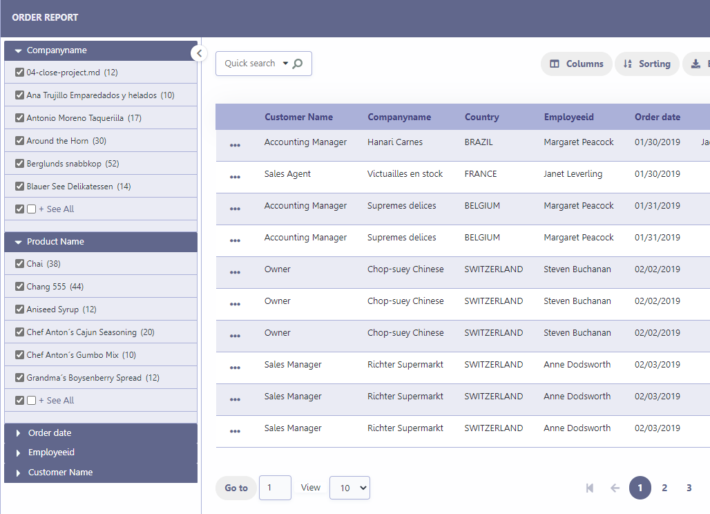
The refined search is a feature where you can integrate a search interface, next to the Grid, limiting values according to a universe that exists in the connected database.
Settings
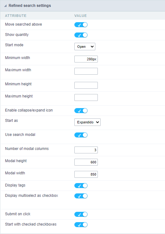
Move searched above
When you filter by a field, this field will be moved to the top of the refined search stack.
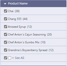
Show quantity
Alongside the values of the fields, you will see the existing amount. Ex.: Brazil (1547)
Start mode
This option sets whether the fields select options will start open or closed.
Minimum width
This option sets the minimum width for the refined search fields, value in pixels.
Maximum width
This option sets the maximum width for the refined search fields, value in pixels.
Minimum height
This option sets the minimum height for the refined search fields results, value in pixels.
Maximum height
This option sets the maximum height for the refined search fields results, value in pixels.
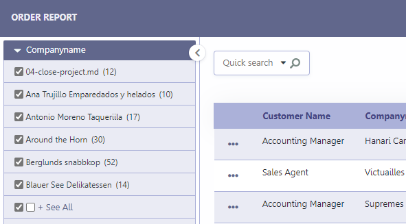
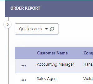
Collected/Expanded
Enables the option collapse or expand the refined filter options panel to improve the Grid visualization.
Start as Collapsed/Expanded
Available only when Collapsed/Expanded option is active, dfines whether the refined filter will start open or closed.
These are the options:
Start open
Start closed
By default, for new applications, this option will come with the value
Start Open
Use modal
When enabled, sets the modal opening when clicking the View All option.
The button + View All is defined in the filter filds settings, by limiting the amount of records displayed in the field. For more details Click Here.
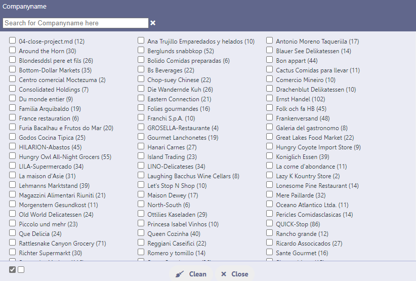
Example of modal screen
Number of modal columns
Defines the number of columns for displaying records in the modal.
Only the number must be informed, without measurement unit, otherwise the value will not be considered.
Modal width
Defines the pixel width of the modal that will be displayed.
Only the number must be informed, without measurement unit, otherwise the value will not be considered.
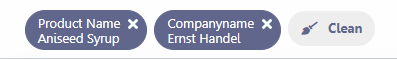
Showing tags
Defines whether or not to display tags with selected filter values.
When active the tags are displayed, as in the image below.
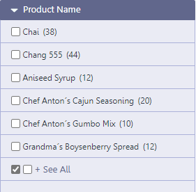
Display as checkbox
Defines whether filter values will be displayed with checkboxes or as links.
Example of display with checkbox
When enabled, the values will have a checkbox indicating your selection whether they are selected or not.
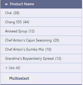
Display example without the checkbox
When disabled, filter values are displayed as a link, and the select button is shown so that more than one value can be selected.
Submit when scoring
When active, the filter is applied instantly after selecting the desired value.
By activating this option, the application is reloaded with each selection of filter values.*
Show marked checkbox
Defines the initial format of the filter values checkbox.
When active, when accessing the application, the filter checkbox is already marked, representing the application’s data universe. This way, the user will have to uncheck the options that he does not want to see.
When disabled, when accessing the application the filter checkbox will be unchecked. This way, the user will have to check the options he wants to filter.
Example of enabled option
Example of disabled option
Select fields
Refined Search fields
The refined search is automatically added to the Grid application when one or more Grid fields are selected in the tab “select fields”.
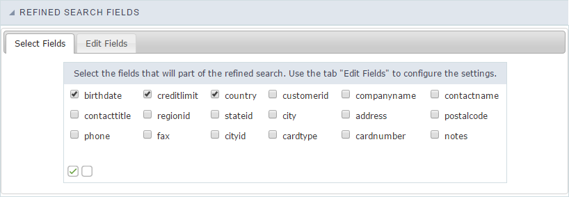 Selecting fields of refined search
Edit fields
In the tab “Edit fields”, you can configure each field according to what you need to display within the application.
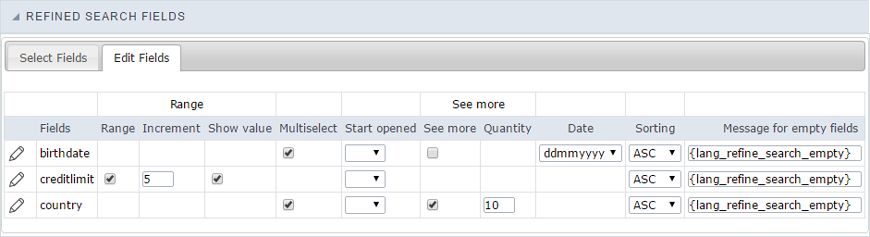
Fields
Listing of selected fields in the tab “select fields”.
RangeThis
option activate a slider with intervals between the smallest and largest value.
Increment
When using the range this option will set an integer value to increase the range.
Show value
When checked, displays the range values in the slider.
Multi select
Enables multiple selection values to perform the filter.
Start opened
This option sets the initial mode for fields selection display in refined search.
See more
When checked, enables the option to “see more” for the filter records. This is recommended when the selected field has a big amount of records. You will be able to click to “see more” or “see less”.
Quantity
This option sets the initial amount of records to be displayed for each field selected.
Date
This option sets the date format that is displayed in the date fields inside the filter.
Sorting
This option sets the records sorting for each selected field.
Message for empty fields
This option sets a message to be displayed when the field has empty values. You can also use a variable from Scriptcase language system.