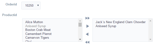
Control - Double Select Field
General Settings
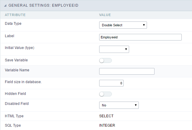 Double Select field configuration Interface.
- Data Type : Select the type of field for the application. When set to Double Select you can have multiple options selected.
-
Label : Defines the title of a field in the application. For example: if the field is defined in the database as cmp_name_client, it will be easier to the user understand if the name is “Client Name”.
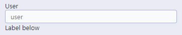
- Label below field : Defines the message to be displayed below the field.
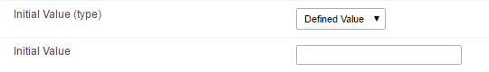
- Initial Value (type) : Defines the initial value for the field when in insert mode. The options are:
- Defined Value : The field will receive the value from the text field of the defined value option.
- System Date : The field will receive the current server date.
If you select the System Date, then it is not necessary to inform the Initial Value attribute.
- Initial Value : You will inform the Defined Value here.
 Initial Value Configuration Interface.
- Save Variable : Saves a variable in the session with the value of the field, that can be used in other applications. For example, in the login form the user name can be saved in the session so that it can be displayed on the header of other applications.
- Variable Name : Set the name for the session variable that will receive the field value.
- Field size in database : Determines the size in bytes of the fields. It is used to set the max amount of characters to be typed in.
- Hidden Field : This option makes the field hidden, but still allows its value to be processed through Javascript or PHP.
- Disabled Field : Defines if the field will be disabled in “Insert Mode”, “Update Mode” or in “Insert and Update Mode”.
- HTML Type : HTML Object that will be used to display the field in the form.
- SQL Type : Displays the data type of field in the database.
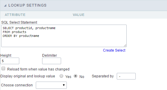
Lookup Settings
A method used to offer the user a list of values that can be selected in the form applications. For example, the gender field in the Database with the values M or F can be presented like Male or Female or in a dynamic way, getting these values from the database.
 Lookup Settings Display for the field.
 Automatic Lookup Interface..
- SQL Select Statement : Defines the SQL command that will get the values displayed on the form field. The command needs to have the following structure:
SELECT key_field , display_field FROM table
The value of the key_field will be stored in the table field.
- Height : Set the height(lines) of the field interface.
- Delimiter : Defines the character used to separate the values selected in the form. Only inform a value to this field if you need to separate the selected options with a different delimiter than (;).
- Reload form when value has changed : With this option selected, the form will refresh if there is a change to the selected object in the field.
- Display original and lookup value : Displays the value of the field and the value returned from the lookup.
- Separated by : Defines which character will be used to separate the values of the field with the value returned from the lookup. It is only necessary to inform this value of the option Display original and lookup value is enabled.
- Choose connection : Selects another specific connection existing in the project. The select command will be done on the second connection.
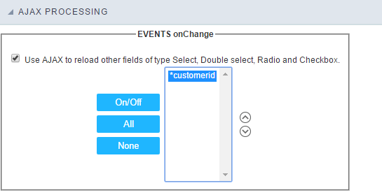
Ajax Processing
 Ajax Processing configuration Interface.
Allows to define the field that will be reloaded when selecting a value that has the (onChange) trigger.
For example: a field of the type select with a list of states, and another select field with a list of cities. When selecting a state, the cities list is reloaded.
Display Settings
The Display Settings allows to define the CSS for the fields individually. For each Display Settings of Scriptcase, exists the same attributes available for this interface.
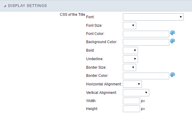
- CSS of the Title
- Font : Allows to choose the font type, that will be applied to the application field title.
- Font Size : Allows to choose the the font size, that will be applied to the application field title.
- Font Color :Allows to choose a color for the font from the color pallet.
- Background Color : Allows to define the color for the field, the color can be selected from the color pallet.
- Bold : Applies the bold style to the font.
- Underline : Applies the underline style to the font.
- Border Size : Applies the border size to the title of the field.
- Border Color : Allows to choose a color for the border, using a color pallet to apply to the title.
- Horizontal Alignment : Allows to position the label of the field in the desired position (left,right,center and justify).
- Vertical Alignment : Allows to position the label of the field in the desired position (baseline, sub, super, top, text-top, middle, bottom, text-bottom).
- Width : To define a width for the title of the field.
- Height : To define a height for the title of the field.
- CSS of the Field
- Font : Allows to choose the font type, that will be applied to the application field.
- Font Size : Allows to choose the the font size, that will be applied to the application field.
- Font Color :Allows to choose a color for the font from the color pallet.
- Background Color : Allows to define the color for the field, the color can be selected from the color pallet.
- Bold : Applies the bold style to the font.
- Underline : Applies the underline style to the font.
- Border Size : Applies the border size to the field.
- Border Color : Allows to choose a color for the border, using a color pallet to apply to the field.
- Horizontal Alignment : Allows to position the field in the desired position (left,right,center and justify).
- Vertical Alignment : Allows to position the field in the desired position (baseline, sub, super, top, text-top, middle, bottom, text-bottom).
- Width : To define a width for the field.
- Height : To define a height for the field.
- CSS of the Input Object
- Font : Allows to choose the font type, that will be applied to the Input Object. For example: Radio, Select, Text, etc
- Font Size : Allows to choose the the font size, that will be applied to the application field.
- Font Color :Allows to choose a color for the font from the color pallet.
- Background Color : Allows to define the color for the Input Object, the color can be selected from the color pallet.
- Bold : Applies the bold style to the font.
- Underline : Applies the underline style to the font.
- Border Size : Applies the border size to the Input Object.
- Border Color : Allows to choose a color for the border, using a color pallet to apply to the Input Object.
- Horizontal Alignment : Allows to position the Input Object in the desired position (left,right,center and justify).
- Vertical Alignment : Allows to position the Input Object in the desired position (baseline, sub, super, top, text-top, middle, bottom, text-bottom).
- Width : To define a width for the Input Object.
- Height : To define a height for the Input Object.
Help Settings
Allow the developer to set up instructions and hints about the field’s use, allowing the developer to help the users about the system usage.
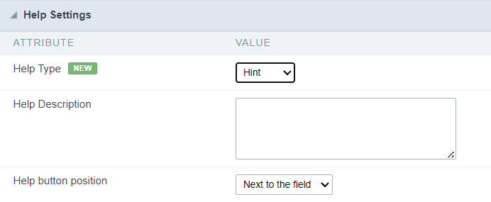
Description of the settings attributes.
Help Description
In this area, you can set up a text that will be shown in the application according to the type of help selected below.
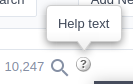
Help Type
Hint
Display a default icon ? beside the field. When the mouse is above the icon a help text will be displayed.
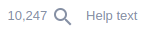
Text
Display a text inside of a <span></span> beside the field.
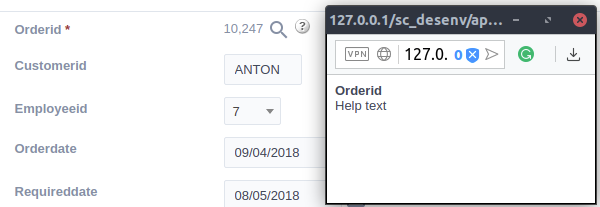
Pop-up
Display a default icon ? beside the field. To display the message just click in the icon that a Pop-up will be displayed with the help text.
The icon displayed when selecting the types Hint or Pop-up vary according to the theme that is being used in the application. This icon can be modified in the CSS Buttons.
Tippy
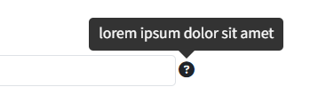
Displays a standard ? icon next to the field. When you hover the mouse over the icon, the message will be displayed in a more user-friendly way.
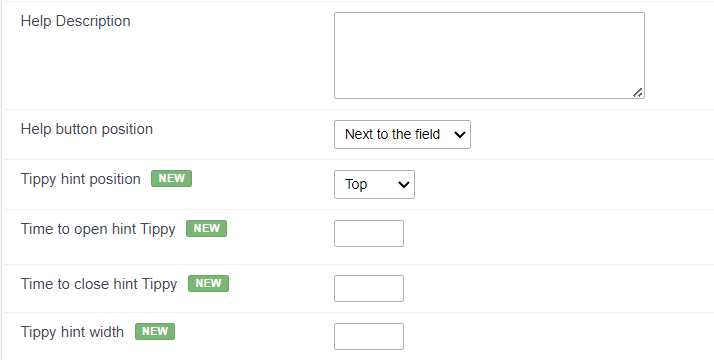
Help type settings (Tippy)
-
Help Description : Defines where the field’s help button will be displayed
-
Help button position : Defines the display position of the Tippy hint in relation to the field’s help icon
-
Time to open hin Tippy : Defines the time in milliseconds for the Tippy hint to be displayed after the mouse passes over the help icon.
-
Time to close hin Tippy : Sets the time in milliseconds for the Tippy hint to be hidden after the mouse leaves the help icon.
-
Tippy hint width : Sets the width of the Tippy hint in pixels.
Help button position (except Tippy)
Allow to set up where the help button will be displayed in the field, there are two options:
Beside: The help icon will be displayed beside the field.
Column: The help icon will be displayed beside the label of the field.