Menu Items
Menu items settings
In this Screen the user have the settings to configure all the menu structure, below you will see how to use each setting.
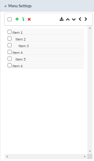
Insert Item 
With this button, the user can add a new item to the menu structure. Every time the user clicks in the button will generate a new item with the id.
Ex: Item 1
Insert Subitem 
With this button, the user can add a new subitem in the menu structure. Every time the user clicks in the button will generate a new subitem but differently from the Insert item, when pressed will generate a subitem inside a subitem, so, to have all the items inside the same, the user must select the first item(The father item).
Remove Item 
With this button, the user can delete an item or subitem by selecting it on the checkbox.
Import Applications 
With this button, the user can select the applications want to use as menu items, this way the user doesn’t need to create an item and then link the application to it.

Move Up
With this button, the user can move the position of the item up.
Move Down
With this button, the user can move the position of the item up.
Move Left
With this button, the user can move the position of the item left, this will make the item to be add as a subitem or not.
Move Right
With this button, the user can move the position of the item right, this will make the item to be add as a subitem or not.
Properties
In this settings, the user can configure how the item will look in the Menu.
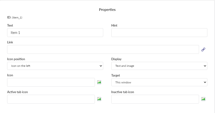
ID
This option shows the actual item that is being edited.
Text
In this option the user configure the text that will be shown in the menu item.
Hint
In this option the user can configure a help text when the mouse is over the item.
Link
In this option the user configure the application that will be open when the link is clicked.
Display
In this option the user can configure how the item will be displayed. There are two options:
- Text and Image - Show the item with an imagem and a text side by side.
- Text and icon Font Awesome - Show the item with an icon from the Font Awesome library and a text side by side.
Icon
If in the display option is selected Text and Image here the user will select the image to be along with the text.
If in the display option is selected Text and icon Font Awesome here the user will select the icon to be along with the text.
Active tab icon
This option allows the user to select the icon or image (same condition to the Icon settings from above) to be shown when the item is actived.
Inactive Tab icon
This option allows the user to select the icon or image (same condition to the Icon settings from above) to be shown when the item is deactivated.
Target
This option allows to select what will happens when the user clicks on the item. There are three options:
- This Window - Will open the application in the same window.
- New Window - Will open a new window for the application be displayed.
- Leave - Will exit the application, most used with the login application to return to the login.