Search
Settings
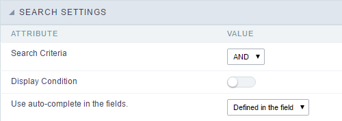
With this interface, you can define general options of the Search Form.
 Search configuration Interface.
Search Criteria
Allows to select the logical operator AND or OR to define the criteria of the search;
Display Condition
Gets the condition of the search available for the user to choose one. He can select “AND” or “OR” in a Combobox.
Use auto-complete in the fields
Automatically turns the field into an autocomplete according to the existing values in the database. If the user chooses Yes, the autocomplete will enable automatically in all inputs that contain a relationship. If the user decides No, so no autocompletes will be displayed. Otherwise, the option selected is Defined in the field it’ll keep the settings for each field individually.
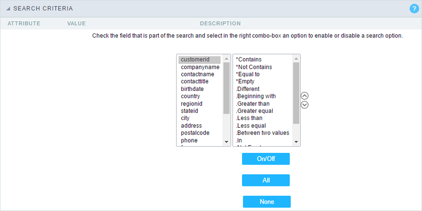
Search Criteria
With this interface, you can configure the conditions available for each field of the Search form.
 Search configuration Interface.
We can see the fields list on the left combo. On the right, the list of options for filtering the selected field. To select an option, click on one of them (Equal to, Beginning with, Contains, etc.) and then the button On/Off. The arrows, on the right, allows altering the order of the fields.
For the Date type fields, you can define special conditions for the search, accessing the field configurations, and editing the Special Conditions Settings.
Below the list are the buttons to enable the selected options:
- On/Off: Enables or disables the field or the option chosen.
- All: Marks all fields or options.
- None: Unmarks all the fields or options.
Advanced Search
Settings
Through the table below we are able to set all the options that will be part of the application “Grid Search”.
Margins
Defines the position of the margins of the Search Form.
Keep Values
It keeps the searched values when the user returns to the search form.
Keep Columns and Order Selection
Set it to preserve the selected columns and sorting for each search, if they went changed by the user through the toolbar options.
Use Enter to
It allows you to define the action that the Enter Key has on the Search form. Tabulate enables you to navigate between fields, and Submit performs the search(activates the Search button).
Display Tags
Allows displaying as tags, the searches used for the Grid.
Display after filtering
Display tags only after performing an advanced search. If disabled, it will always display a tag, regardless of the advanced search.
Unify results
Sets the chars limit to group the result of the tags. This option should be used when the field type is multiple-select.
Treeview in the Tags
Sets the use of Treeview for tags.
Initial status of the Treeview
It sets the initial state of the Treeview. (If the app is using Treeview for tags)
Start open
It displays the tags. 
Start close
It displays the full description of the tags as text. 
Clear other filters after submit
After applying the advanced filter, all other filters will be deleted.
Interact with the dynamic filter
Apply the same filter in matching fields between Advanced and Dynamic Filter, when not showing the labels.
Highlight
Highlights the results in the query. It only works for “Exactly the same”, “Contains” and “Equal start” conditions.
To customize how the highlight will be displayed, you must access the theme editing tool.
1 - Access the Layout > Application Themes menu.
2 - Choose the desired theme and click Advanced Mode.
3 - Then look for the sub-item Grid, within the item of the same name.
4 - In this sub-item you will find the option “Line”, which contains the folders Line Odd and Even. In each of these folders you will find the option Quicksearch highlight, with the options for editing Text, Border and Background of the searched terms.
Select fields
![Interface for filter fields selection.][filtro_avancado_configuracao_selecionar_campos] Interface for filter fields selection.
Required
Defines which fields of application will be required for the Search.
![Required fields interface.][filtro_avancado_configuracao_campos_obrigatorios] Required fields interface.
The application generated will be displayed a bullet (*) next to the field and an error message is generated if not assigned no value.
![Configuration interface of the marker placement.][filtro_avancado_configuracao_campos_obrigatorios_posicionamento] Configuration interface of the marker placement.
- Marker position : Marker’s position relative to the field.
- Display message : Displays whether or not the validation error message.
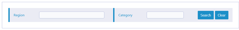
Toobar
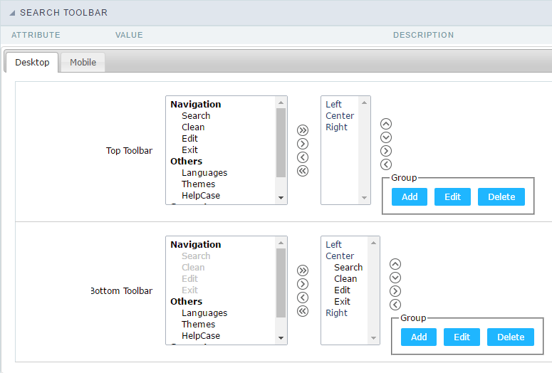
Search Toolbar
The Search toolbar is divided in two parts: Top and Bottom, in a way that is possible to define the buttons that will be displayed in both bars. The selection of buttons in the top and bottom toolbar works independently, allowing the buttons to be displayed in both bars at the same time.
 Toolbar Interface.
Navigation:
Groups the options relative to the navigation buttons that can be displayed in the application.
- Search: Execute the search.
- Clean: Clean the all the search fields.
- Edit: Enable the Save Tag option.
- Exit: Exit the application.
Others:
Groups a diversity of options relative to the application.
- Languages: Displays a combobox with the names available, defined in the project properties.
- Themes: Displays a combobox with the themes available, defined in the project properties.
- HelpCase: Displays a button to redirect to the help page.
Separator
- —————–: Dispays a line separating the buttons, when used the Group Buttons.
Use in-line buttons:
Allows the alignment of the filter buttons next to the fields.
Inline buttons: Allows you to select which buttons will be displayed next to the field, and you can sort them according to your wishes. This option is available by enabling Use buttons inline in the button settings.
When activating the Inline Buttons option, the screen to configure the buttons will be displayed.
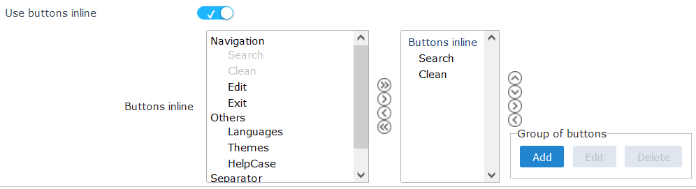
The buttons available in this in-line button option are the same as those shown in the standard toolbar described above.
This is the result when using a radio button on the line
Button Settings
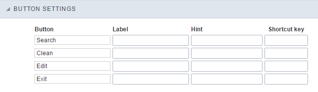 Button Settings Interface.
- Hotkey: Allows you to set keyboard hotkeys to a button.
- Position of the in-line buttons: Sets the positioning of the buttons to the right or left of the fields.
- Column Quantity: Sets the number of display columns of the buttons, allowing you to configure whether they will be displayed side-by-side or distributed in columns.
Save Search
This feature allows the end-user to save his searches in a profile. You can create some rules, like to save the searches by user login.
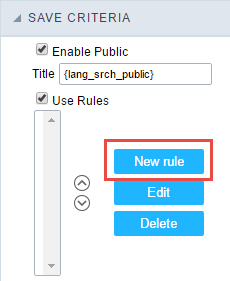 Save Filter Interface.
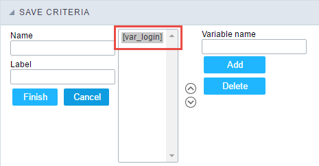 Save Filter Interface.
Events
In event blocks can be used global variables, local, JavaScript code, CSS codes and Scriptcase macros.
onScriptInit
onRefresh
onSave
onValidate
Layout
This module lets you editing display options for the application. You can apply visualization themes, organize blocks, define values, and the display format of the Header and Footer.
Layout Settings
ScriptCase creates an app by using default values defined per project, but you can change those values for a specific application on this interface.
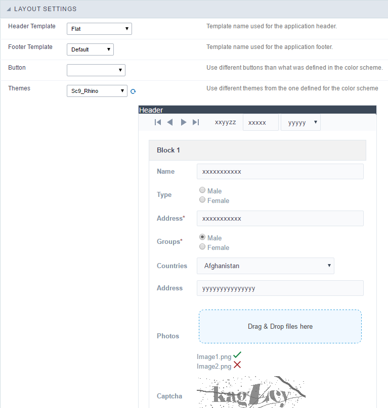 Application Layout Settings
Header Template
Allows choosing the look of the application Header.
Footer Template
Allows choosing the look of the application Footer.
Button
Allows choosing the button theme for the application.
Themes
Choose one of the selected themes in the project properties. It defines the look of the application, like colors, fonts, and others.
Header & Footer
Header
Here we can define if we want to display the header or not, the application title, and fill the header variables. The header looks according to the selected template in the Layout settings interface.
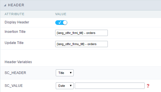 Application Header Configuration
Display Header
This option determines if we want to display the header or not.
Title
Allows informing the title of the application.
Header Variables
We must fill the variable fields with one of the types available in the Combobox. Depending on the type, you need to associate content with it. Those are the types:
- Field: When you choose the option “Field”, it opens a Combobox to choose a field to associate the field value with the header.
- Title: It displays the value of “Application Title” in the header.
- Date: It displays the system’s date in “yyyy/mm/dd” format in the header. There are several display formats available, and you can change it by using the text field beside it. To access existing formats, click on the hint to see an explanation.
- Image: It displays a field to inform the name of an existing image in the server. You can select an image by clicking on the icon “Choose Image”, and you still can upload new images by using the button “Upload”.
 .
. - Value: It displays the content of the text input. You can inform static texts and “Global Variables”. e.g. “Employee Name: [v_name]”.
Depending on the Application, you may have more than one title option.
Footer
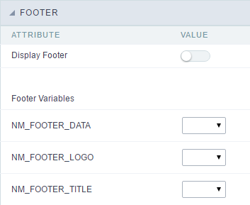 Application Footer Settings
This page may change depending on the footer template chosen in the Layout Settings.
Display Footer
This option determines if we want to display the footer or not.
Footer Variables
We must fill the variable fields with one of the types available in the Combobox. Depending on the type, you need to associate content with it. Those are the types:
- Field: When you choose the option “Field”, it opens a Combobox to choose a field to associate the field value with the header.
- Date: It displays the system’s date in “yyyy/mm/dd” format in the header. There are several display formats available, and you can change it by using the text field beside it. To access existing formats, click on the hint to see an explanation.
- Image: It displays a field to inform the name of an existing image in the server. You can select an image by clicking on the icon “Choose Image”, and you still can upload new images by using the button “Upload”. .
- Value: It displays the content of the text input. You can inform static texts and “Global Variables”. e.g. “Employee Name: [v_name]”.
Fields
This is a list of fields available for use in the filter. Click on the desired field to access the configuration instructions.