Interactive charts from your data
Charts for data-driven decisions.
Turn database data into responsive, interactive charts that help users compare metrics, explore trends and understand performance with clarity.
Build the right chart for every analysis
Scriptcase gives you a wide range of chart types to represent different kinds of data, from simple comparisons to advanced visual analysis. Create traditional, analytical and specialized charts directly from your applications.
Samples
Advanced visualizations for complex data
Go beyond traditional charts with advanced visualizations for more complex analysis. Use chord, heatmap, sankey and Gantt charts to represent relationships, intensity, flows and timelines with clarity.
Samples
Let users explore data
Charts created with Scriptcase can go beyond static visualization. Add drill-down navigation, connect chart values to record details, enable runtime customization, and let users explore data directly inside the application.
Interactive chart navigation
Samples
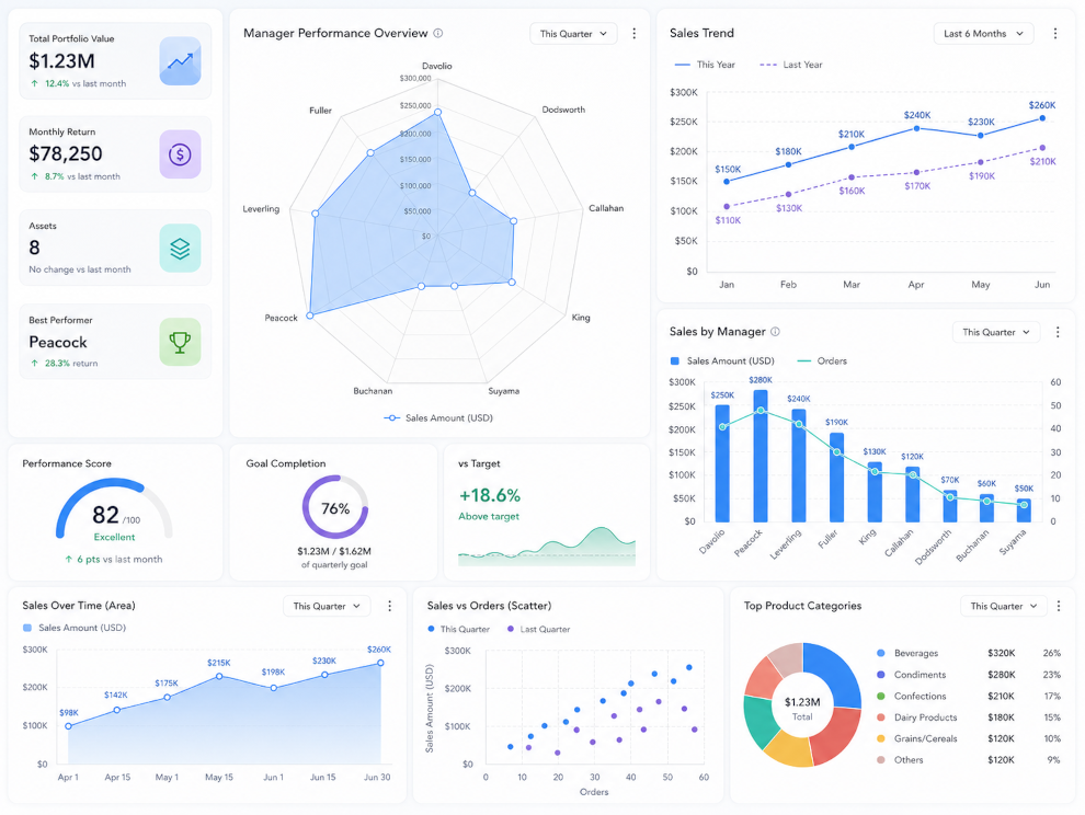
Compare metrics and reveal business patterns
Create charts that help users compare values, identify trends and understand performance over time. Combine different metrics in the same visualization, work with multiple series, create stacked or overlapping charts, and highlight trends to support better decisions.
Samples
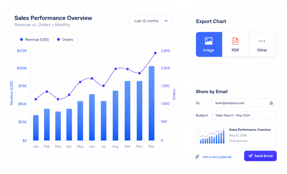
Customize, export and share your charts
Adapt your charts to match your project identity and make it easy to share results. Use the chart theme editor to customize visual styles, export charts to multiple formats, or send them by email when needed.
Samples
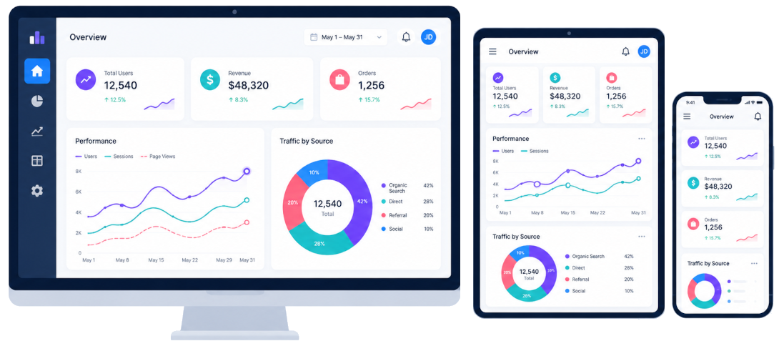
Responsive charts for web and mobile
Charts generated with Scriptcase are designed to work across browsers and devices, helping users access visual information from desktops, tablets and smartphones with a consistent experience.
Examples
Explore practical examples and see how each feature can be applied in real projects. Browse the gallery below to discover use cases, variations, and implementation ideas.
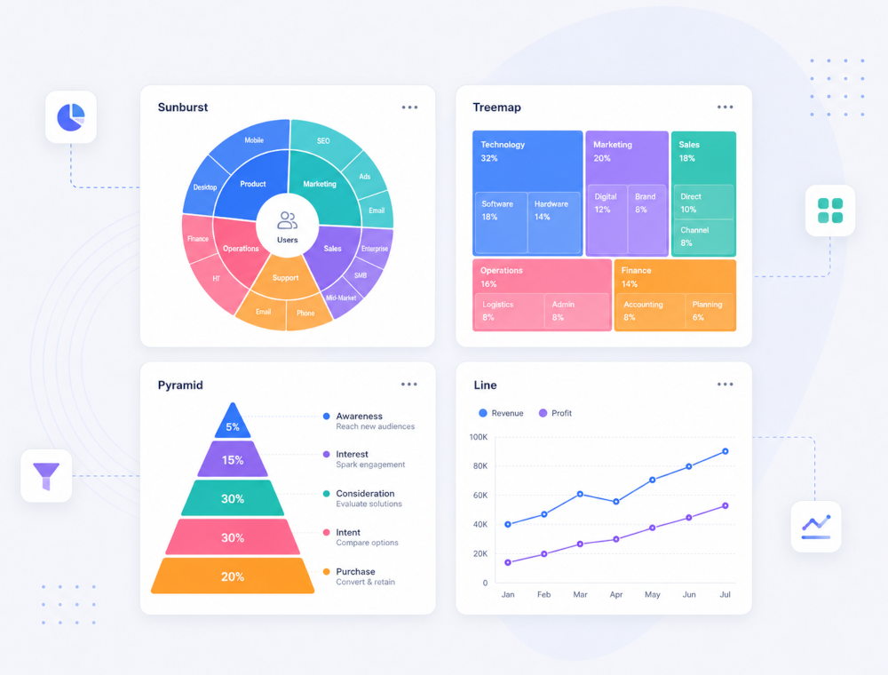
A sunburst chart displays hierarchical data in a radial layout, where each level is represented by a ring. It helps visualize structure and relationships across multiple levels in a compact and intuitive way.
A treemap chart displays hierarchical data using nested rectangles. Each rectangle represents a category, and its size is proportional to the value it represents, making it easy to compare parts of a whole and understand structure at multiple levels.
Displays a Percentage Comparison of Sales Quantity by Region through a Fully Interactive Pyramid Chart
This example shows a grid application using the line chart
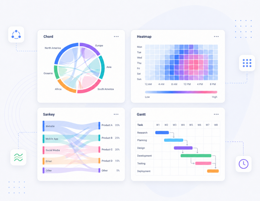
A Sankey chart visualizes flows between entities, where the width of each connection is proportional to the quantity it represents. It is ideal for understanding distributions, transfers, and relationships across stages.
The Gantt chart is used to show project schedules. It is a time-based chart that allows you to plan tasks with their exact start and finish dates and times
Navigation between the chart and the details of a particular record of that chart.
Navigation between graphs. click the record in a chart to view a detailed chart related to that record.
The zoomline function allows the data analysis into a specific user-defined range offering several levels of navigation within the line chart.
A horizontal scroll bar that optimizes the visualization of charts. Available in the chart types: 2D Bar, 2D Column, Line, 2D Area.
Overlapping bars & columns can be used to visualize two data sets on a single chart. Similar to a simple bar/column chart, this chart uses vertically/horizontally aligned rectangular bars/columns on one axis as data plots plotted against the discrete values shown on the other.
Graph application with trend lines.
Analytical chart with the sales of each employee over the months, comparing them with each other.
The Combination chart allows you to display two types of graphs at a time (Column and Row), and thus display and compare different metrics. In this example, we can visualize the value of the sum of the value and the number of requests per employee
The Stacking chart allows you to group the sales value by region in a single two-dimensional column for each employee
Chart application with trend zone.
Display a button to send the chart exportation by email
This example shows a grid application using the line chart to represent an evaluation of the products listed.
This example displays a toolbar on the same screen as the chart, allowing customization of the chart at runtime.
The Bubble chart allows you to create a line of average sales value, and represent sellers through the bubbles, indicating their performance against the average. In this type of chart, 3 metrics are defined, the sum, the maximum, and the mean.
Ready to build powerful apps?
Start exploring examples or try Scriptcase for free.
Support
During the evaluation period you have free access to our technical support team. They will assist you with installation and general use of Scriptcase.
Access technical support »Purchase
Get started with Scriptcase today and enjoy the most efficient database-based web development tool.
Buy now