Creating Ajax button
The action button of the ajax type creates an ajax event of the onClick type, allowing the execution of routines without the need to reload the application.
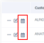
Example of the action button in the application
See below how to create and configure this type of button.
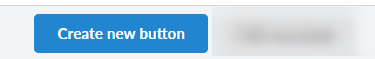
Creating one button
on the screen of list of buttons click Create New Button.
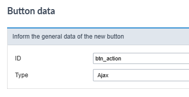
Button data
Then, select the Type and inform the name of the button.
The name field only allows numbers, unaccented letters and underscores.
Button visual settings
On this screen you must define the appearance of the button for displaying in your application.
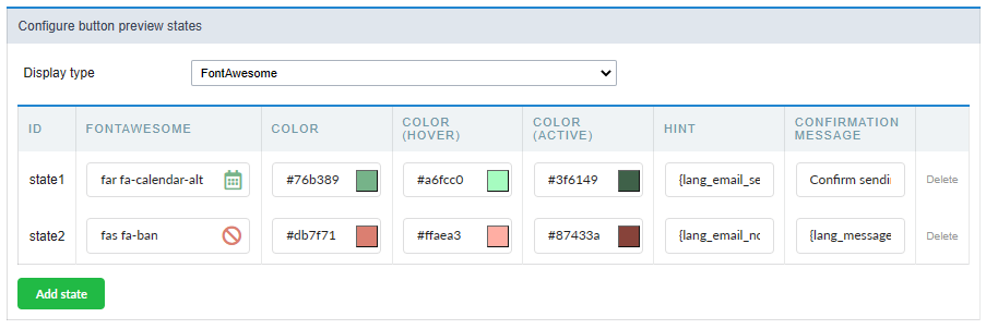
Check out the detailed view configurationoptions below.
Display type
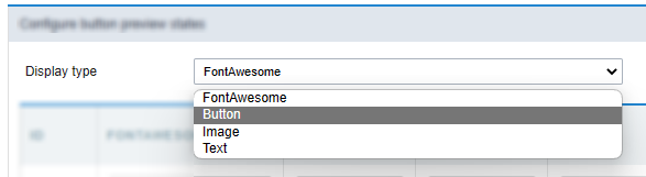
This attribute defines the display format which can be: FontAewsome, Button, Image or text.
Some display options are displayed according to the type of display used.
The options are:
FontAwesome
This is the default value of the attribute. In this setting, the button will be shown only how a font awesome icon.
See a font awesome example
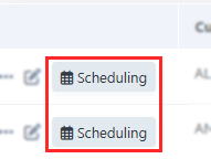
Button
In this configuration, the button will be shown as a standard Scriptcase button, inheriting the button theme used in your application.
After selecting this option, another option (Button format) will be displayed and you will have to define how the button label will be displayed. In this attribute you can choose between:
- FontAwesome - The button will only display with FontAwesome.
- Text - The button will only display with text.
- Font Awesome and text - The button will appear with FontAwesome and text, with the text positioned to the right.
- Text and Font Awesome - The button will appear with FontAwesome and text, with the text positioned to the left.
See a button example
Image
Using this option, you must upload or select an image in the Scriptcase image manager.
Example of action button as image
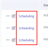
Text
Using this option, the action bar button will be display how a link.
Example of action button as Text
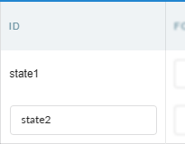
ID
This attribute defines the name to a button state.
No allowed the use langs or anytype variables in this attribute.
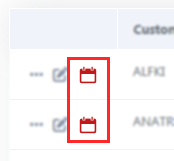
Font Awesome
Defines the font awesome that will be displayed in the button.
This option is displayed when selecting in the Type of Display attribute the valures: FontAwesome or Button
Action button example as Font Awesome image
Image
Defines the image that will be displayed in the application when selecting Type of display as image.
Click on the icon  to open the [image manager][link_gerenciador_img]{:target=”_blank”} and select the desired image.
Text
The text attribute define text that will be display how a link in the action bar.
This option is displayed when selecting in the Type of Display attribute the valures: Button or Text
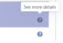
The text definition has no character restriction and can be done with a fixed text or using a lang, to create systems with multiple languages.
See more details about langs and about our Data dictionary.
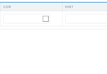
Color
Sets the color of the Font Awesome icon. Cif no value is informed, the icon assumes the color defined in the general configuration of the [action bar visual][link_editar_visual]{:target=”_blank”}.
Displayed only when using Type of display as FontAwesome
Color (Hover)
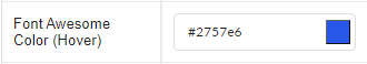
Sets the color of the Font Awesome icon in hover state, when hovering the mouse over the icon.
Available when selecting Display Type as FontAwesome.
Color (Active)
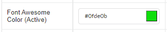
Sets the color of the Font Awesome icon in the active state.
Available when selecting Display Type as FontAwesome.
Button Visual
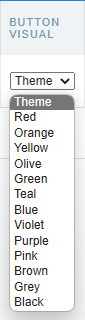
This attribute defines the color of the button. You can select a color from the list or use the Theme option to inherit the button layout used in your application.
Only available when selecting Display Type as Button.
Button Visual (Hover)
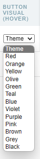
This attribute sets the color of the button on button hover. You can select a color from the list or use the Theme option to inherit the button layout used in your application.
Only available when selecting Display Type as Button.
Hint
Defines the help text for the button.
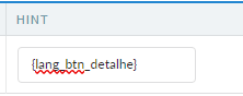
The text definition has no character restriction and can be done with a fixed text or using a lang, to create systems with multiple languages.
See more details about langs and about our Data dictionary.
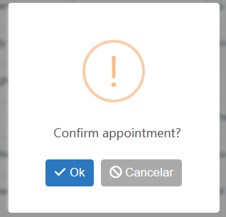
Confirmation Message
The confirmation message is displayed after clicking the button and before that action is performed.
Confirmation Message example
The text definition has no character restriction and can be done with a fixed text or using a lang, to create systems with multiple languages.
See more details about langs and about our Data dictionary.
Delete
Deletes a button state.
Botão Adicionar Estado
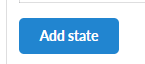 Adds a line for configuring a new state for ajax button.
These states can be manipulated using the macrosc_actionbar_state at ajax event.
After adding the desired states and configuring the appearance of the buttons, click on Save button and configure ajax to create the button and event.
Ajax Event
The ajax event will be created, which will be executed on the button’s onClick.
In this event we must code the procedures that we want to carry out. Added some macros for handling the action buttons:
- sc_actionbar_clicked_state - Returns the current state of the ajax button created in the action bar.
- sc_actionbar_state - Changes the current state of the button to a new state.
- sc_actionbar_disable - Disables action bar buttons.
- sc_actionbar_enable - Enables action bar buttons, disabled by sc_actionbar_disable macro.
- sc_actionbar_hide - Hides an action bar button.
- sc_actionbar_show - Show action bar buttons, hidden by sc_actionbar_disable macro.