Creating Link button
The action button of the link type allows you to create a link between the source application (grid) and any application in the project (destination application). This link will be activated in the onclick event of the button.
Source Application is used to identify the application where the link will be created.The Source application will have the call to the Destination Application, which refers to the application that will be called after activating the connection.
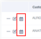
Example of the action button in the application
See below how to create and configure this type of button.
Creating a link button
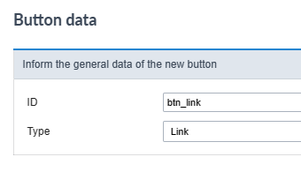
on the screen of list of buttons click Create New Button.

Button data
Then, select the Type and inform the name of the button.
The name field only allows numbers, unaccented letters and underscores.
Button visual settings
On this screen you must define the appearance of the button for displaying in your application.
Check out the detailed view configurationoptions below.
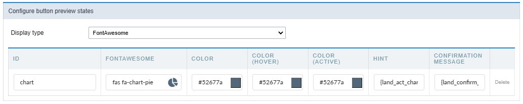
Display type
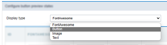
This attribute defines the display format which can be: FontAewsome, Button, Image or text.
Some display options are displayed according to the type of display used.
The options are:
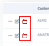
FontAwesome
This is the default value of the attribute. In this setting, the button will be shown only how a font awesome icon.
See a font awesome example
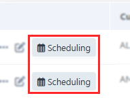
Button
In this configuration, the button will be shown as a standard Scriptcase button, inheriting the button theme used in your application.
After selecting this option, another option (Button format) will be displayed and you will have to define how the button label will be displayed. In this attribute you can choose between:
- FontAwesome - The button will only display with FontAwesome.
- Text - The button will only display with text.
- Font Awesome and text - The button will appear with FontAwesome and text, with the text positioned to the right.
- Text and Font Awesome - The button will appear with FontAwesome and text, with the text positioned to the left.
See a button example
Image
Using this option, you must upload or select an image in the Scriptcase image manager.
Example of action button as image
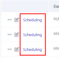
Text
Using this option, the action bar button will be display how a link.
Example of action button as Text
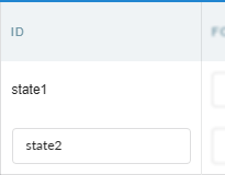
ID
This attribute defines the name to a button state.
No allowed the use langs or anytype variables in this attribute.
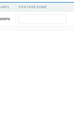
Font Awesome
Defines the font awesome that will be displayed in the button.
This option is displayed when selecting in the Type of Display attribute the valures: FontAwesome or Button
Action button example as Font Awesome image
Image
Defines the image that will be displayed in the application when selecting Type of display as image.
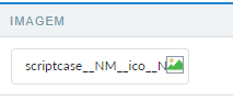
Click on the icon  to open the [image manager][link_gerenciador_img]{:target=”_blank”} and select the desired image.
Text
The text attribute define text that will be display how a link in the action bar.
This option is displayed when selecting in the Type of Display attribute the valures: Button or Text
The text definition has no character restriction and can be done with a fixed text or using a lang, to create systems with multiple languages.
See more details about langs and about our Data dictionary.
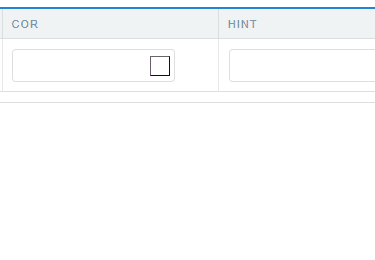
Color
Sets the color of the Font Awesome icon. Cif no value is informed, the icon assumes the color defined in the general configuration of the action bar visual.
Displayed only when using Type of display as FontAwesome
Color (Hover)
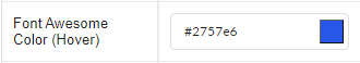
Sets the color of the Font Awesome icon in hover state, when hovering the mouse over the icon.
Available when selecting Display Type as FontAwesome.
Color (Active)
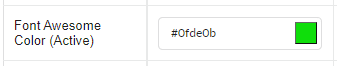
Sets the color of the Font Awesome icon in the active state.
Available when selecting Display Type as FontAwesome.
Button Visual
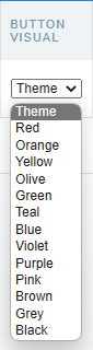
This attribute defines the color of the button. You can select a color from the list or use the Theme option to inherit the button layout used in your application.
Only available when selecting Display Type as Button.
Button Visual (Hover)
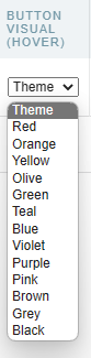
This attribute sets the color of the button on button hover. You can select a color from the list or use the Theme option to inherit the button layout used in your application.
Only available when selecting Display Type as Button.
Hint
Defines the help text for the button.
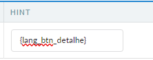
The text definition has no character restriction and can be done with a fixed text or using a lang, to create systems with multiple languages.
See more details about langs and about our Data dictionary.

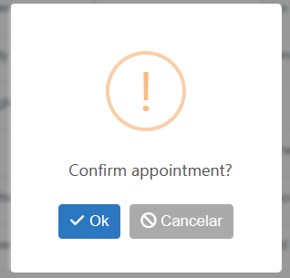
Confirmation Message
The confirmation message is displayed after clicking the button and before that action is performed.
Confirmation Message example
The text definition has no character restriction and can be done with a fixed text or using a lang, to create systems with multiple languages.
See more details about langs and about our Data dictionary.
After making the visual settings, click on Save button and configure link. The button settings will be saved and you will be redirected to the link creation screen to define the application and target application behavior.

Application List
All project applications available for the link will be listed. In this step, the developer must select the destination application that will be used in the connection.
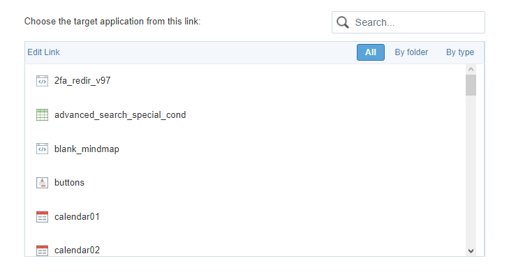
Finding Applications
To assist in locating the application, you can use the grouping buttons or the Search field.
Search field
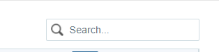
The search is performed by application name.
Grouping Buttons
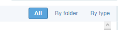
In this grouping there are three visualization options:
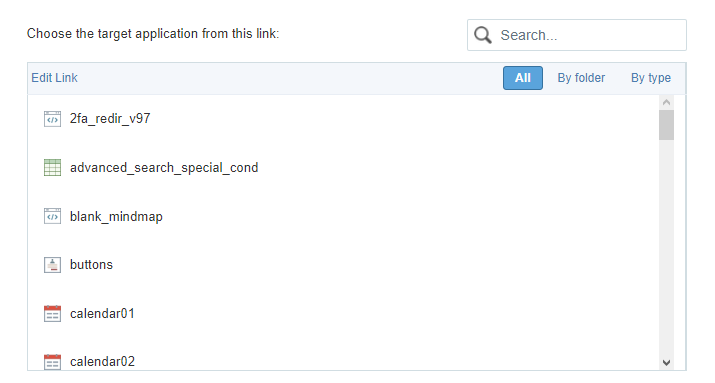
All
Lists all applications in the project alphabetically a-z.
Example of applications without clustering
By folder
Lists applications grouped by their folder, according to the organization of applications in the Explorer Project.
Example of applications grouped by Folder
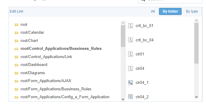
- Item 1 - List of folders created in Explorer Project. Select the folder and all applications in the folder will be displayed on the item 2.
- Item 2 - List of applications in the folder selected in the__Item 1__.
By type
Lists applications grouped by their respective type.
Example of applications grouped by type
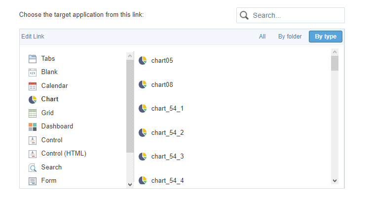
Item 1 - Types of existing applications in Scriptcase. Select the type of application you want to list, the applications corresponding to the selected type will be listed in item 2. Item 2 - List of applications referring to the type selected in item 1.
When selecting the destination application, click on Next ».
Parameters Definition
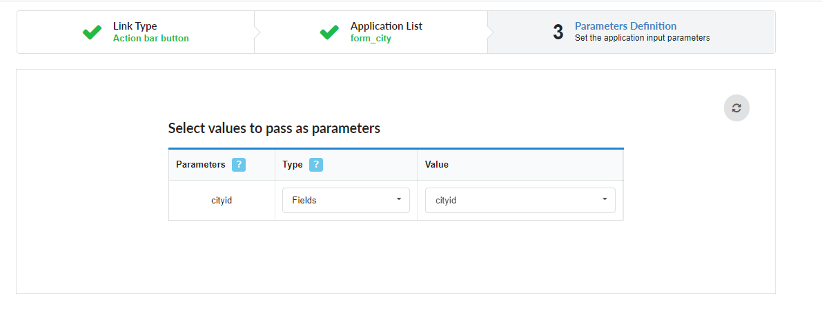
In this step, the developer must inform the values that will be passed to the parameters of the destination application.
These parameters can be:
- Global Variables - Which can be defined in the events or in the target application’s SQL.
- Primary Key - For connections created with applications of the types: Form and Calendar.
Parameters
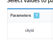
Lists all parameters defined in the target application.
Type
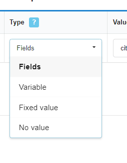
Defines the source type of the value that will be sent to the parameter defined in the destination application.
The options are:
- Fields - It uses the value of a field from the source application as a parameter.
- Variable - It uses the value of a global variable, defined in the source application, as a parameter. This option will only be listed if a global variable is defined in an event in the source application.
- Fixed value - It uses a fixed value, defined in the value column, as a parameter. In this option only alphanumeric values are allowed.
- No value - Using this option no value is passed. When using this option as a parameter for a primary key, the target application will be displayed in include mode.
Value
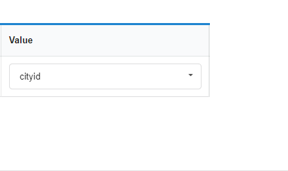
Defines the value that will be sent as a parameter. The options in this column change according to the selected Type.
- When selecting Campo - The value column will list all the fields of the source application, which will send the value.
- When selecting Variable - All global variables defined in the source application will be listed.
- When selecting Fixed value - A field will be displayed for the value to be informed. The use of variables is not allowed in this option and we must use only alphanumeric values.
- When selecting No Value - In this case, no value will be sent to the parameter.
Refresh Button

This button enables ajax reloading of the list of parameters, in this way it is possible to change or add a parameter in the destination application without the need to restart the creation of the connection in progress.
Link Properties
These properties define the behavior of links, such as opening location and return URL.
Link operation mode
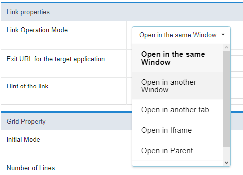
Defines how the target application will be displayed on the link. This attribute is also responsible for defining the available configurations according to the selected link operation mode. Check the Table below.
Open in the same window
The destination application will be displayed on the same screen as the source application. With this display option, the exit button of the destination application must have the behavior of returning to the previous application.
Open in another Window
The target application will open in a new browser window. With this display option, the target application’s exit button should close the open window.
Open in another tab
The target application will open in a browser tab. With this display option, the exit button on the target application should close the open tab.
Open in Iframe
The destination application will be displayed in an iframe next to the source application.
open in parent
The target application will be displayed in the parent of the source application.
If used in a security module, this option displays the destination application on the same menu screen, overlapping the application and keeping the session logged in at login.
Modal
The target application will be displayed in a modal. With this display option, the exit button on the target application should close the open tab.
Link Properties attributes available according to selected Link Operation Mode
| Link Attributes and Modes of Operation | Open in the same window | Open in another Window | Open in another tab | Open in Iframe | open in parent | Modal |
|---|---|---|---|---|---|---|
| Called application exit URL |  |
|
|
 |
|
|
| Closes the form after an update | |
|
|
|
|
|
| Close form after insertion | |
|
|
|
|
|
| Open the application in a tab within the menu | |
|
|
|
|
|
| Title for Tab | |
|
|
|
|
|
| Tab hint | |
|
|
|
|
|
| Active Tab Icon | |
|
|
|
|
|
| Inactive Tab Icon | |
|
|
|
|
|
| Width | |
|
|
|
|
|
| Height | |
|
|
|
|
|
Exit URL for the target application
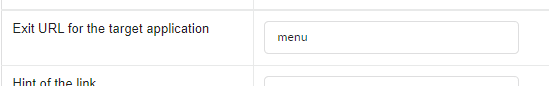
This attribute defines to which page or other application of the project the target application of the link will return. This return can be triggered through the back button or through some behavior configuration performed in the link, for example, the Closes the form after an update option (This attribute is exclusive for links with forms).
It is possible to define an external URL, for example https://scriptcase.net, or a project application where it will be necessary to inform only the application name.
If no value is informed, the return will be to the source application itself. This option is only available when the Link Operation Mode is set to: Open in same Window or Open in parent.
Close form after update
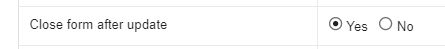
This attribute defines the behavior of the form when performing a record update from a link.
When you check yes, the form opened in the connection will be closed automatically when updating the record. If the attribute is marked as não, the destination application will remain open after the update, allowing new registry changes to be made.
This attribute is available only when the target application is a form.
Close form after insert
![Define se o formulário chamado será fechado após realizar inserção de algum registro][img_att_fechar_no_insert]
This attribute defines the behavior of the form when inserting a record from a connection.
When you check yes, the form opened in the connection will be closed automatically when inserting a record. If the attribute is marked as not, the target application will remain open after inserting records, thus allowing new records to be inserted. [img_att_fechar_no_insert]: ../../../../../assets/images/docs/app/comum/ligacao/geral/atributos_propriedade/att_fechar_no_insert.png
This attribute is available only when the target application is a form.
Open the application in tab within the menu
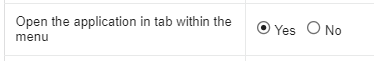
This attribute defines the connection behavior when the origin application is accessed from a menu application, which in turn must be configured with the opening of items in tabs. See how to enable this feature in the applications of menu and tree menu.
The attribute is available when using the Link operation mode defined as: Open in another window or Open in another tab.
When activated the destination application will open in a tab within the menu application. When checking no the target application will be opened in a new window or a new browser tab, according to the selected Link operation mode.
Tab Title
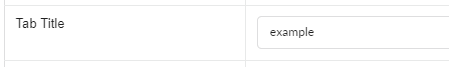 Allows the developer to define a menu tab title where the target application will be displayed. If no value is informed, the tab will inherit the name of the called application.
This setting is available if the attribute Open the application in a tab within the menu is set to Yes The text definition has no character restriction and can be done with a fixed text or using a lang, to create systems with multiple languages.
See more details about langs and about our Data dictionary.
Tab Hint
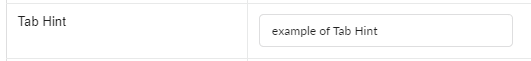
Allows the developer to define a text to guide the end user in using the system. Help text will be displayed when hovering the mouse over the menu tab.
This setting is available if the attribute Open the application in a tab within the menu is set to Yes The text definition has no character restriction and can be done with a fixed text or using a lang, to create systems with multiple languages.
See more details about langs and about our Data dictionary.
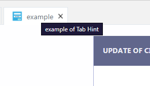
Example of Hint in menu tab with destination application
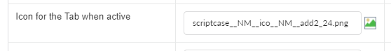
Icon for the Tab when active
Defines the image that will be displayed on the menu tab when activated. If no image is informed, the tab will inherit the default image, defined in the menu icons.
This setting is available if the attribute Open the application in a tab within the menu is set to Yes
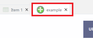
Example of active tab icon
Icon for the Tab when Inactive
Defines the image that will be displayed on the menu tab when activated. If no image is informed, the tab will inherit the default image, defined in the menu icons.
This setting is available if the attribute Open the application in a tab within the menu is set to Yes
Example of the inactive tab icon
Width
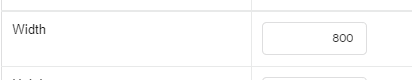
This attribute is available for configuration only when using the Link operation mode as Modal.
Defines the width of the modal where the form will open. This width refers to the horizontal space available for displaying the application.
This attribute obligatorily uses pixels as the measurement unit, therefore, only numbers must be informed to define the width. The width of the application displayed in the modal respects the definition of the Table Width attribute.
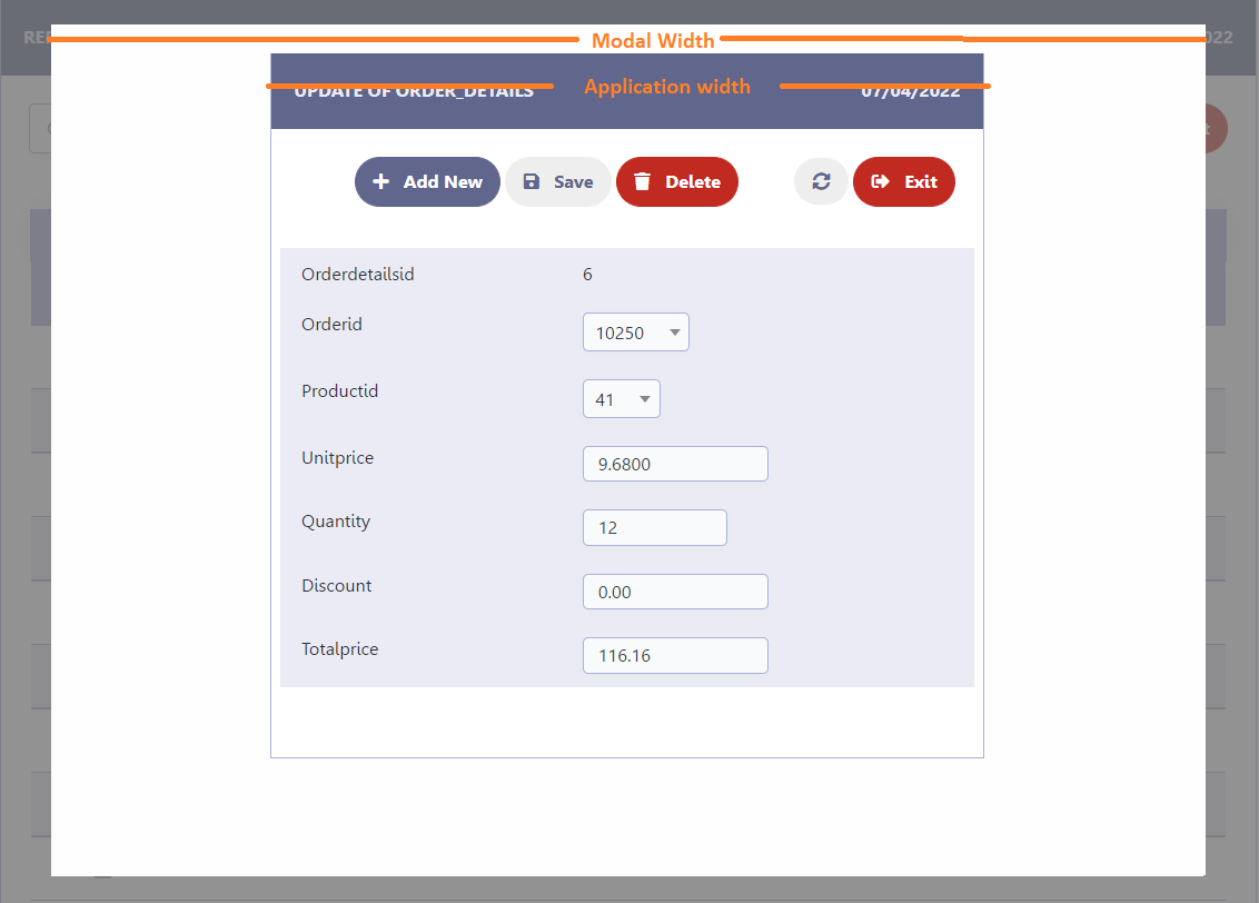
Example of the application opened in the modal
Height
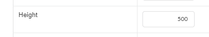
This attribute is available for configuration only when using the Link operation mode as Modal.
Defines the height of the modal where the form will be displayed. This height refers to the vertical space available for displaying the application.
This attribute obligatorily uses pixels as the measurement unit, therefore, only numbers must be informed to define the width. The height of the application is calculated automatically and respects the number of fields selected for the application.
Example of the application opened in the modal
Form Properties
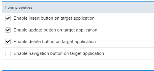
These properties are only available in links where the destination application is a form, this configuration block defines whether or not to display the Update (Insert, Update and Delete) and Navigation (first, * previous, *next and last) of the target form, according to the toolbar settings of the called application.
It is important to point out that the attributes in the Form Properties block do not override the toolbar settings of the called form, they only determine whether the buttons configured there will be displayed or not in the link.
This attribute is not available if the Link Operation Mode attribute is set to Open in an iframe. In this configuration, the form’s buttons will be displayed on the toolbar of the link’s source application. Click here for more details on the query toolbar.
Enable Insert Button
Sets whether or not to display the Insert button on the target form. For this, it is necessary that the button include is selected to be displayed in the settings of the toolbar of the appplication.
Enable Update Button
Sets whether or not to display the Refresh button on the target form. For this, it is necessary that the button change is selected to be displayed in the settings of the toolbar of the appplication.
Enable Delete Button
Sets whether or not to display the Delete button on the target form. For this, it is necessary that the button Delete is selected to be displayed in the settings of the toolbar of the appplication.
Enable Navigation Buttons
Determines whether or not to display the Navigation Buttons (First, Back, Page Navigation, Next, Last) configured in toolbar of the target form.
Keep the WHERE clause in the target application
This attribute is only available when enabling navigation buttons.
This attribute makes it possible for the WHERE clause of the source application (Query) to be maintained in the destination application. This means that the filters performed in the query will be inherited by the target form, enabling better quality in the records displayed for editing.
Grid Properties
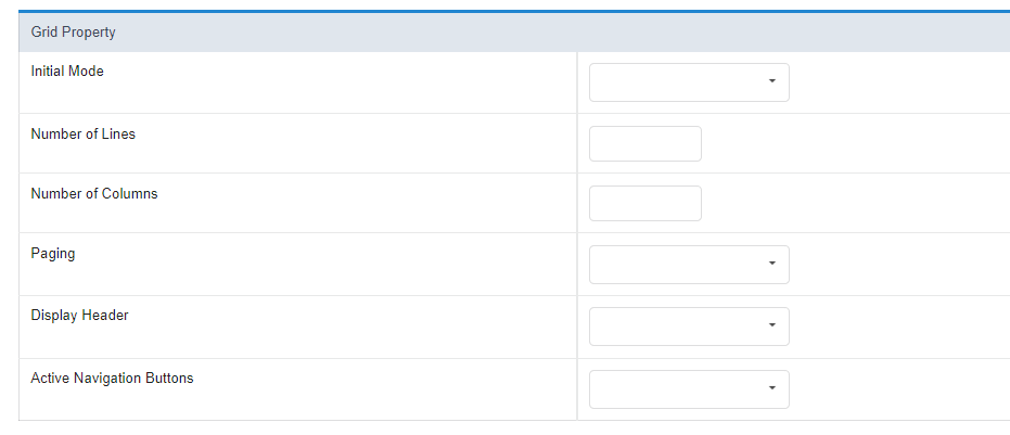
Grid properties allow changing the behavior of the target application, without having to change the application.
It is important to point out that these configurations do not force the configurations in the destination application, they only change the previously made configurations. For example, if the target application has the filter module disabled, using Initial mode as filter in the connection will not have any effect.
These properties are only available on connections where the target application is a grid.
See below for more details on the attributes.
Initial Mode
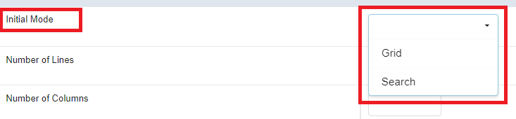
Defines the opening module of the target application, which can be Grid or search. For this feature to work, the target application must have the modules enabled.
Number of Lines:
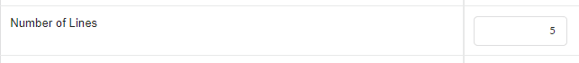
Defines the number of lines that will be displayed in the target application. If no value is informed, the configuration of the called application will be respected.
Number of Columns
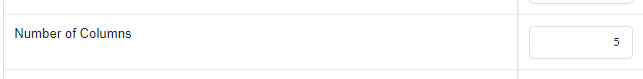
Limits the number of columns displayed in the target application.
The entered value must be less than the number of columns displayed in the target application.
Paging
This attribute defines the type of pagination used in the application, which can be Partial where the developer defines the number of lines per page or total which displays all records on the same page.
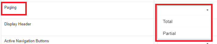
Partial
Displays the target application with a limited number of records per page. The number of records per page can be defined in the Number of Lines attribute, if no value is informed, it will inherit the target application’s configuration.
This attribute does not force partial pagination on the target application, only the navigation buttons configured on the toolbar.
Example of toolbar with partial pagination

Total
Forces the target application to display without paging, displaying all records on a single page. In this case the navigation buttons are removed.
Example of toolbar with full pagination

Display Header

Defines whether the target query header will be displayed. For the feature to work correctly, the application and destination must have header options configured.
Active Navigation Buttons
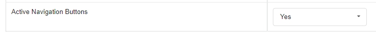
Determines whether or not to display the Navigation Buttons (First, Back, Page Navigation, Next, Last) configured in toolbar of the target application.
Iframe properties
This configuration block is available when using the Link Operation Mode set to Open in an iframe.
Position of the iframe relative to the main application
Defines the positioning of the iframe relative to the source application.
- Below: The iframe will be displayed below the source application.
- Above: The iframe will be displayed above the source application.
- Right: The iframe will be displayed on the right side of the source application.
- Left: The iframe will be displayed on the left side of the source application.
Iframe height
Defines the height of the iframe where the form will open. The attribute obligatorily uses pixels as the unit of measurement, therefore, we must inform only numbers in its definition. If no value is informed, the height will be based on the connection origin application.
Iframe width
Allows the width of the iframe to be set.
Defines the width of the iframe where the form will open. The attribute compulsorily uses pixels as the measurement unit, thus, only numbers must be informed to define the width.